✱ Health & AestheticsPrivate HealthcareSurrey
The category leader that didn’t look like one.
Brand strategy, a complete visual identity and a new website for a multi-award-winning, CQC-registered clinic whose reputation had long outgrown its branding.
Look like the clinic they already were.
Health & Aesthetics is a doctor-led, CQC-registered cosmetic medical clinic in Elstead, Surrey, founded by Dr Rekha Tailor. It has been open since 2008, employs twenty-one qualified medical staff, and has treated more than three thousand clients. Its clientele is private and, at the top end, ultra-high-net-worth: people who research thoroughly, ask for referrals, and treat discretion as a baseline rather than a feature.
The clinical reputation was already there. The brand was not. It read as a competent local practice at exactly the moment the market filled with slick, venture-backed operators who looked far more expensive than they were.
That gap costs money in both directions. It undercuts pricing power with the clients you want, and it fails to filter out the ones you do not.
Good Housekeeping · Tatler · Women’s Health · Vogue · Daily Mail · The Independent · Harper’s Bazaar
Strategy first. The identity was the last thing we drew.
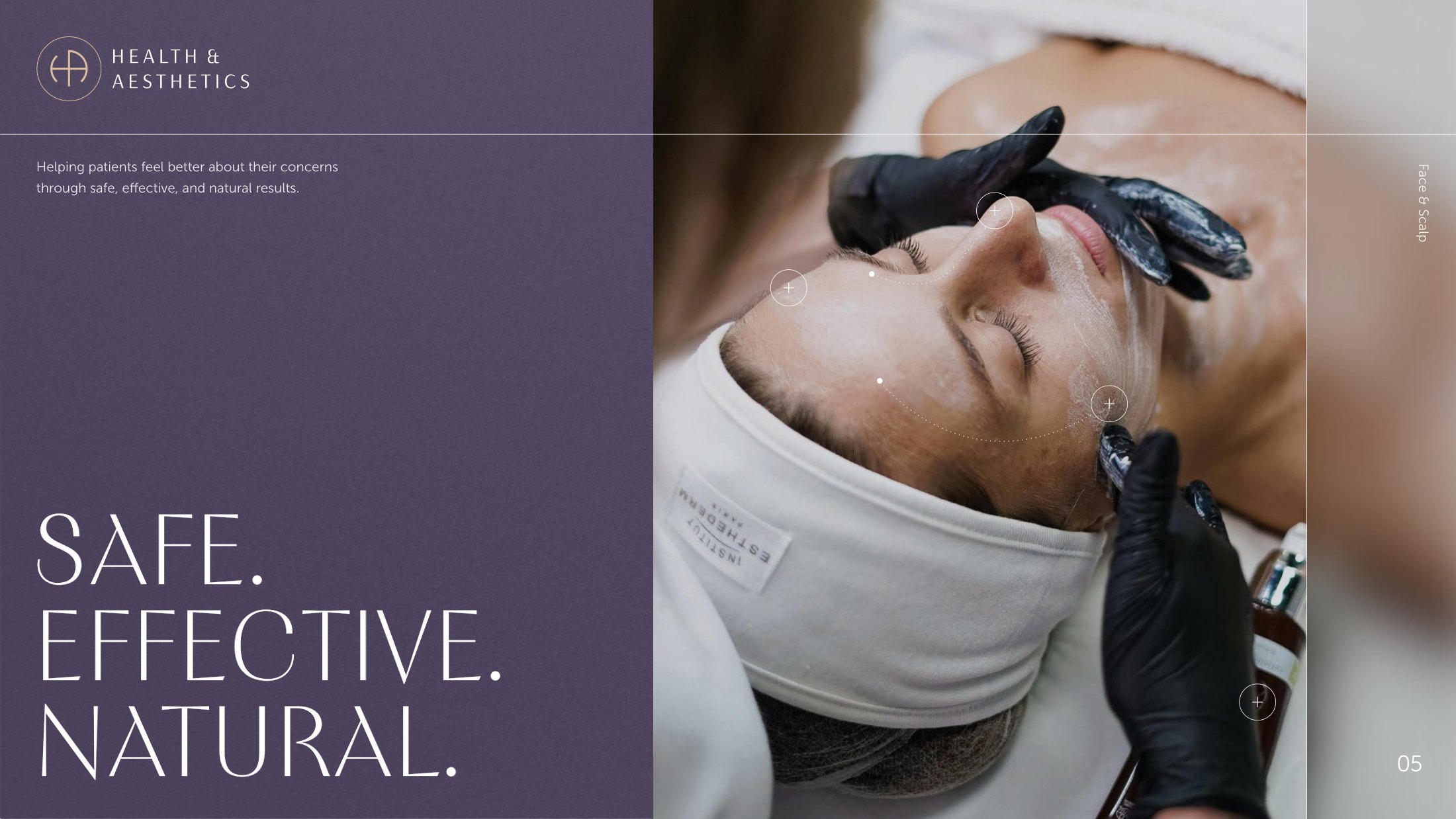
Most rebrands in this category start with a logo and work backwards. We started with the harder question: in a market that sells transformation, what does a clinic that sells restraint actually stand for? The answer came back consistently from the practice itself, and it became the spine of everything after it.
Doctor-led, CQC regulated, and never apologetic about declining a treatment.
Clients are informed, not sold to. The brand had to explain rather than persuade.
The result should read as the client, rested. Not as work that has been done.
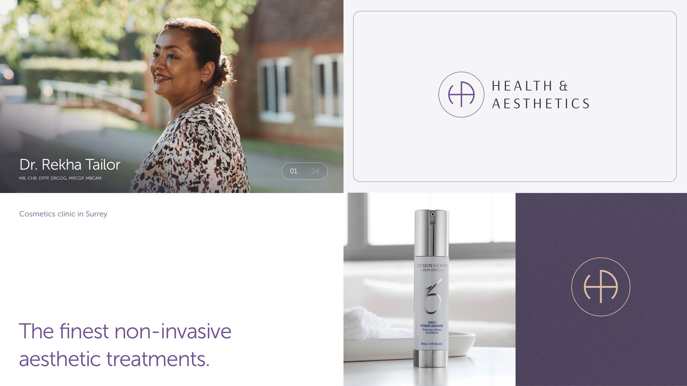
An H and an A, drawn as one.
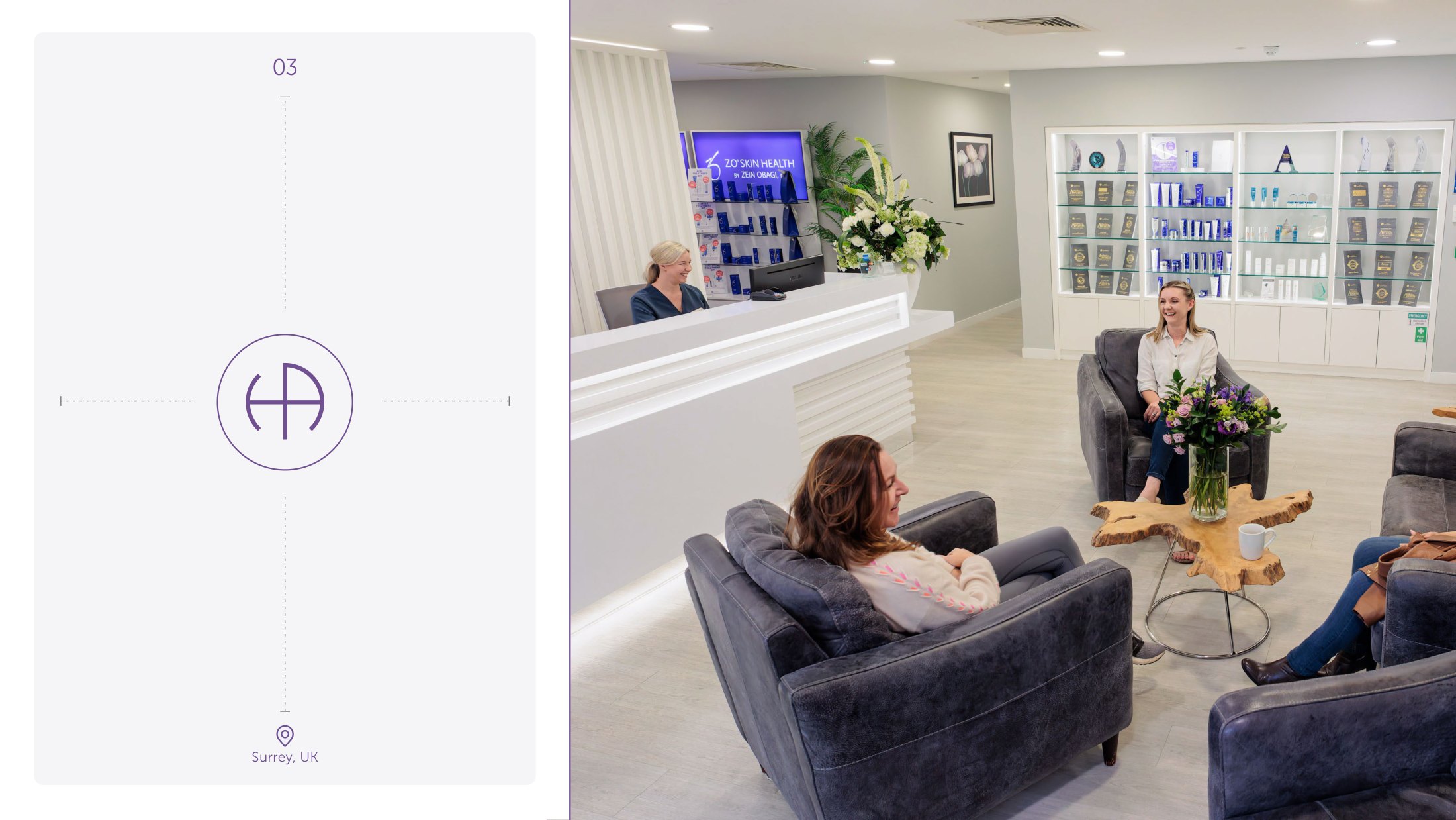
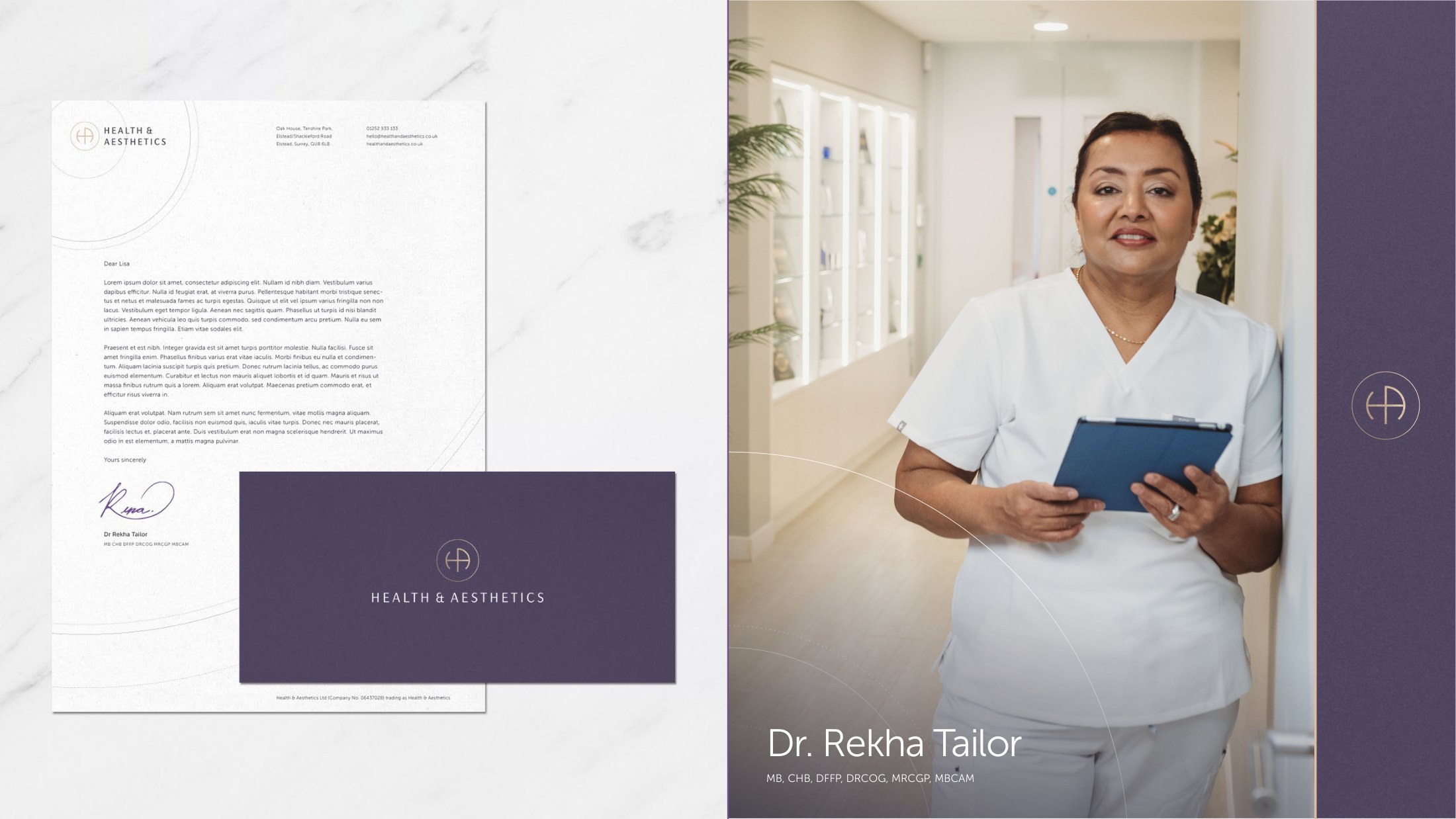
The monogram ties the H and the A into a single continuous form inside a circle: a suture, a seal, a mark of approval. It reads as medical without ever reading as clinical, and it holds at the two sizes that matter most in this business, a shopfront and a jar lid.
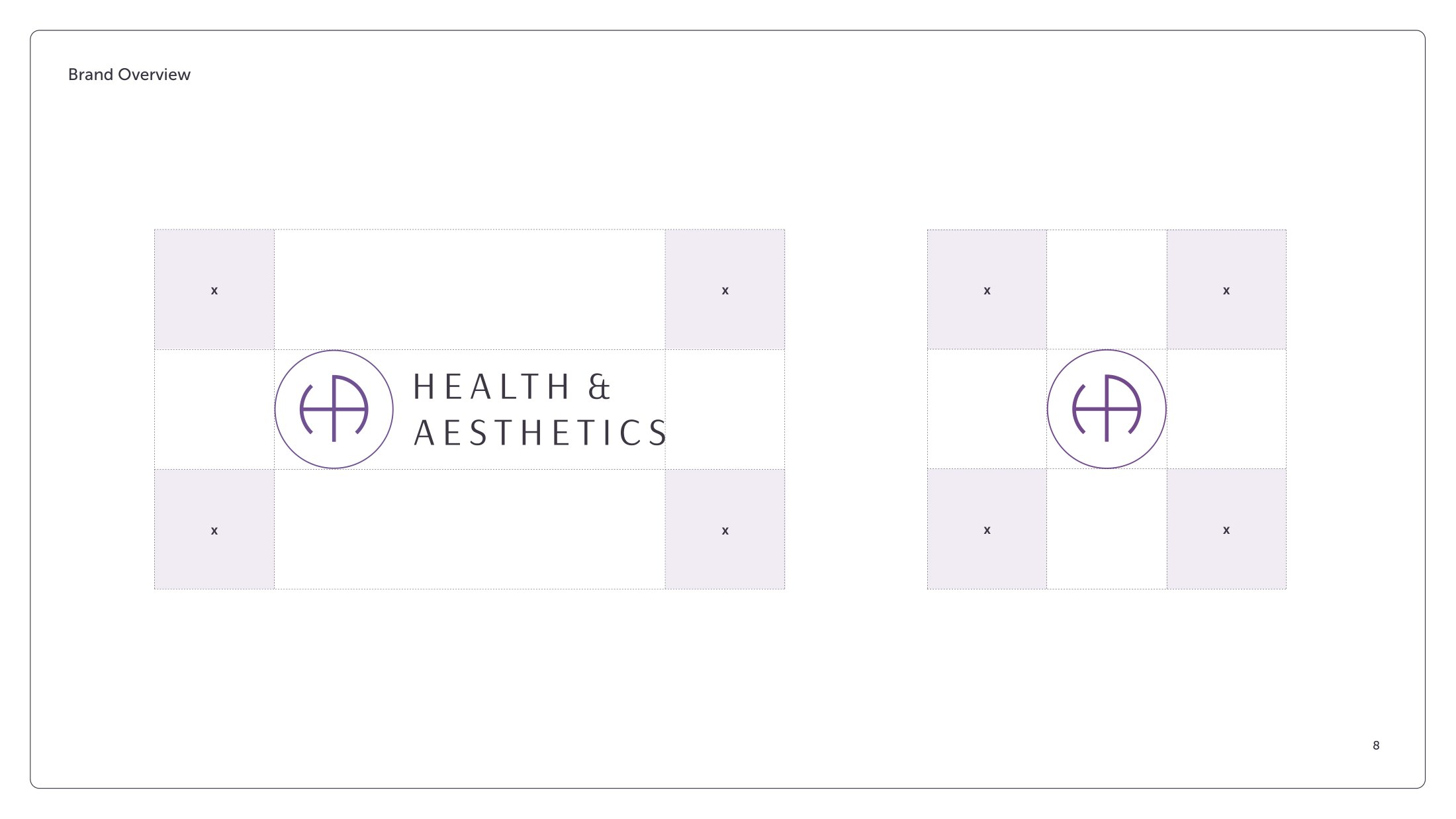
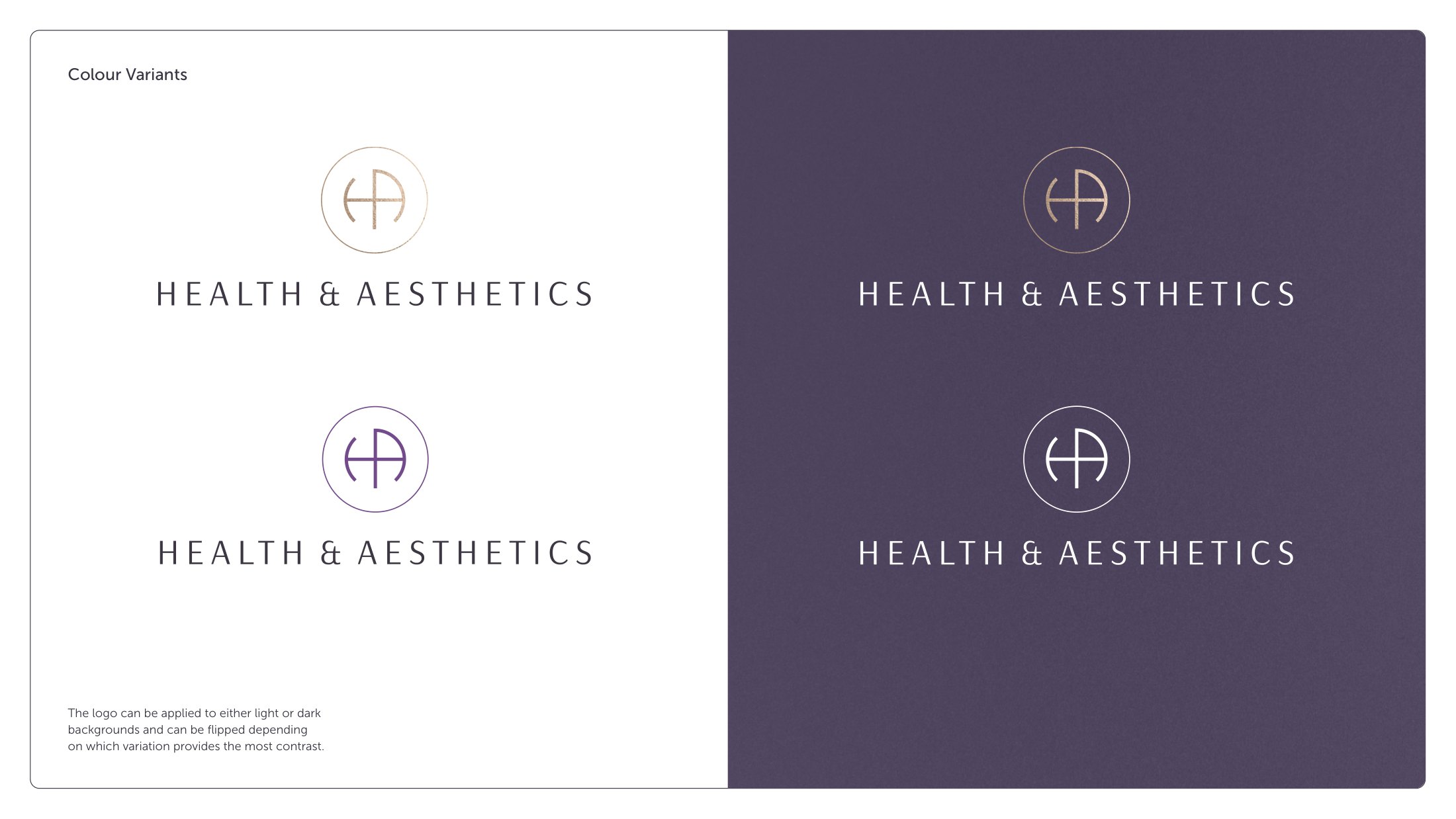
It was built with the apparatus a real identity needs: clear-space rules keyed to the mark’s own proportions, colour variants for light and dark grounds, and a documented set of things nobody is allowed to do to it.
Purple, without the wellness cliché.
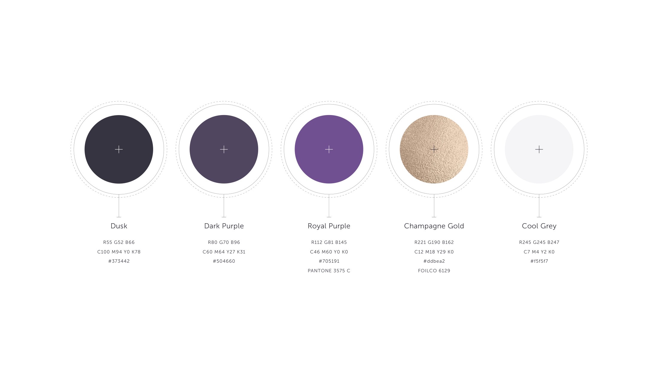
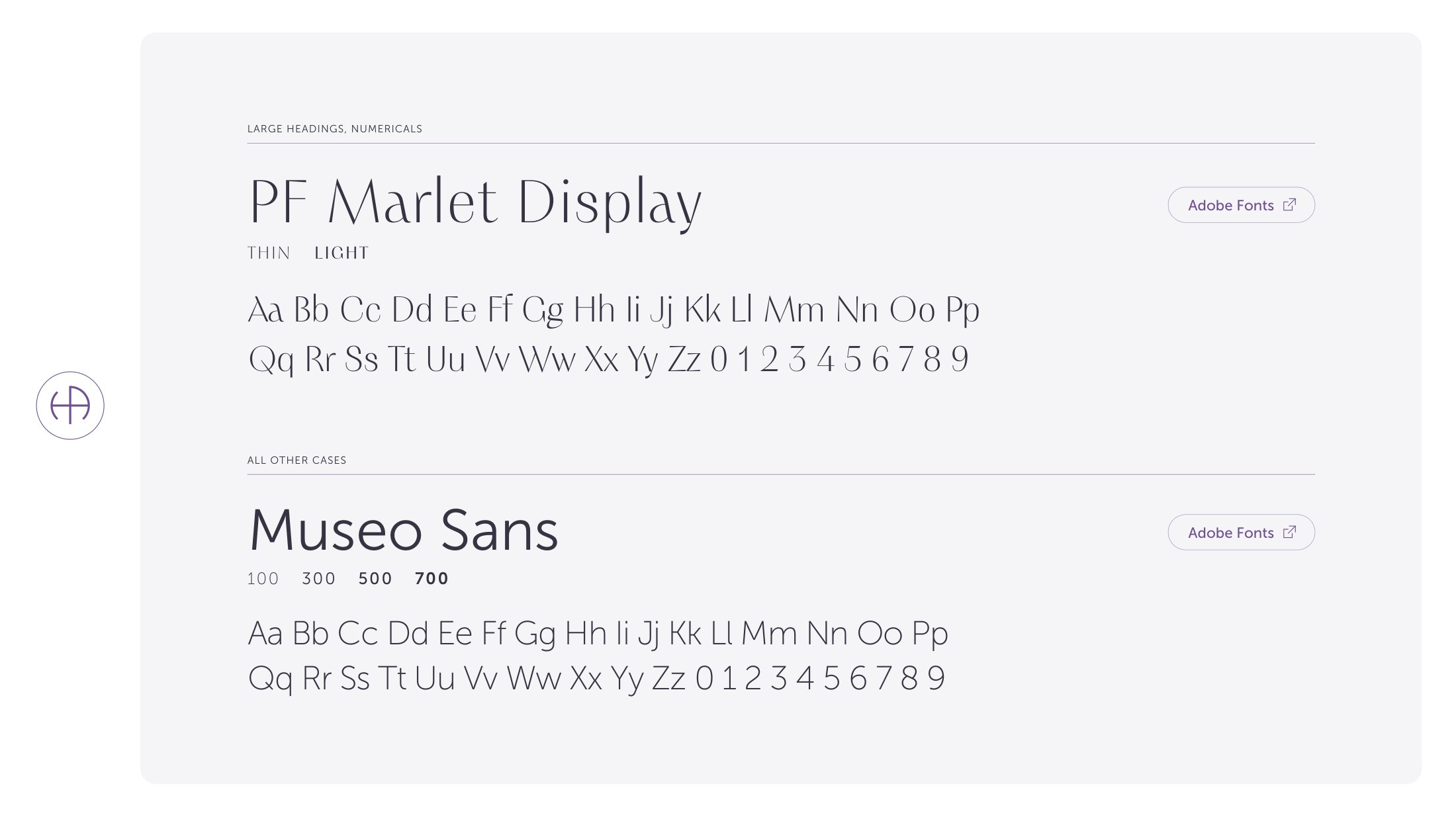
The palette runs deep: Dusk, Dark Purple and Royal Purple, warmed by Champagne Gold and cooled by a single grey. Purple is the category default, so the work was in taking it somewhere serious rather than soft, closer to a private bank than a day spa. PF Marlet Display carries the headlines, Museo Sans does everything that has to work small and be read carefully.
A brand is what the client actually touches.
Signage, stationery, aftercare cards, the bag a product leaves in, the retail wall behind reception. In a clinic these are not brand extras, they are the entire experience between the consultation and the next appointment.
Each was drawn from the same system, so a client who sees the shopfront, the letter and the jar recognises all three as one place.
Proof above the fold, not below it.
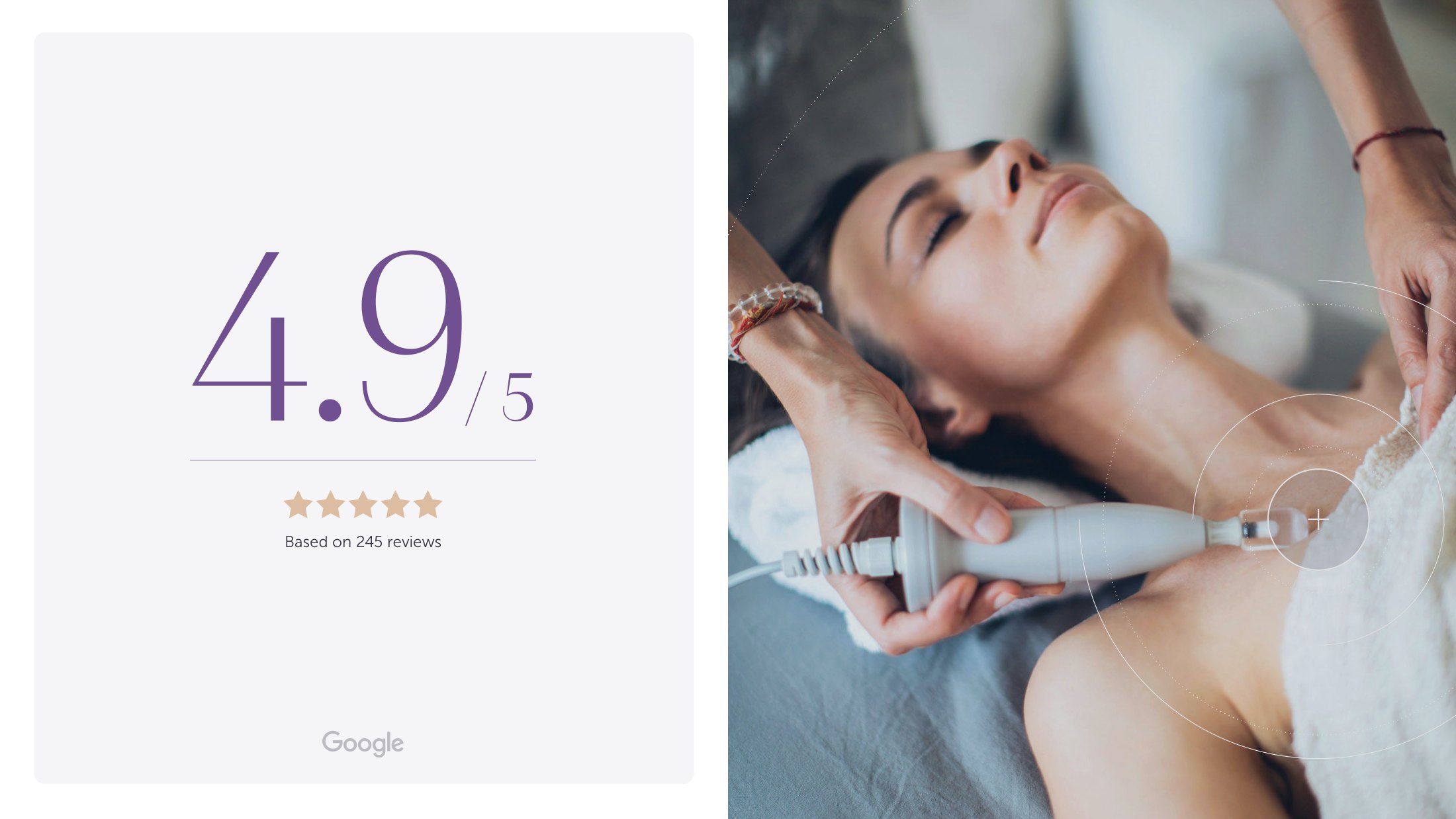
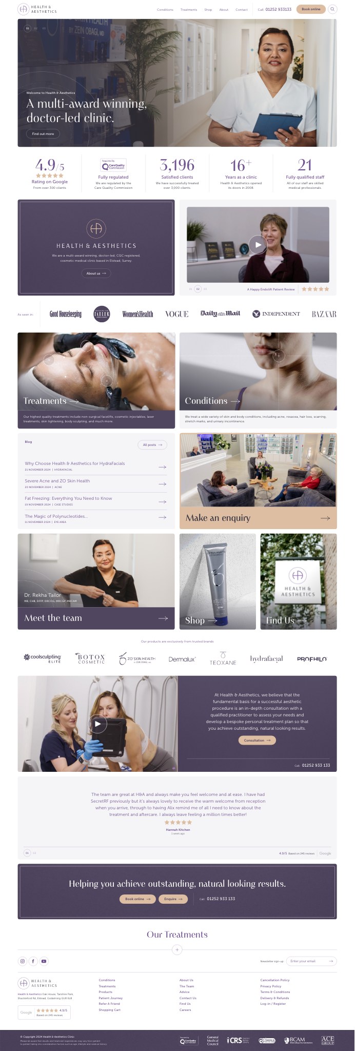
Private healthcare has a specific conversion problem: the visitor is deciding whether to trust a stranger with their face. So the regulator, the rating, the client count, the years open and the size of the medical team sit in a single band directly under the hero, before a treatment is named.
Beneath that, the site splits the way patients actually think: by condition when something is wrong, and by treatment when they already know what they want. Both routes lead to the same consultation.
The rest is credibility furniture, used carefully: the press logos, the partner brands, a patient video, and reviews pulled live rather than typeset by us.
Real staff, real rooms, no stock.
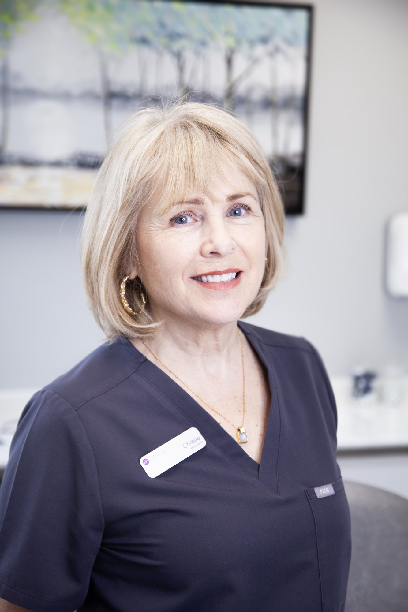
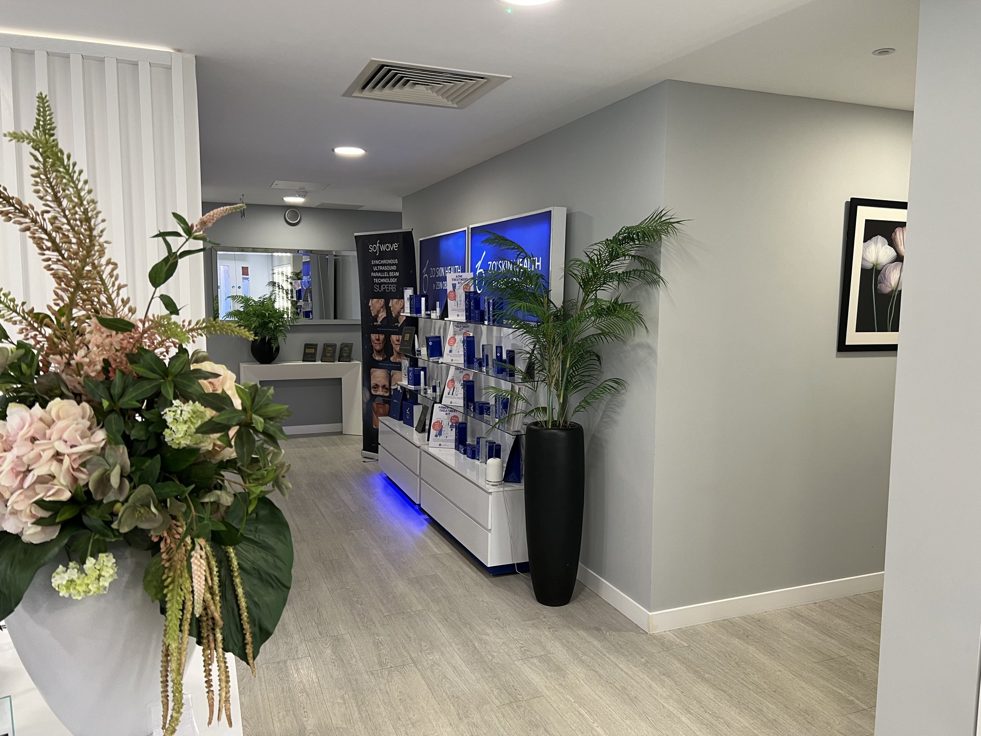
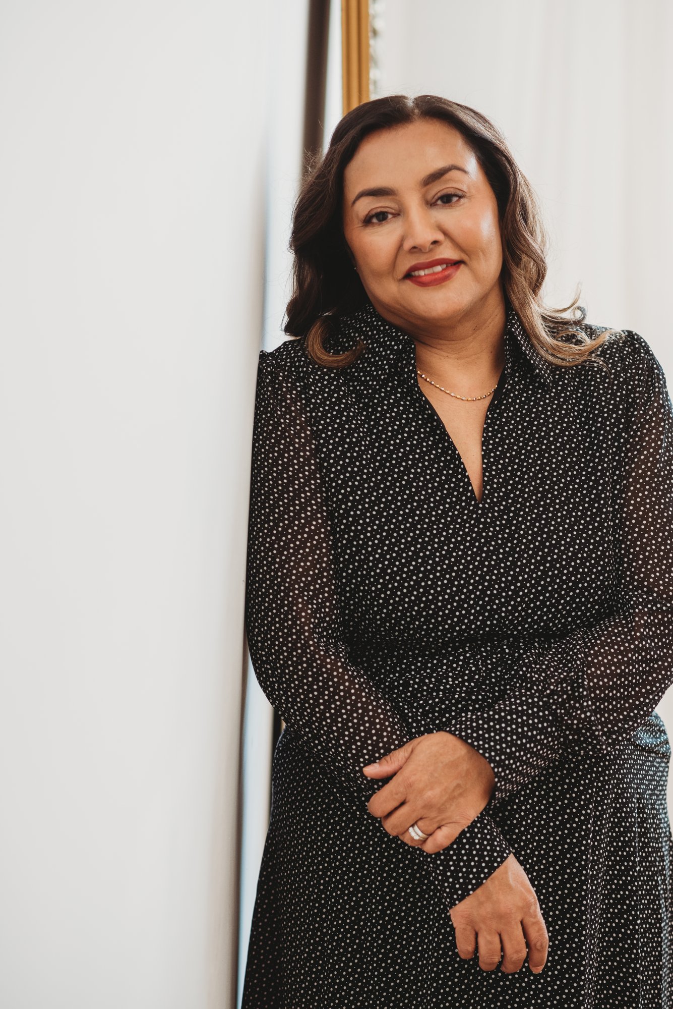
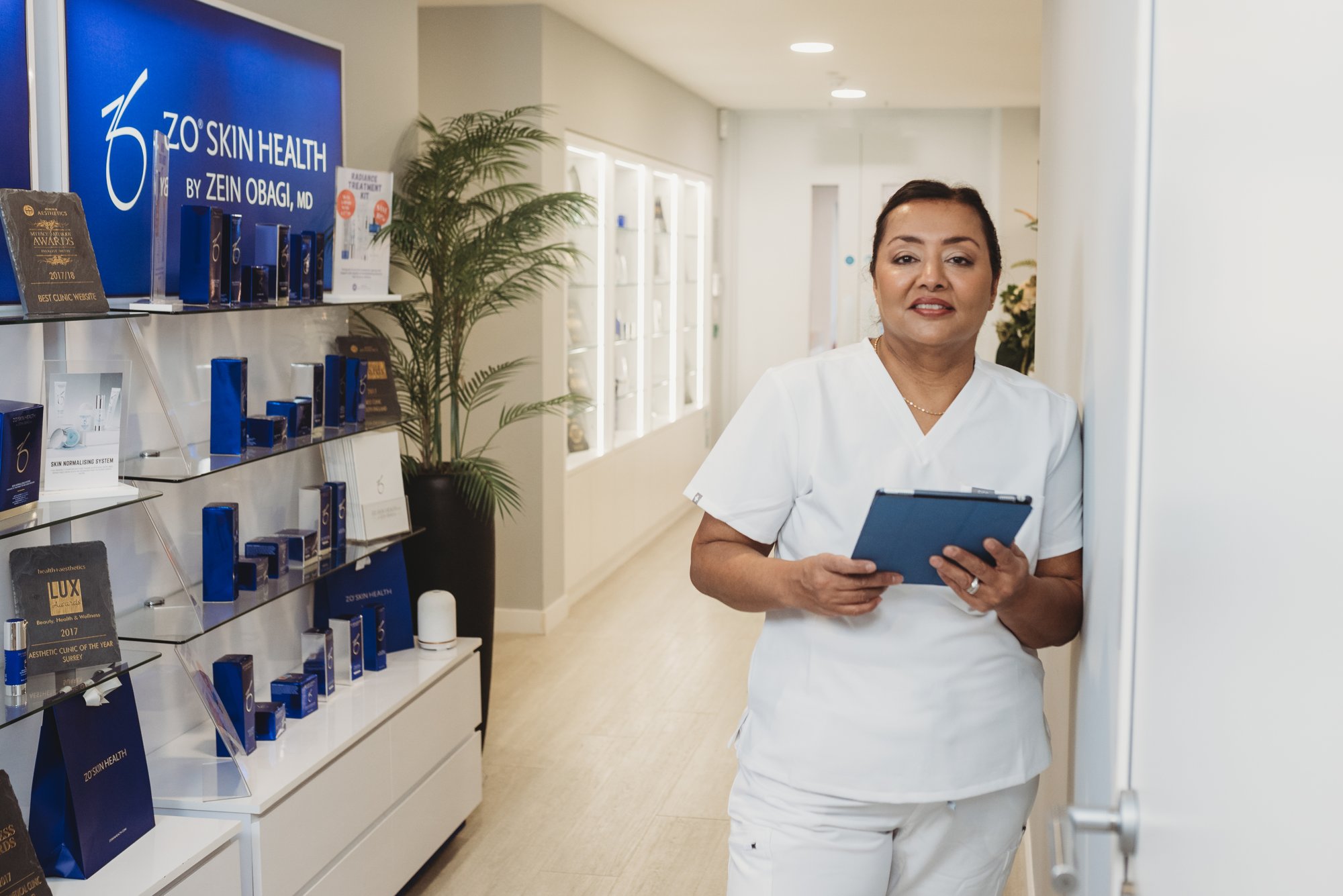
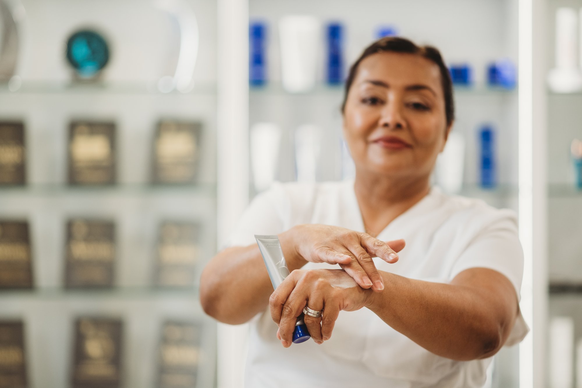
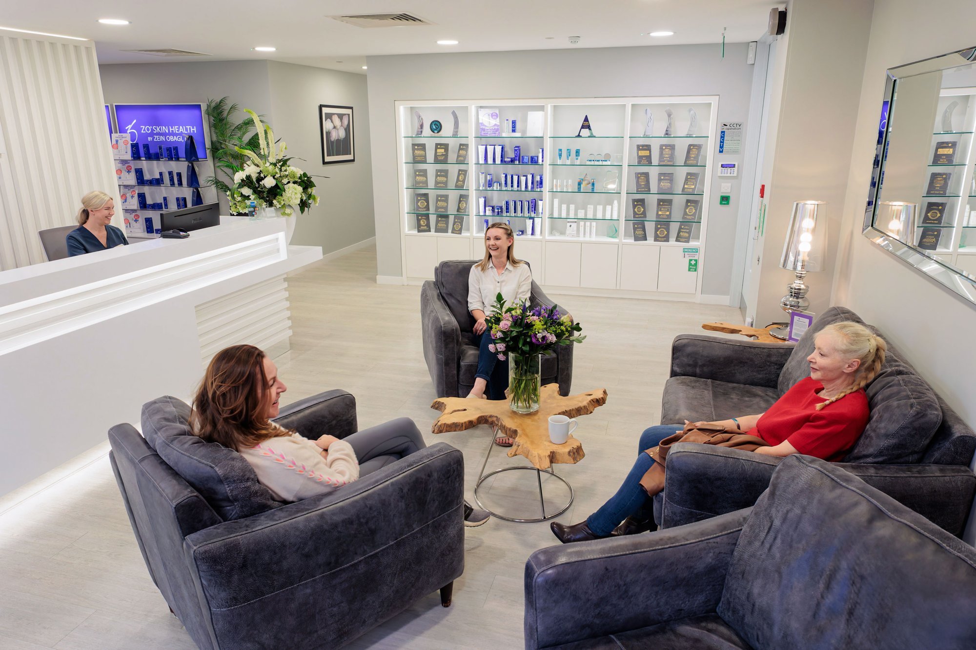
Every practitioner, every treatment room and the clinic itself were shot for the brand. In a category where the same three licensed images of a woman touching her cheek appear on a hundred competitor sites, photographing the actual people is the cheapest credibility available.
I always leave feeling a million times better.
The team are great at H&A and always make you feel welcome and at ease. It is always lovely to receive the warm welcome from reception when you arrive, through to having the practitioner remind me of all I need to know about the treatment and aftercare.
Hannah Kitchen · Client review, Google
In private healthcare, the brand is the first piece of evidence.
Nobody can assess a clinician’s work before they commit to it. So they read everything else instead: the signage, the typography, the paper the aftercare notes are printed on. Getting that right is not decoration. It is the only proof available before the appointment.
Health & Aesthetics · Elstead, Surrey