← All Work
Build a Brief
Wellness · Direct to consumer

Premium, in a category that reaches for cute.

RUMI Dogs makes wellness supplements for dogs. The brief was a brand with genuine luxury credentials, and a site built to sell it.
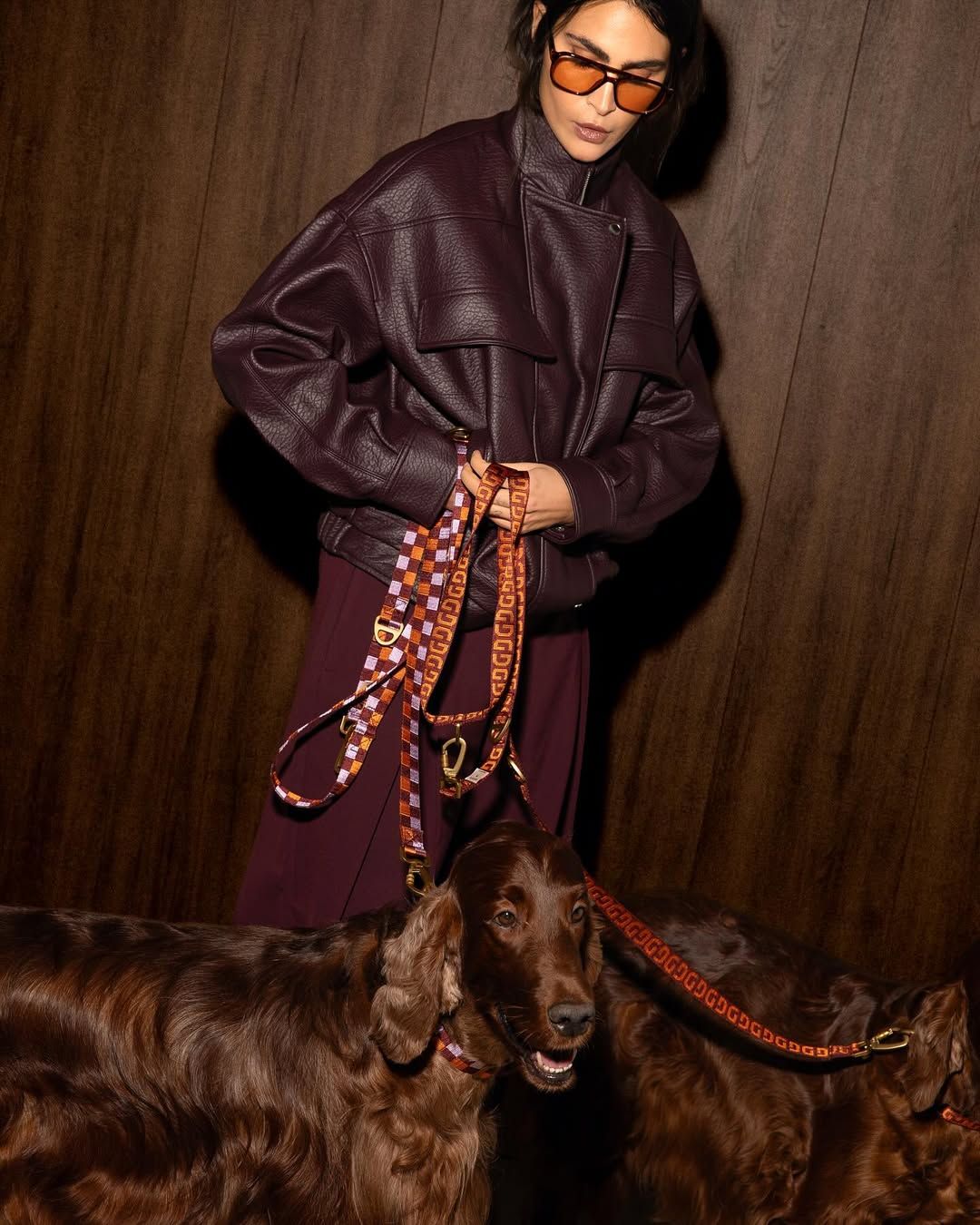
RUMI Dogs editorial photography
ClientRUMI Dogs
SectorWellness · Consumer
DeliverablesBrand · Packaging · Guidelines · Website
EngagementOngoing, founder level
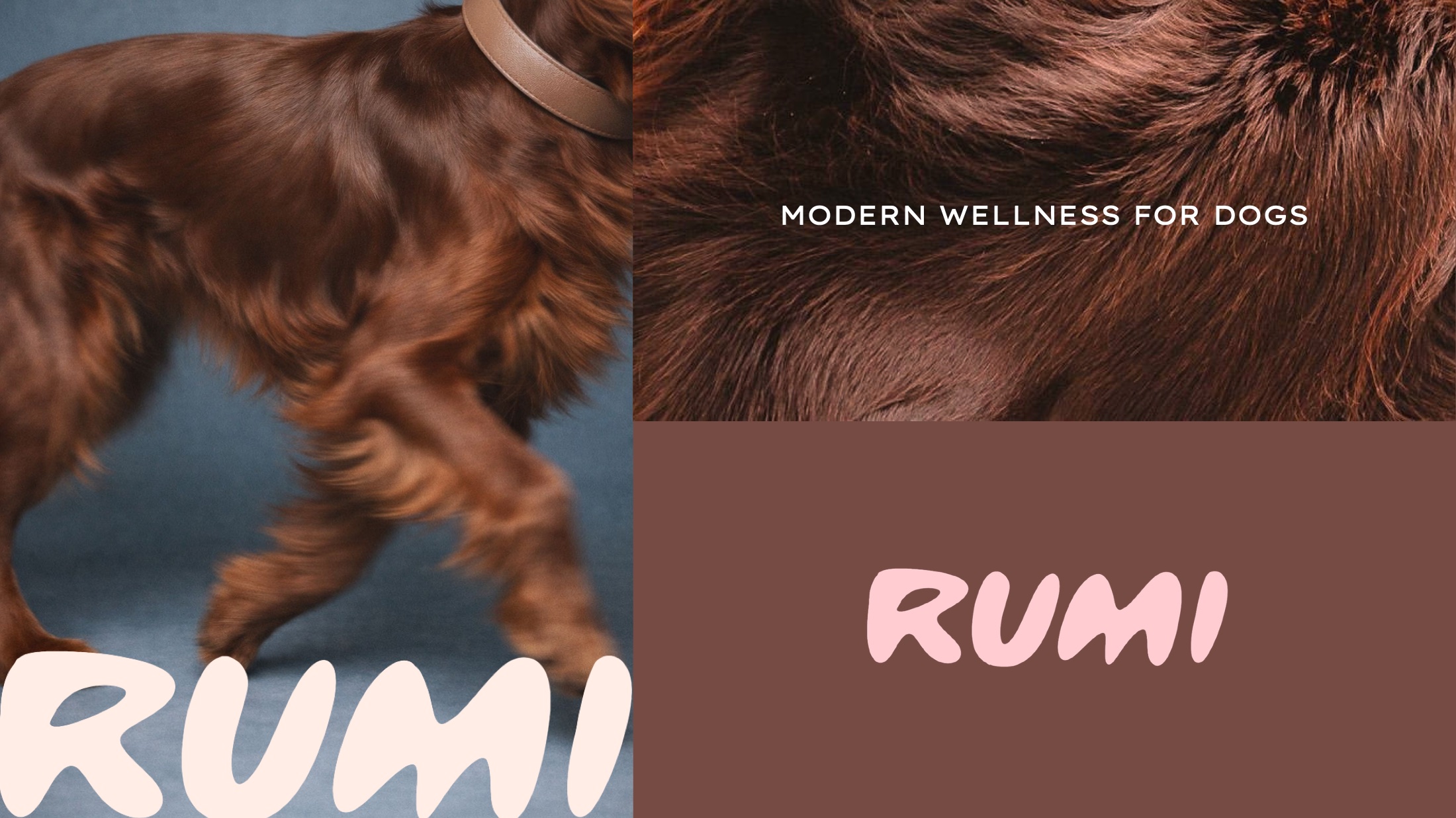
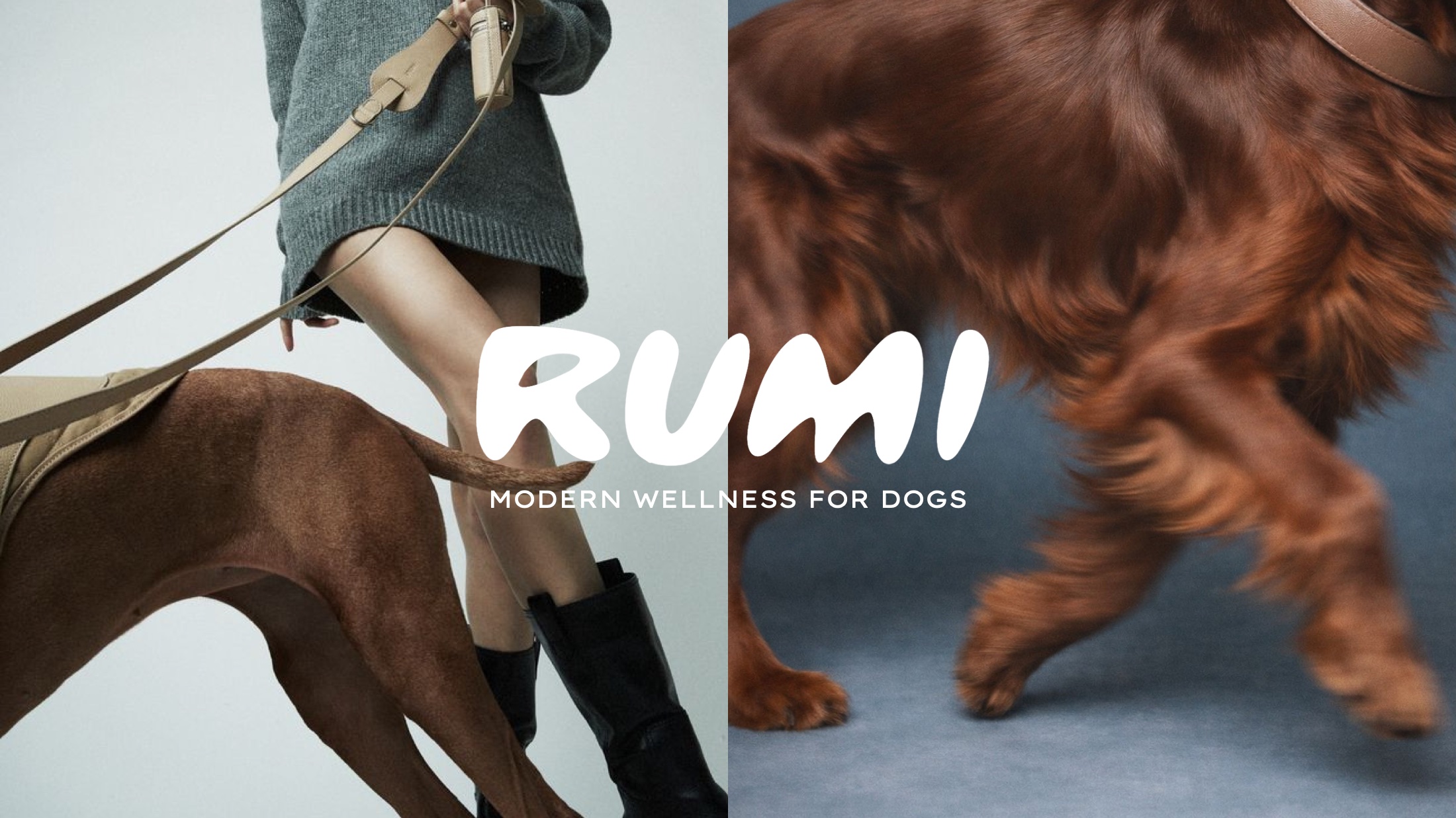
RUMI brand spread: a dog mid-stride beside the wordmark and the line, modern wellness for dogs
Modern wellness for dogs
/01The Brief

Dogs are a serious category.

Founded by Thara de Ridder, whose background is scaling high-growth e-commerce brands.

Pet wellness is a large, fast-growing market served almost entirely by brands that reach for cute: rounded type, primary colours, a cartoon dog. It works at the value end. It caps you there too.

The brief was to build RUMI to the standard we would give a beauty house, and to do it with a nine-figure ambition in mind from the first decision rather than retrofitted later.

/02The Identity

Warmth, held to a standard.

RUMI logotype
The logotype: soft enough to belong to a dog brand, drawn tightly enough to sit beside a beauty label
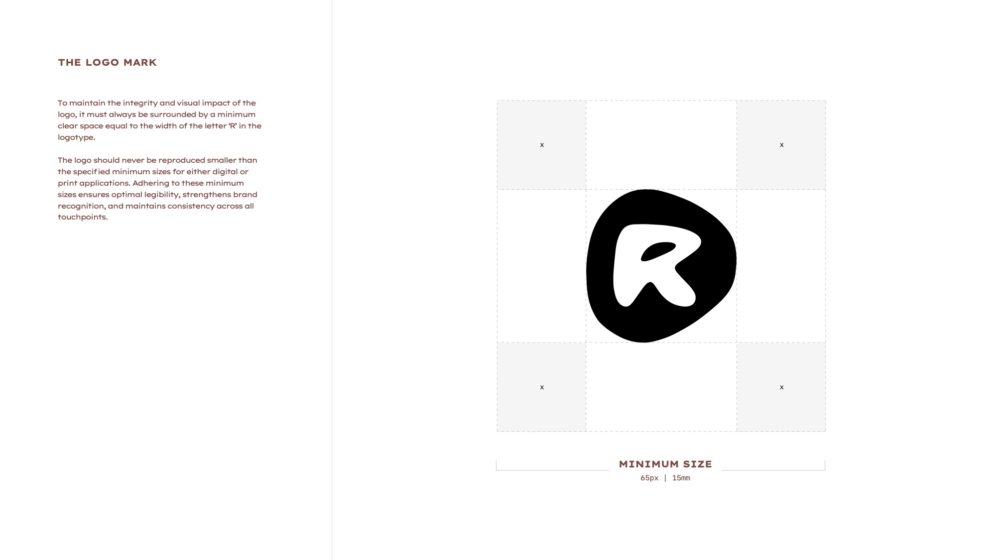
RUMI logo construction and clear space
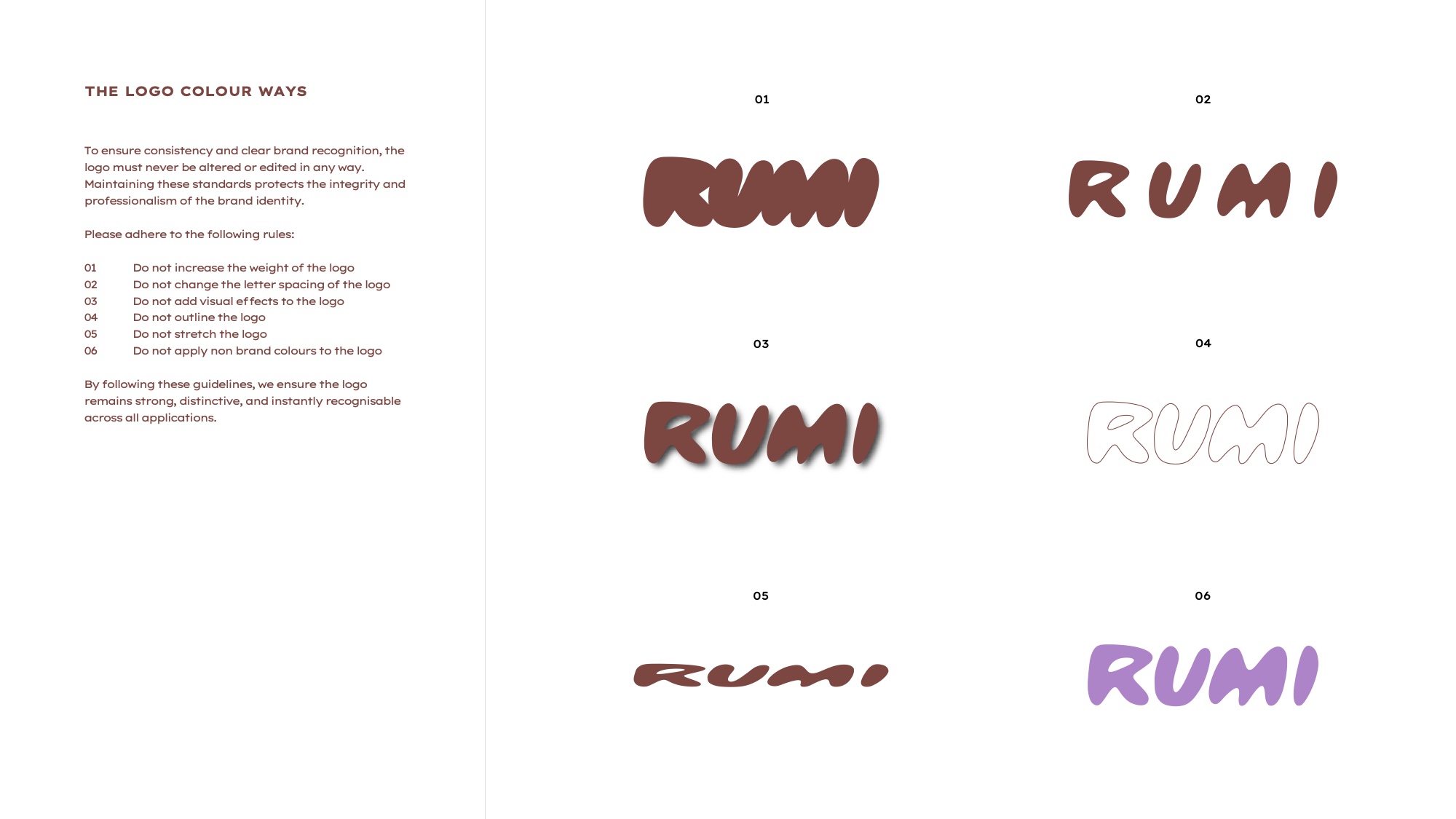
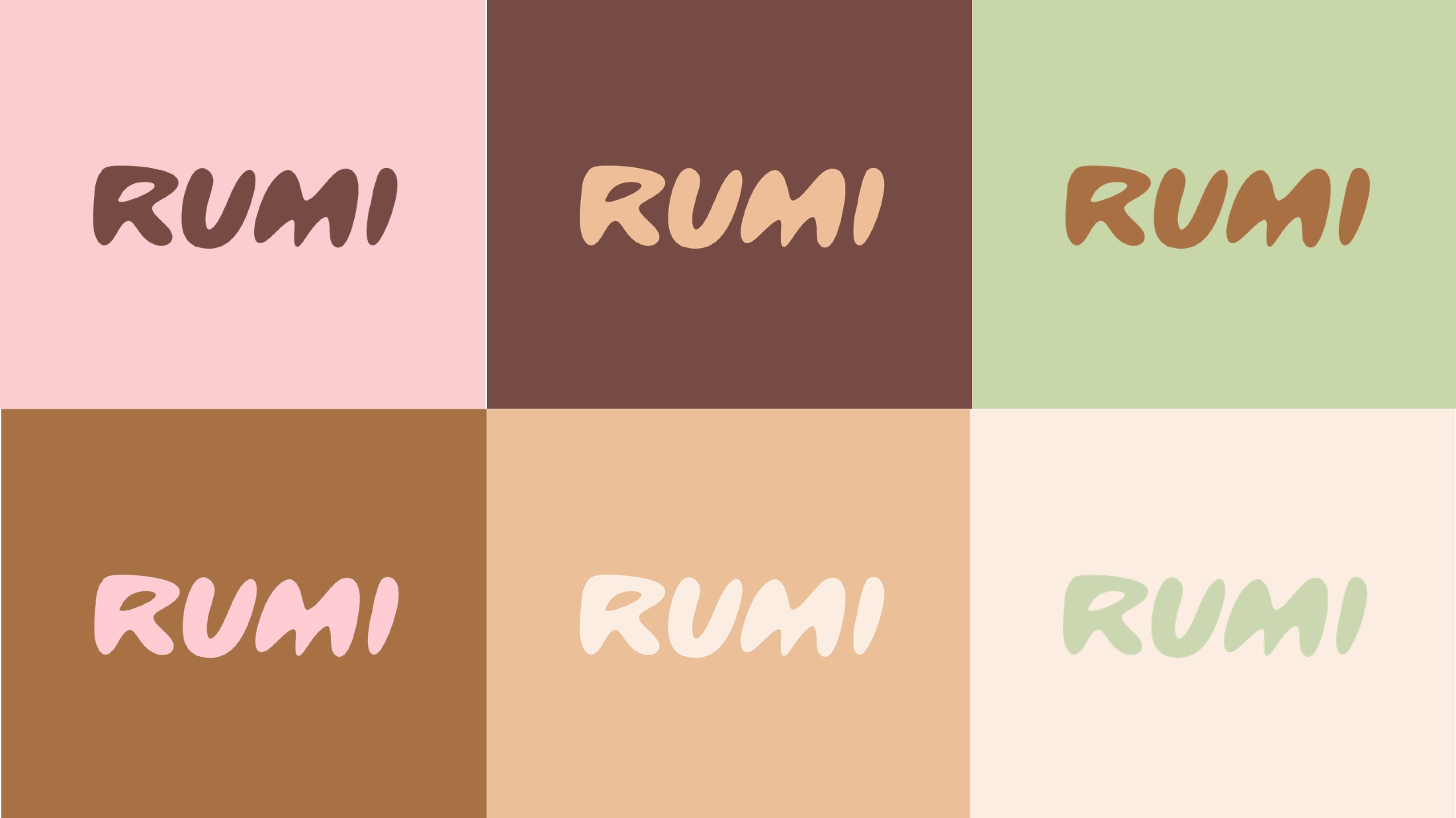
RUMI approved logo colourways
Construction and clear space on the left, the approved colourways on the right. Nothing outside this set, ever
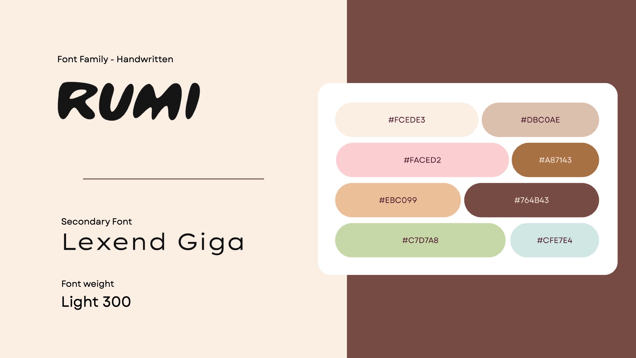
RUMI colour palette
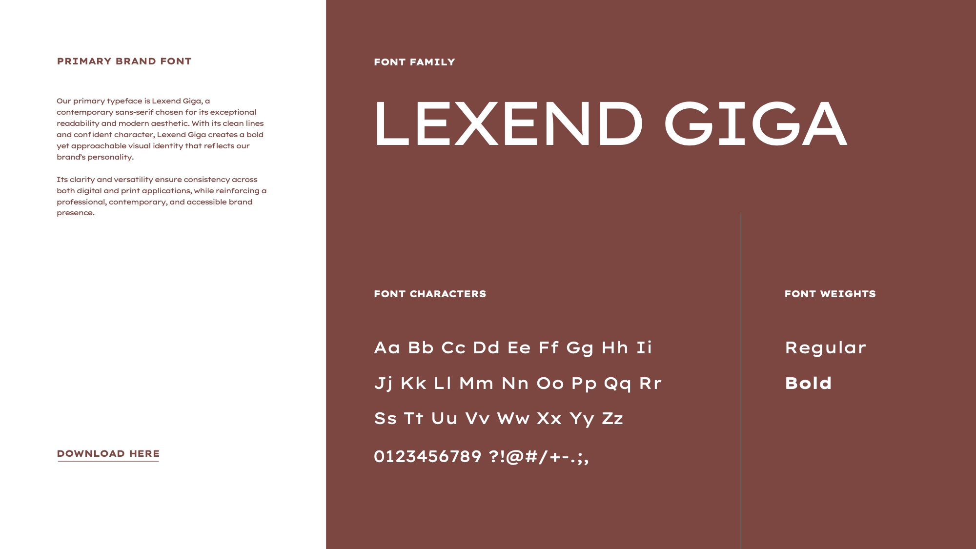
RUMI typography system
The palette with its named pairings and proportions, and the typographic hierarchy
RUMI typography and colour: the handwritten mark, Lexend Giga and the palette swatches
RUMI brand spread: coat detail beside the wordmark
The handwritten mark against Lexend Giga, and the palette taken off the coat rather than off a trend board
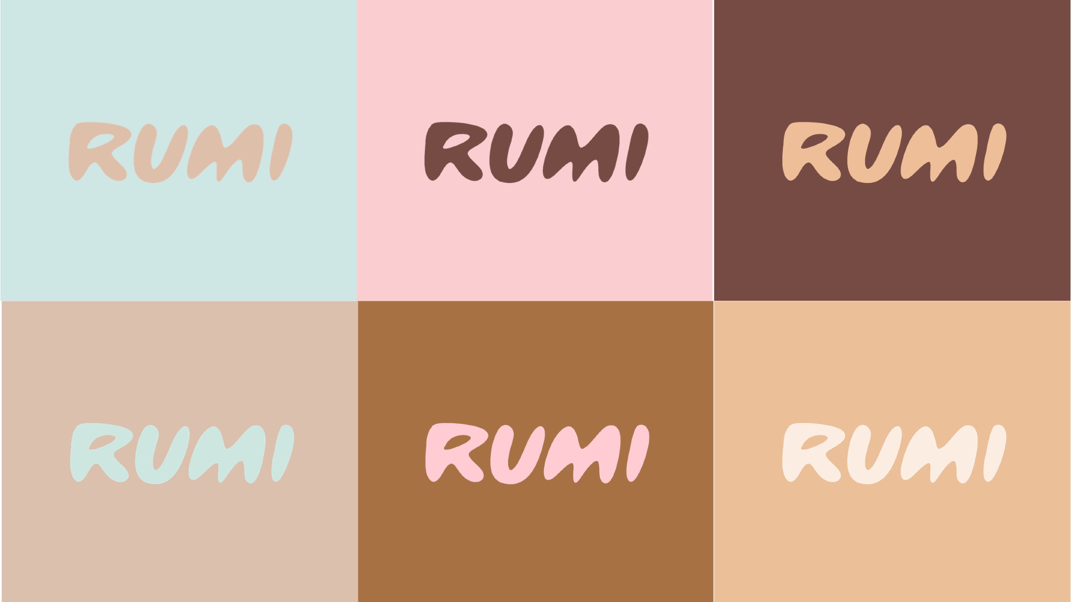
RUMI logo colourways across six ground colours
Further RUMI logo colourways
Twelve permitted colourways. A wordmark this soft only survives if the grounds are decided for it in advance
/03The Brand World

Photography that treats the dog as the subject.
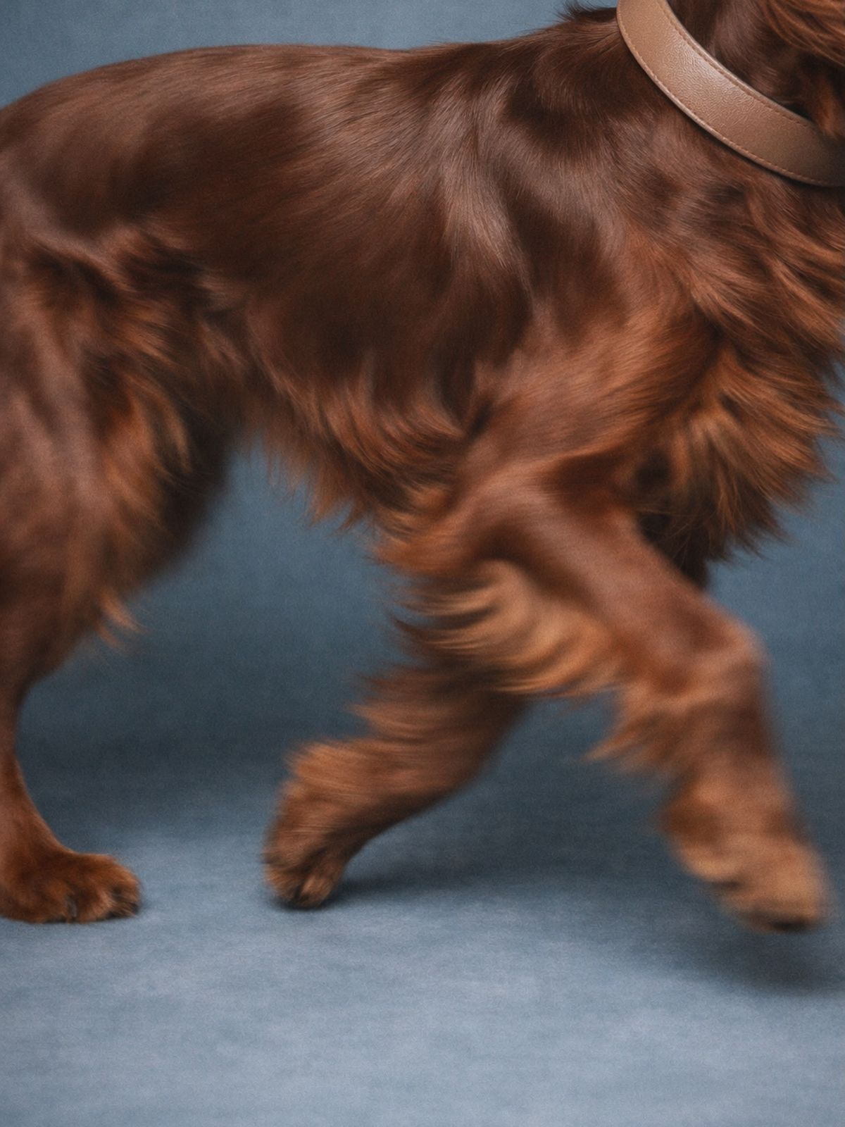
RUMI macro photography, coat detail
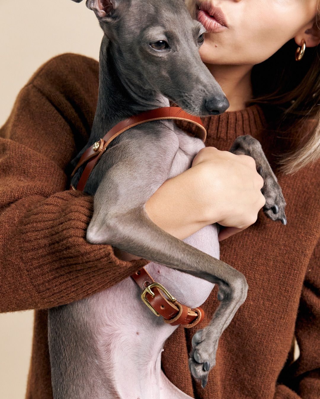
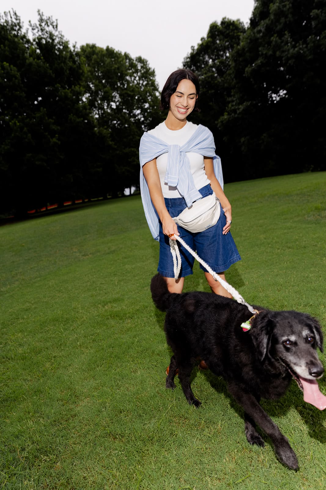
RUMI owner and dog photography
Tight crops, real coats, real light. The category default is a studio dog on white, looking at the camera
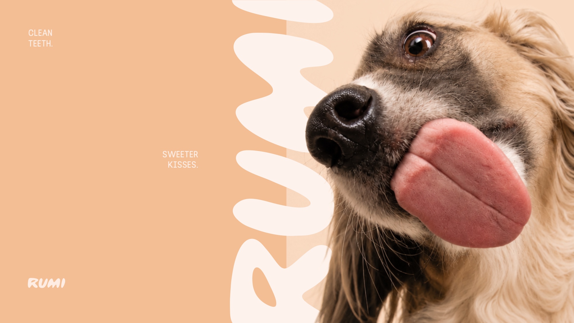
RUMI large-text brand device
The large-text device: the logotype set enormous and bled off the frame, so the brand is present without a badge in the corner
RUMI lifestyle photography
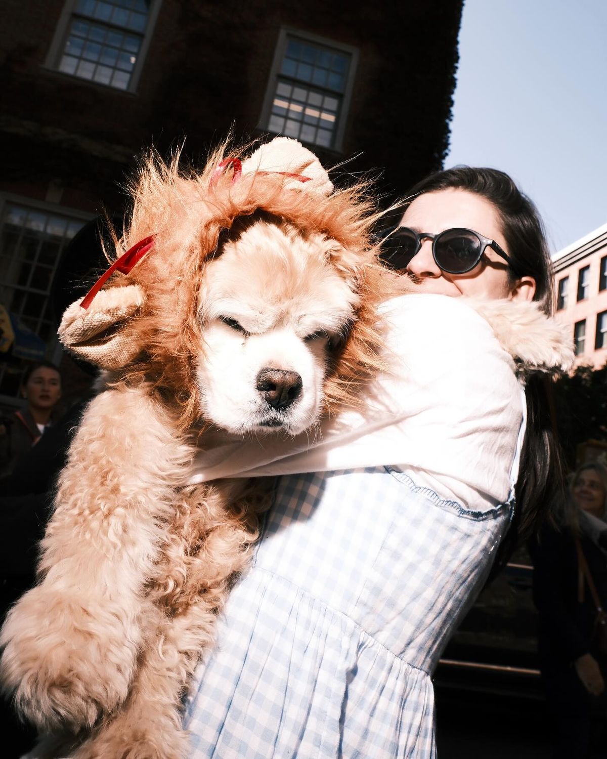
RUMI community photography
Guidelines cover the photography brief as tightly as the logo, because this is what the customer actually sees
/04The Site

Built around the four objections that decide the sale.

A fully custom design, not a theme with the colours swapped.

A supplement for a dog is bought by a person who is sceptical, and who is buying on behalf of someone who cannot tell them whether it worked. So the page is not a catalogue. It is structured around the four things a buyer needs answered before they will commit: what is in it, whether it is safe, how long until anything changes, and what happens if it does not.

Around that spine sits the commercial architecture the category expects: a subscribe-and-save module, per-day pricing, plan comparison, ingredient breakdown, a timeline of what to expect, and the guarantee stated plainly rather than buried.

/05Why it matters

Positioning is easier to build than to retrofit.

A brand that starts premium can move down later. One that starts cheap almost never moves up, because the customer it recruited will not follow.

RUMI was built at the standard it intends to trade at. Our founder continues to consult directly with theirs on the growth plan.

01Brand Strategy
02Visual Identity
03Key Messaging
04Packaging Design
05Brand Guidelines
06Content & Social Strategy
07Custom Website Design
08Senior Consultancy
WhatsApp