← All Work
Build a Brief
Activewear · Direct to consumer

The brand, and the rules that keep it looking like itself.

Thrivin needed an identity. What it needed more was a way to shoot hundreds of products a season and have every image arrive looking like the same brand.

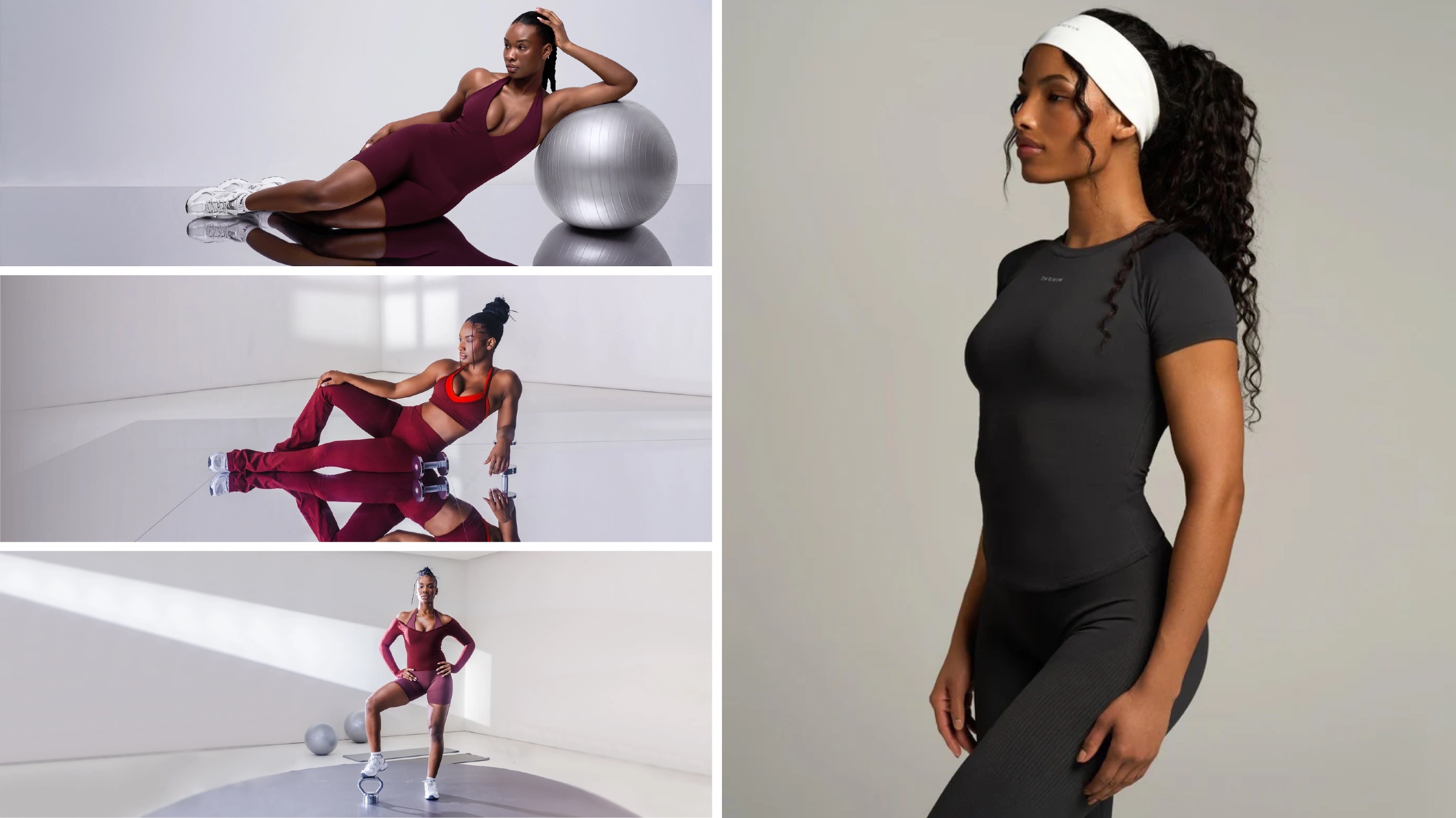
Thrivin studio frame on a mirrored floor, orchid two-piece
ClientThrivin
SectorActivewear · E-commerce
DeliverablesBrand strategy · Identity · Icons · Packaging · Shoot guidance
Year2026
/01The Brief

A logo was the smaller half.

Build the identity for a direct-to-consumer activewear label.

Mark, wordmark, lockups, an icon set, packaging. The usual shape of an identity job, and the part every studio is comfortable with.

But a D2C activewear brand does not meet its customer through a logo. It meets them through several hundred product images a season, shot by different people, in different rooms, on different bodies. Every one of those images is the shop window.

Identity work usually stops at the logo and hopes the photography sorts itself out. It does not sort itself out. So the engagement was scoped as a production plan rather than a logo package: brand strategy, identity, icon delivery, packaging, and the shoot guidance that holds the rest together.

/02The Identity

A mark that works at label size.

Thrivin mark and wordmark lockup
The mark and the wordmark, drawn to hold at woven-label size as well as they hold on a shopfront
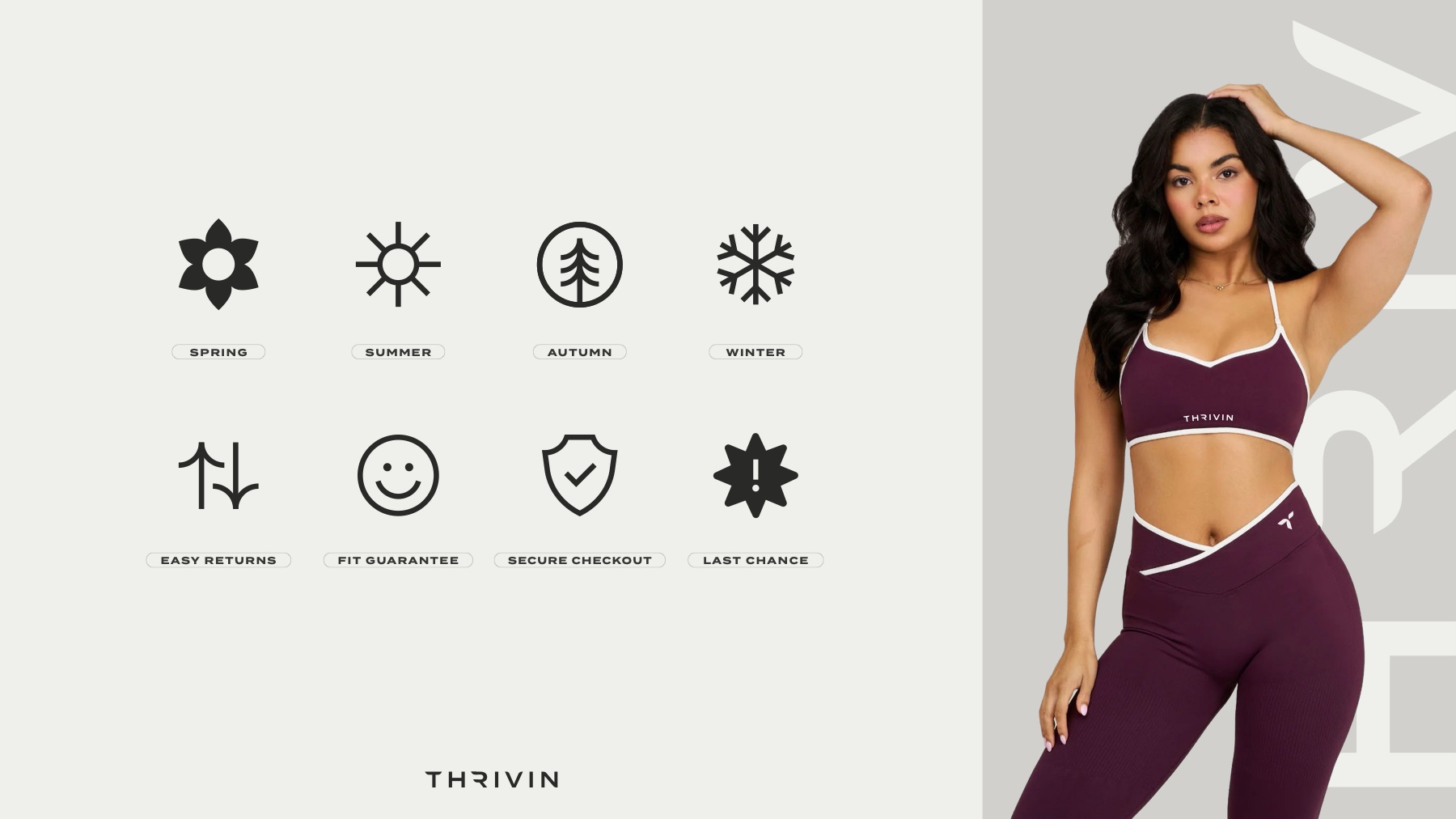
Thrivin icon system for seasons and product attributes
The icon set that runs across product pages, where a garment has to explain itself without a paragraph
/03The Product

The brand lives on the garment.
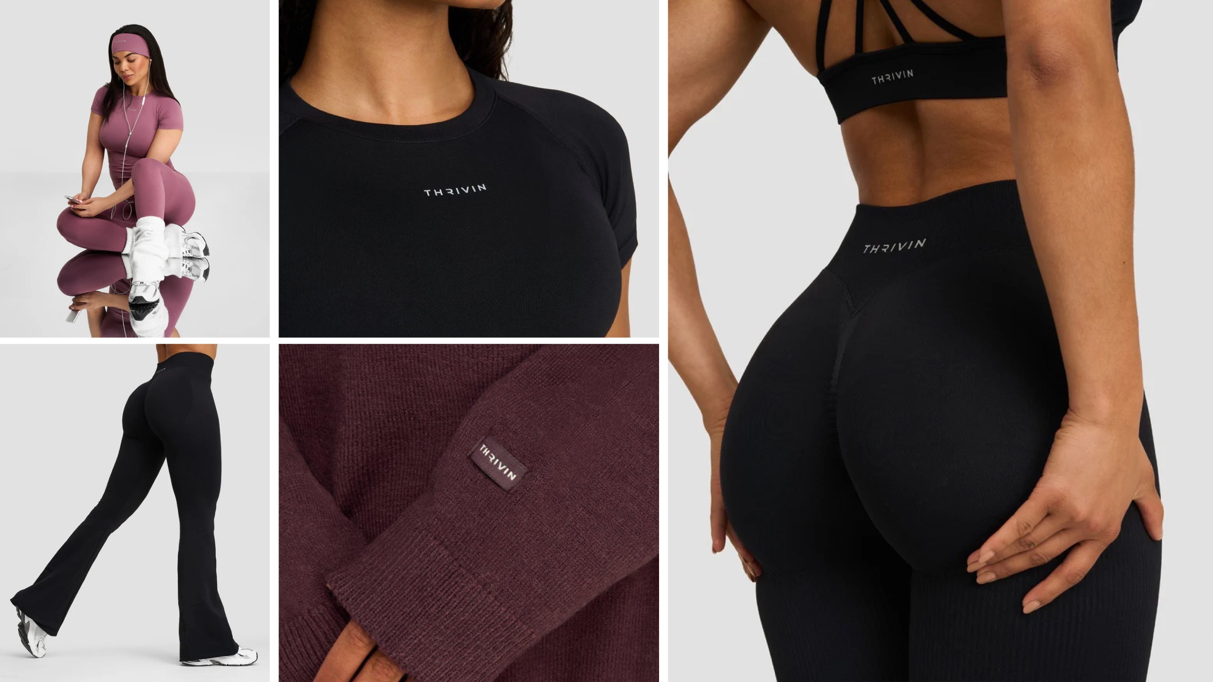
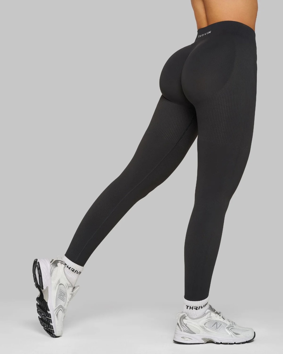
Thrivin wordmark on a legging waistband, shot against a neutral ground
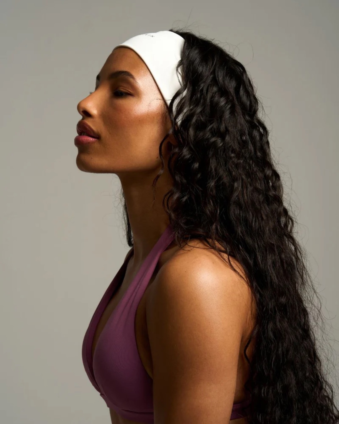
Thrivin headband, shot in profile with soft wrap-around light
Waistbands, bands and headbands carry the wordmark at the size it was drawn for. The set stays neutral so the garment carries the colour
Studio frame on a mirrored floor, orchid two-piece with a stability ball
The same set, a different colourway. One room, shot to hold a whole season
Studio frame on a mirrored floor, the set reflected beneath
A mirrored floor doubles the set and halves the styling. The garment is still the only thing carrying colour
Thrivin catalogue imagery: studio and editorial frames from a single season
Frames from one season, shot to one rule. Soft wrap-around light, silhouette first, real skin, a warm neutral ground
Thrivin catalogue imagery: product detail and full-length frames showing the wordmark across the range
Detail and full-length frames from the same season. The mark appears on the tee, the band, the waistband and the woven tag, and reads the same way in each
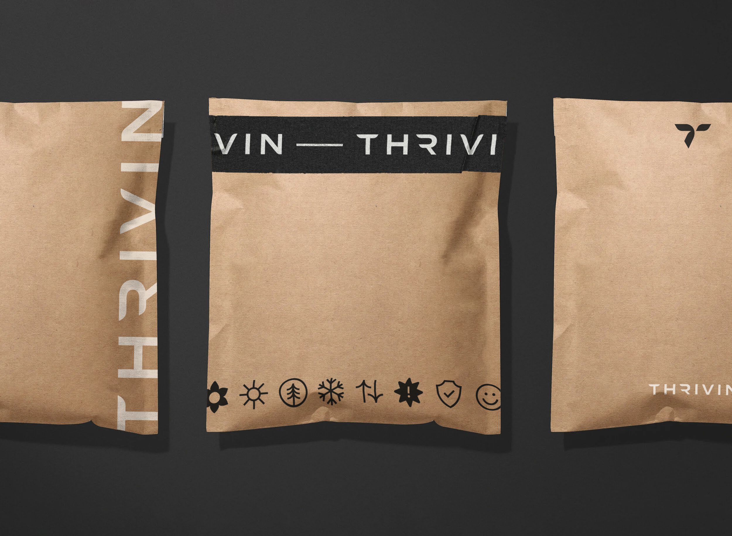
Thrivin kraft mailers carrying the wordmark, mark and attribute icons
Kraft mailers carry the wordmark, the mark and the attribute icons, so the unboxing reads as considered rather than expensive
/04The Campaign

Weightless, and on brand.

Golden Butter, shot against open sky.

The seasonal drop needed a campaign that was not another model against another wall. We went to our own black book and brought in photographers who shoot for Alo and Gymshark, then art directed to the guide we had just written.

Bodies suspended mid-air, nothing in frame but sky. It reads as lightness, which is what the fabric is selling, and it still obeys every rule in the shooting guide.


Thrivin Golden Butter campaign: three suspended figures composited against open sky beneath the wordmark
The campaign lockup for the Golden Butter drop
Thrivin campaign frame: a model suspended against blue sky, arms trailing
Thrivin campaign frame: a model suspended in profile against blue sky
Single frames from the same set. Shot on the day, composited after, held to the guide throughout
Thrivin studio frame: a full-length training pose on a neutral ground
And the studio counterpart, so the campaign and the catalogue read as one brand rather than two
/05The System

Every image must feel like Thrivin.

The identity shipped with a shooting guide.

Not a mood board. A working document that anyone briefed onto a Thrivin shoot can follow: camera bodies and lenses, the lighting setup and the reasoning behind it, framing and composition with worked examples, model direction, hair and make-up, and a studio policy.

Then the unglamorous half that actually keeps a catalogue consistent: the required deliverables for every single product, file naming, folder structure, output rules and a QC checklist to sign off against before anything reaches the site.

/06Why it matters

A brand that can be handed to anyone.

Thrivin can now brief a photographer it has never worked with, in a city it has never shot in, and get back images that sit beside last season’s without a seam.

That is what the guide buys. Not one good shoot, but every shoot after it.
01Brand Strategy
02Brand & Visual Identity
03Logo, Mark & Lockups
04Icon System & Delivery
05Packaging
06Art Direction & Campaign
07Shoot Guidance & QC
WhatsApp