✱ Tyron AshLuxury Real EstateUK & Dubai
A mark that could sit on a tower.
Brand identity for an international real estate agency selling luxury property across London and Dubai.
Estate agency, or property house.
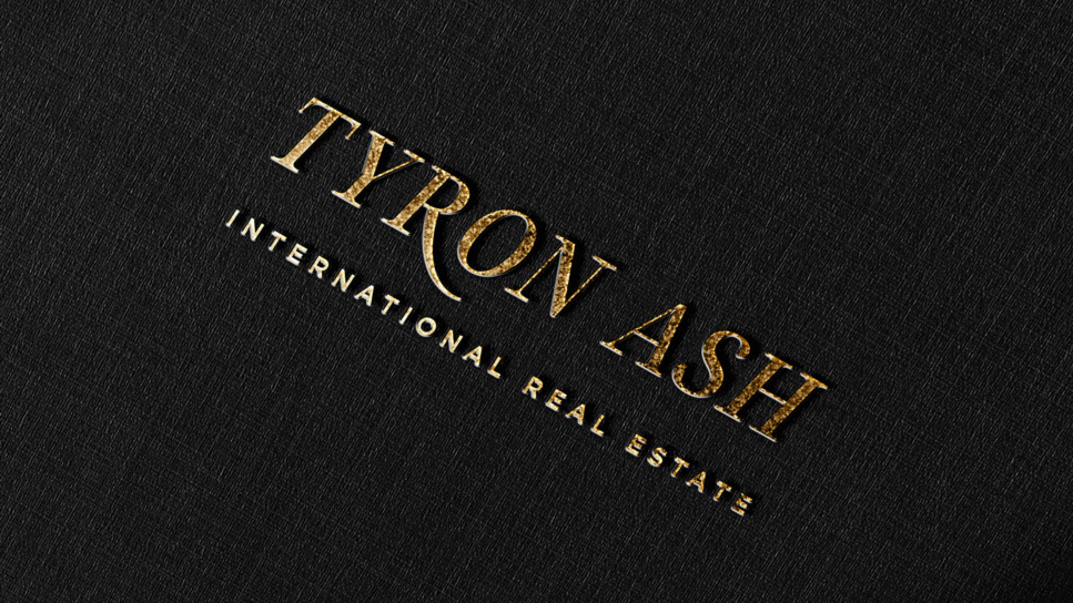
Luxury real estate has a branding problem that nobody in it wants to name: almost every agency looks like an estate agent. Gold on black, a serif, a skyline. The category has converged so hard that the brand does nothing to justify the fee.
Tyron Ash sells at the top of the UK market and in Dubai, against developers and international houses whose branding is built to a different standard. The identity had to survive being seen next to the buildings it was selling.
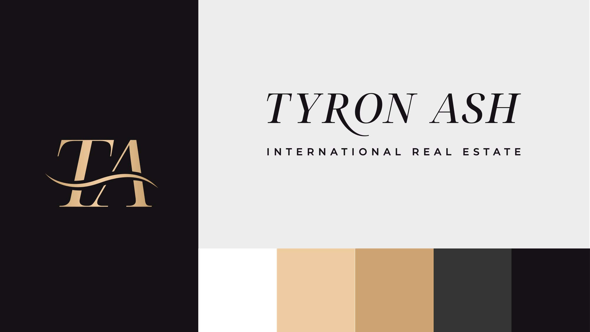
A monogram with a signature in it.
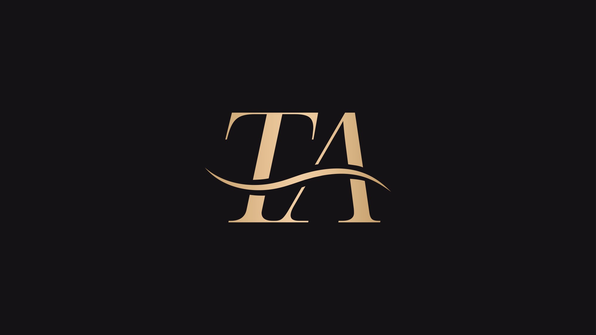
The T and the A interlock, and a single swash runs beneath them: part underline, part signature, part the curve of a coastline. It gives an otherwise formal mark a hand, which is the point. At this level, property is still sold by a person.
Two golds, two blacks, and nothing else.
Champagne and a deeper tan carry the mark; a charcoal and a near-black carry everything behind it. A palette this tight is a discipline rather than a limitation: it means every application looks like the same company without anyone having to police it.
Foiled on stock it reads as jewellery. Reversed out on a shopfront at night it still reads from across the street.
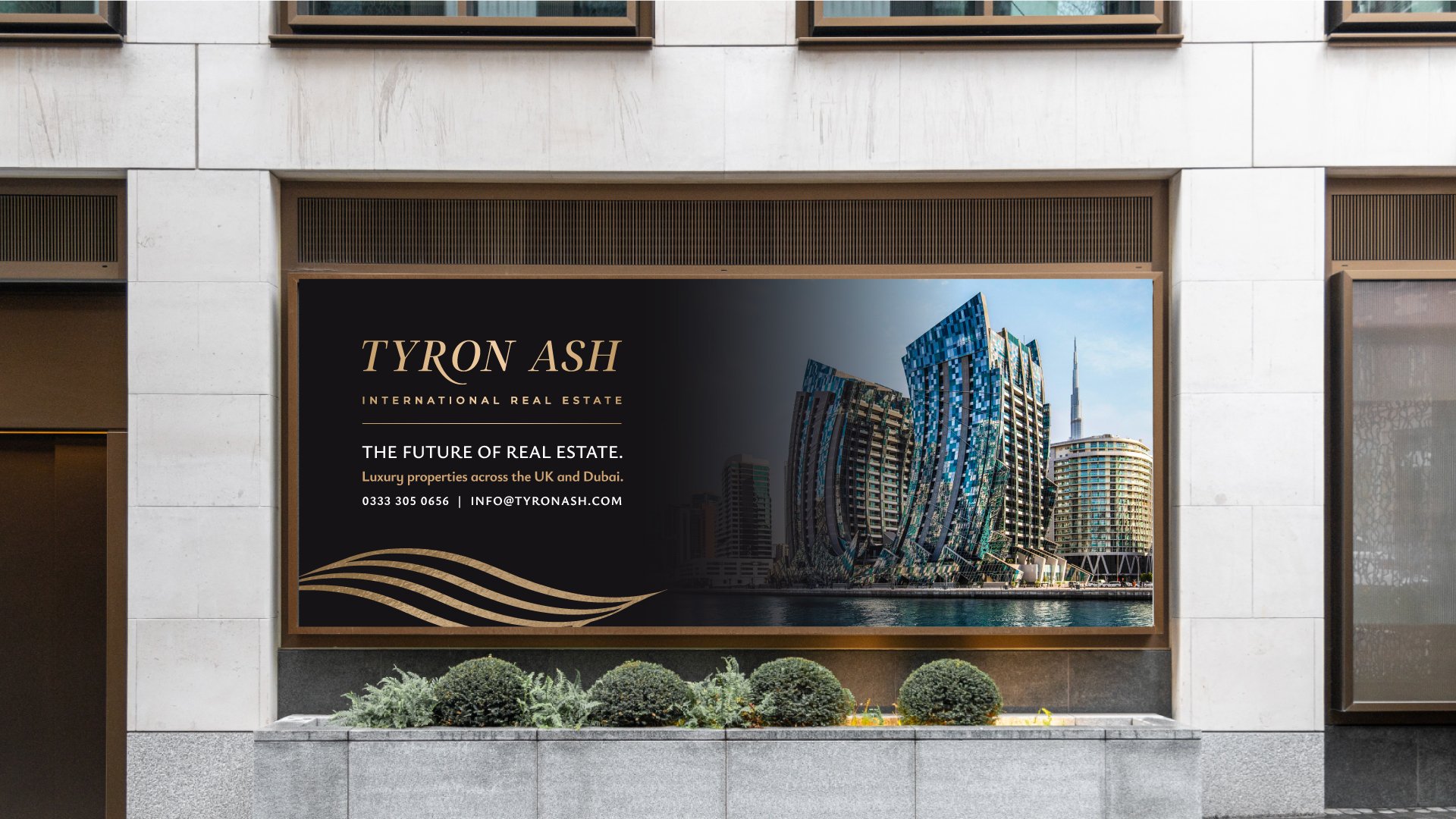
The brand has to survive being seen next to the building.
Tyron Ash International Real Estate · UK & Dubai