Six coffees. Six characters. Not a single bean on a hessian sack.
Artisan Coffee Co was founded by a Michelin-starred chef and sold like every other bag on the shelf. We rebuilt the brand around the one thing coffee marketing had stopped talking about: how it tastes.
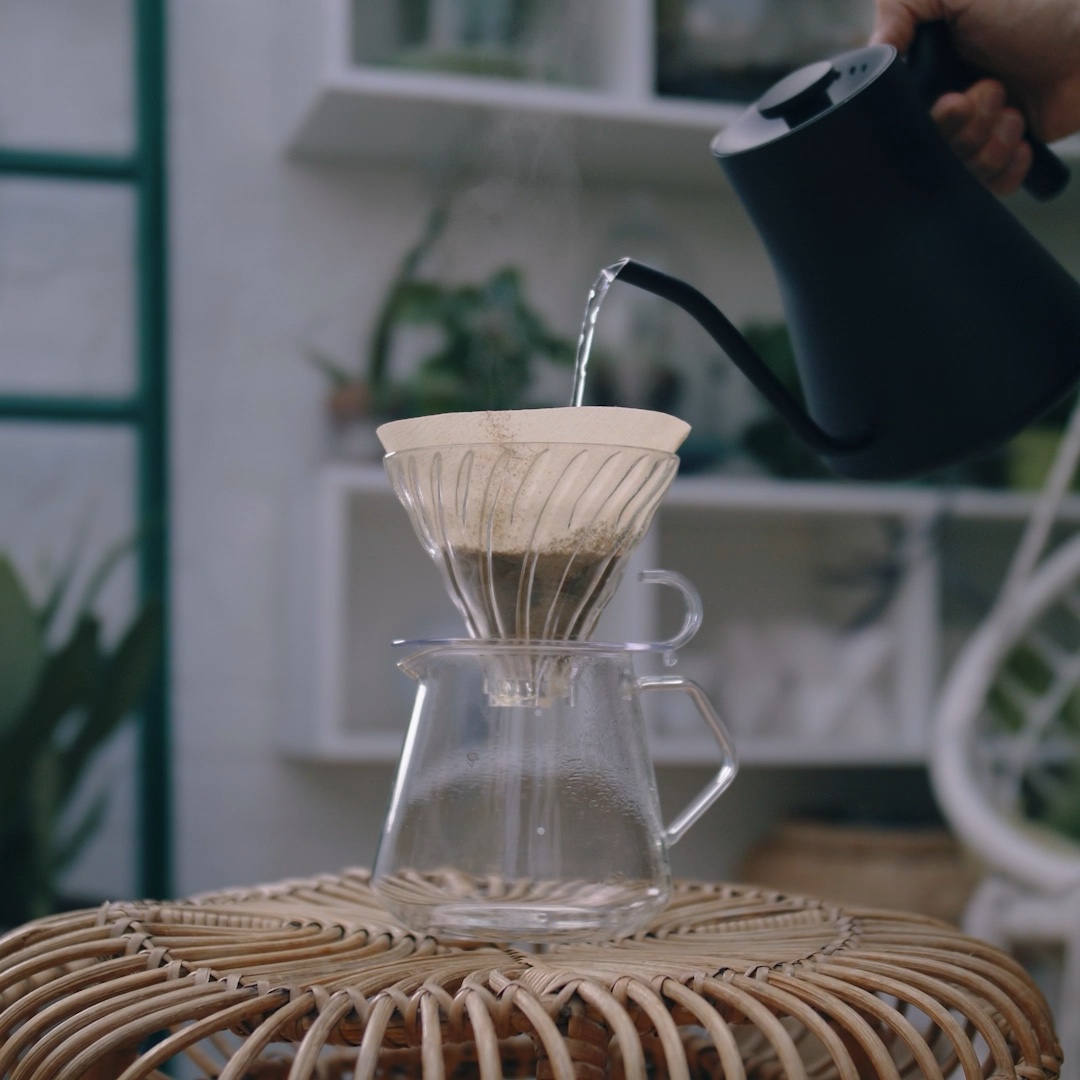
Three films shot for the feed rather than cut down to it — a pour-over on a Saturday, a kitchen full of plants, an espresso and a newspaper.
Coffee advertising had settled into the same images for a decade.
Beans on hessian. A tamper on a slate board. A moody portrait of someone in an apron. Every speciality coffee brand was reaching for the same visual shorthand, which meant none of them were actually saying anything.
Artisan had a genuine advantage that nobody could see. The company was founded by Ashley Palmer-Watts, a chef who spent his career at the very top of British fine dining. The coffees were built the way a tasting menu is built — deliberately, around flavour. The marketing was built the way everyone else’s was.
Stop selling the bean. Sell the character.
The founder had already named the coffees as characters rather than origins. That was the door in. We took the six names and built them into a brand world — a colour, a personality, a flavour promise, and a reason to pick one over another.
It solves a real commercial problem. Origin naming asks the customer to already know something. Character naming asks them to recognise themselves. You don’t need to understand a washed Colombian to know you want The Big Shot on a Monday morning and The Dreamer at nine at night.
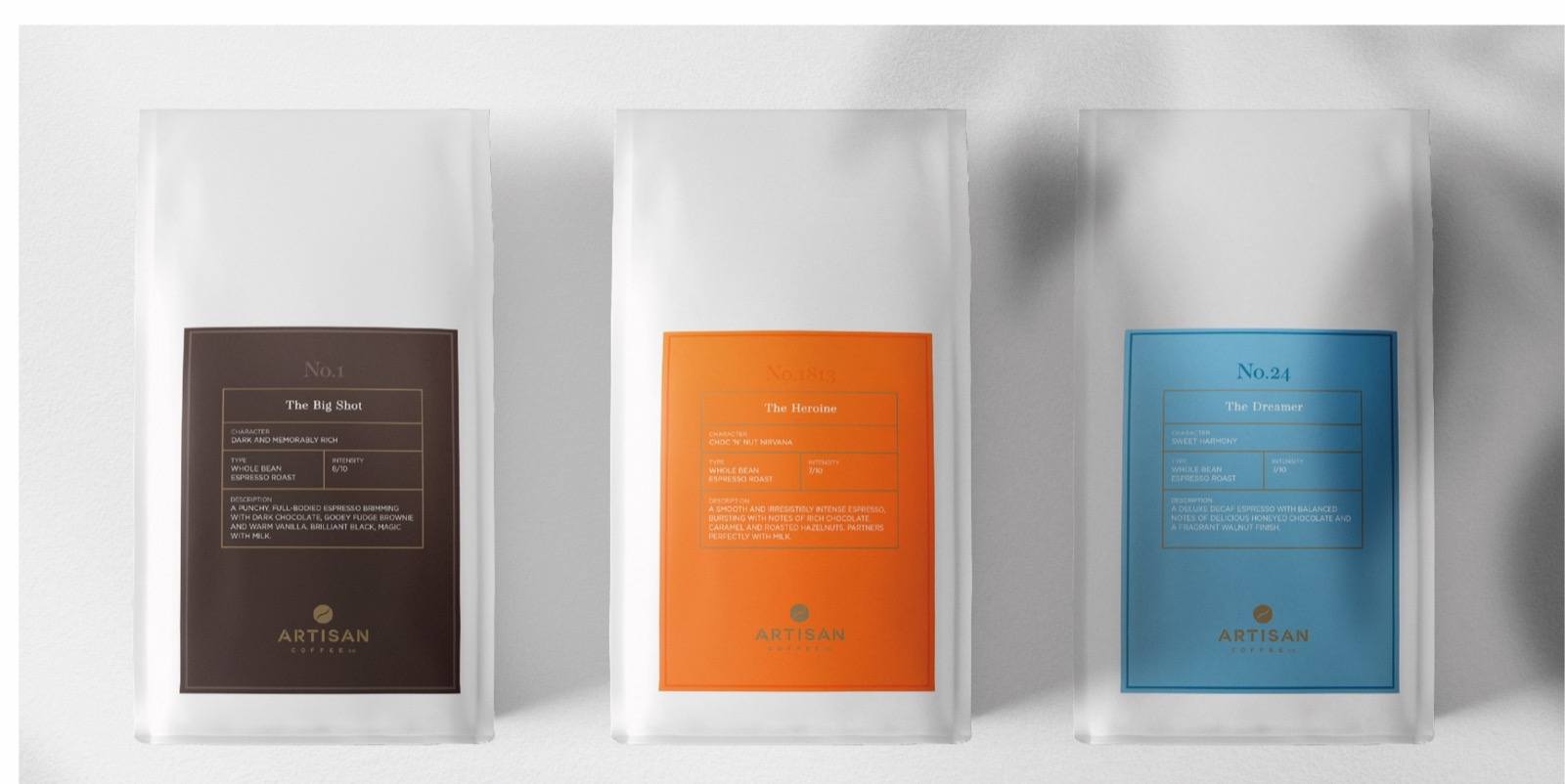
- No.1The Big ShotDark and memorably rich8/10
- No.1813The HeroineChoc ‘n’ nut nirvana7/10
- No.24The DreamerSweet harmony7/10
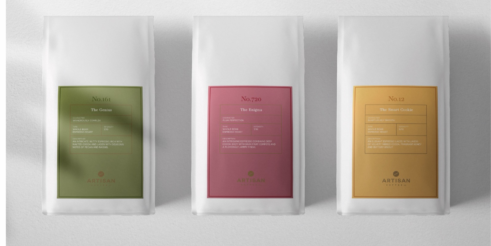
- No.161The GeniusWondrously complex7/10
- No.720The EnigmaPlum perfection7/10
- No.12The Smart CookieSumptuously smooth6/10
Six characters, six intensities, one shelf. Every pack tells you what it tastes like before it tells you where it came from.
Exceptional doesn’t have to be exclusive.
Fine dining has a credibility problem in the supermarket aisle: the moment it sounds like a restaurant, it sounds expensive and slightly unwelcoming. The line works in both directions at once — it keeps the Michelin pedigree and takes away the velvet rope.
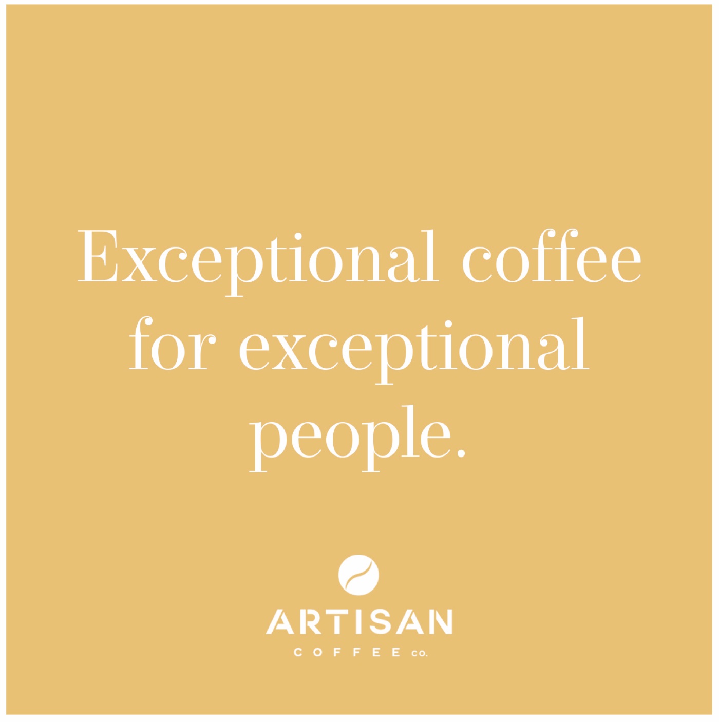

Built as a grid, not as eighteen posts.
Social for a food brand is usually commissioned post by post, and then discovered too late to look like a jumble sale on the profile page. We art-directed the whole eighteen-piece block at once: colour blocks carrying the line, product doing the selling, people doing the wanting.
Read across, it holds a rhythm. Read as a single tile in a feed, each one still stands on its own.
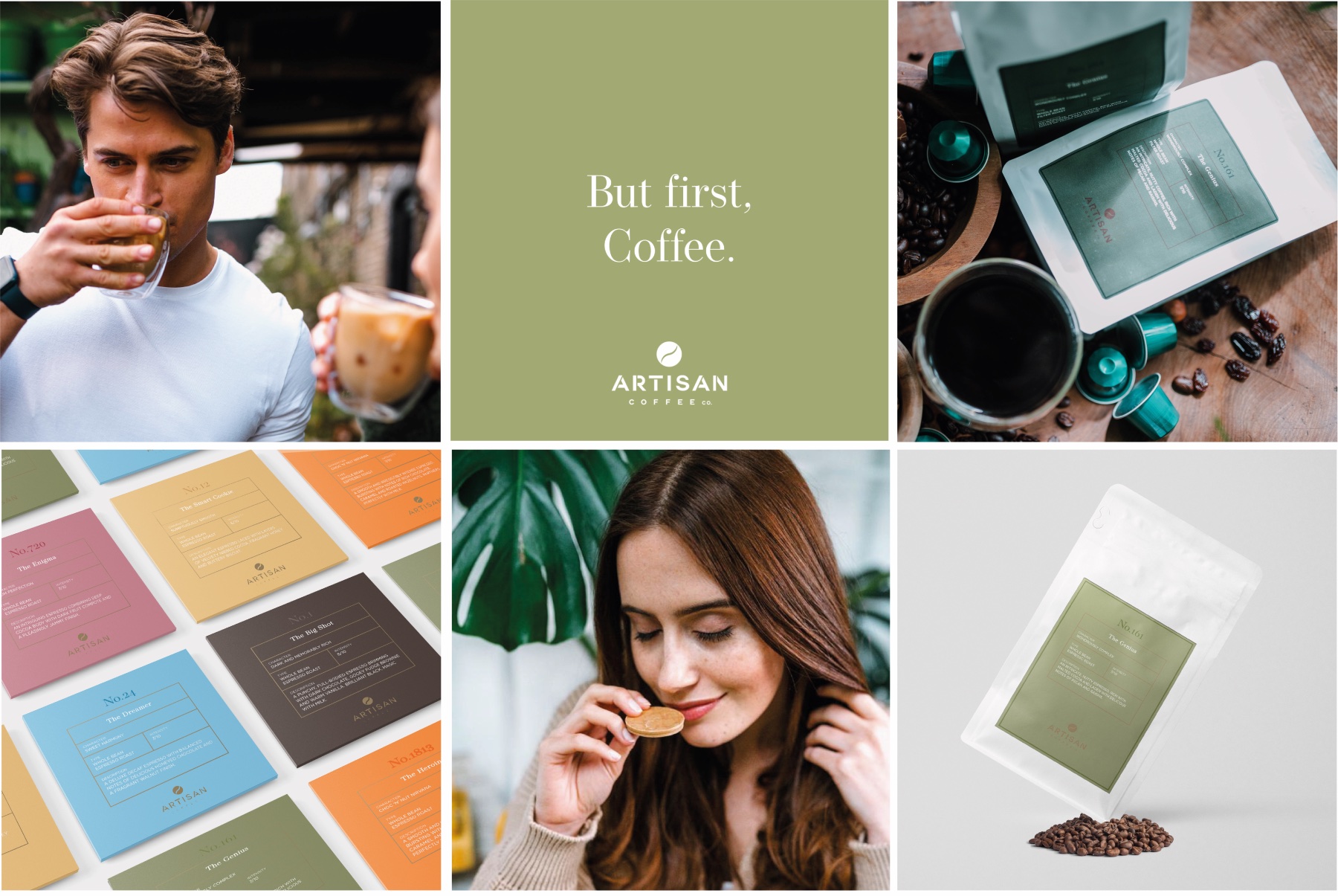
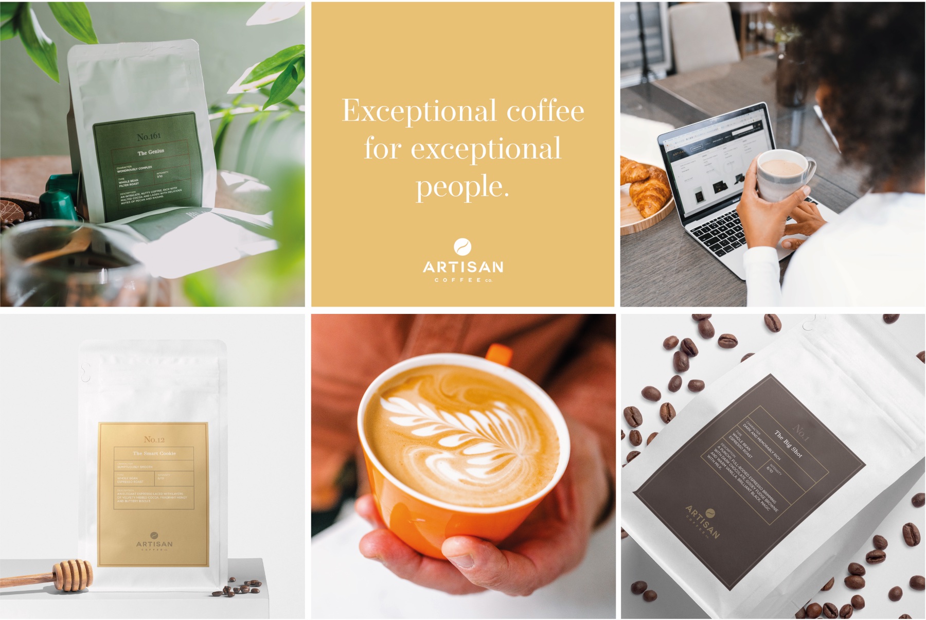
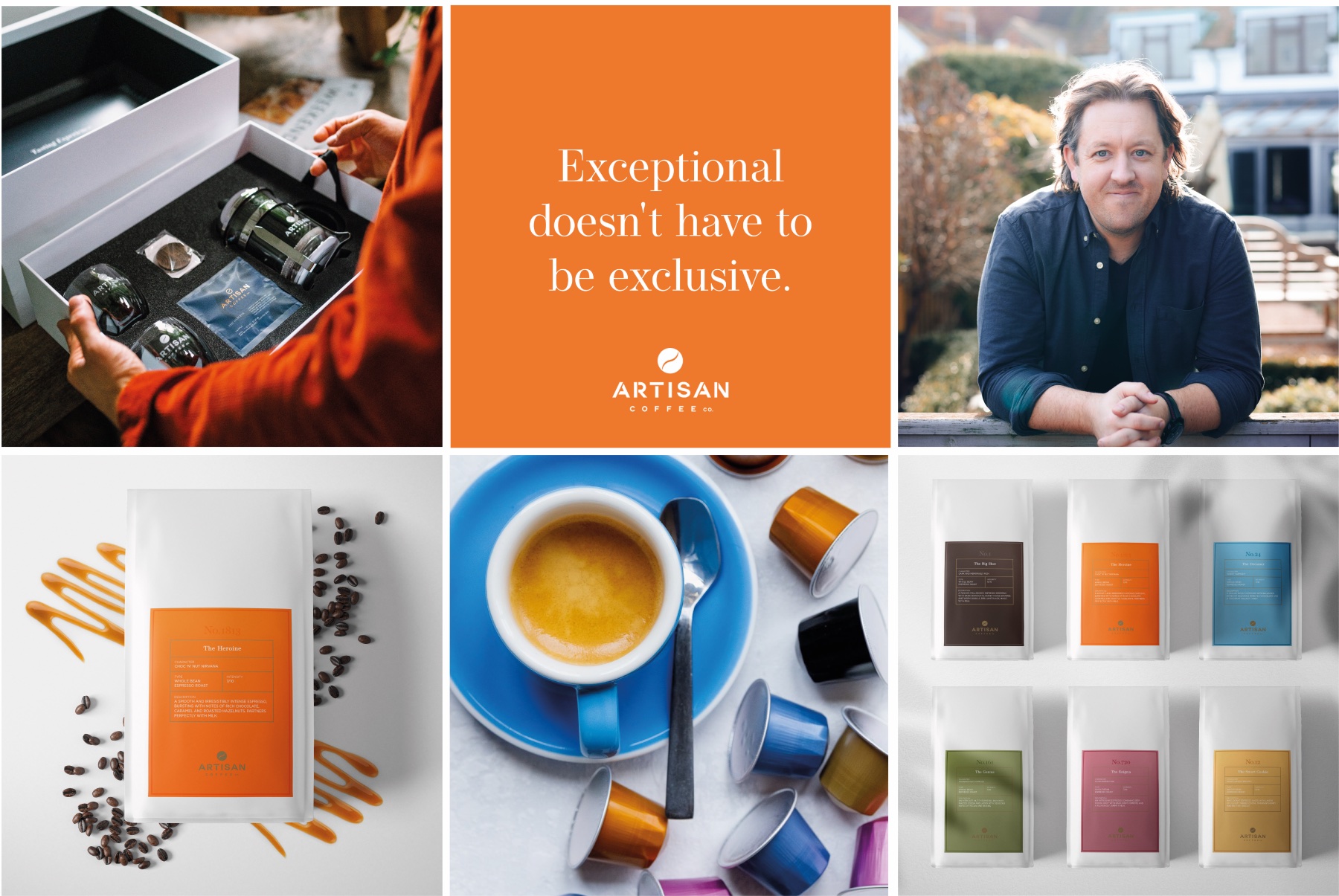
Eighteen tiles, art-directed as one composition.
The credential was the story.
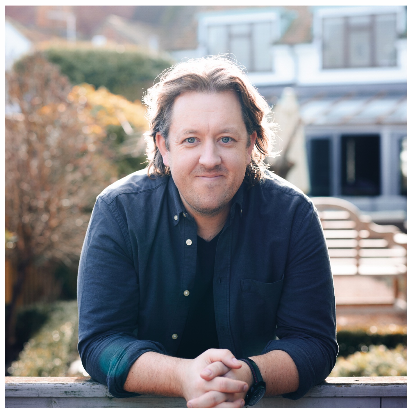
A chef who spent years at the top of British fine dining didn’t start a coffee company to sell beans. He started it because he could taste what was missing. Putting the founder into the brand — on camera, in the copy, in the naming — is what separates a speciality coffee from a supermarket one.
So the six characters aren’t a decoration sitting on top of the product. They’re the chef’s palate, written down.
We embarked on a journey to transform the coffee-drinking experience, and Jensen & Jensen played a pivotal role in realising the vision.
Marketing Director · Artisan Coffee Co
Led by our founder at Jensen & Jensen.