Born in Nigeria. Crafted in London.
A Chapman is what Nigerians drink at every party, wedding and christening. Chapmans of London put it in a bottle for a market that had never heard of it — and needed a brand that could explain itself in one glance on a shelf.
Selling a drink most of the shelf has never heard of.
The Chapman is a Nigerian institution — a red, citrus-and-bitters mix that turns up at every celebration. Outside that context it has no shorthand. A shopper in a London aisle has no reference for it, and the non-alcoholic category around it is crowded with brands that either shout WELLNESS or apologise for not being alcohol.
The brand had to do two jobs a label rarely does at once: carry its origin without becoming a novelty, and read as a premium adult drink rather than a soft one.
Six words that answer every question on the shelf.
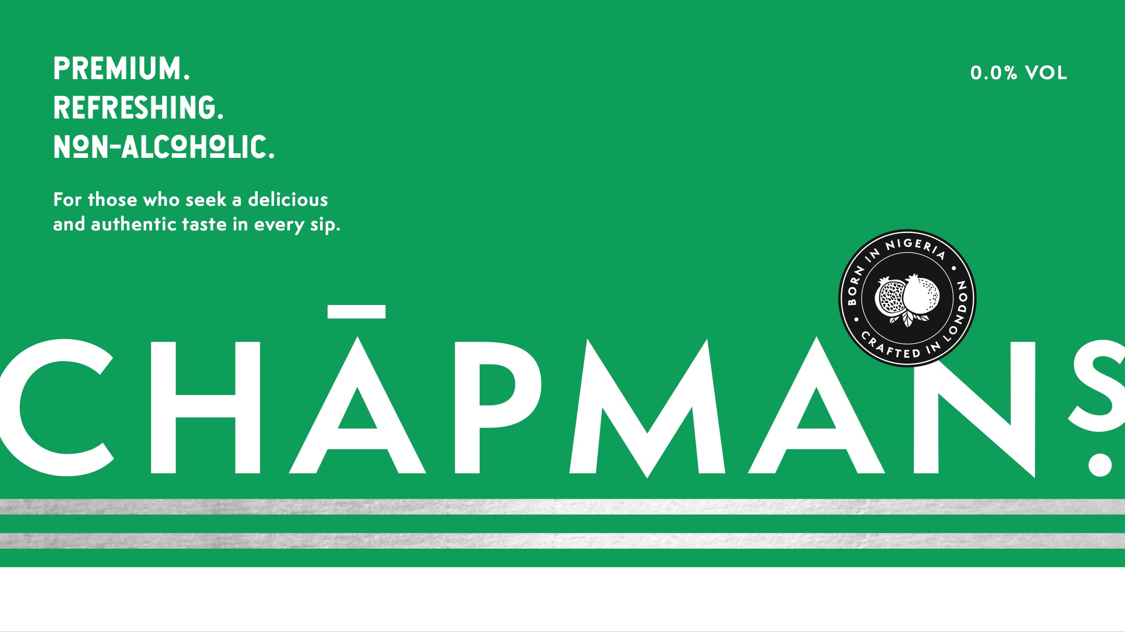
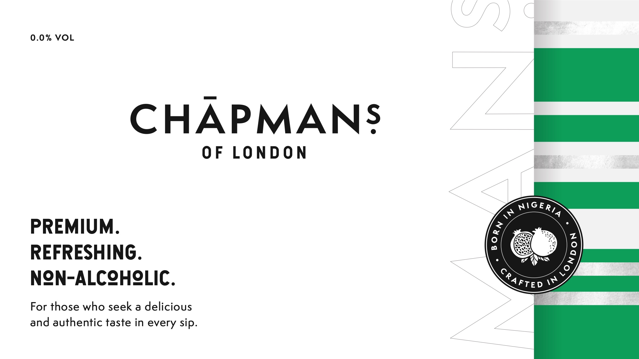
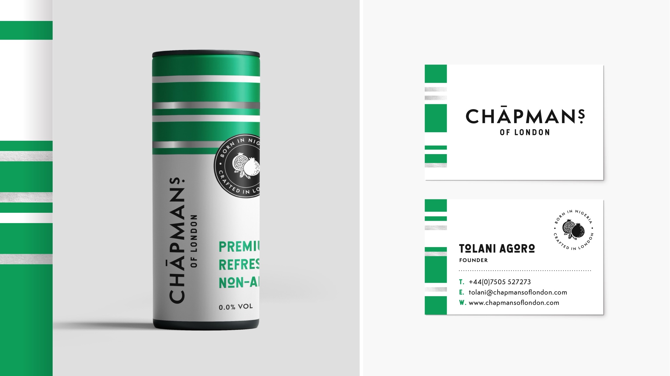
Premium. Refreshing. Non-alcoholic. One word to place it, one to describe it, one to remove the doubt. Under it, the roundel does the origin work: Born in Nigeria · Crafted in London, wrapped around a pomegranate.
That pairing is the whole positioning. The origin is stated as heritage rather than exotica, and the London line tells a UK buyer this is a local product, not an import they will struggle to find twice.
A flag, without ever drawing one.
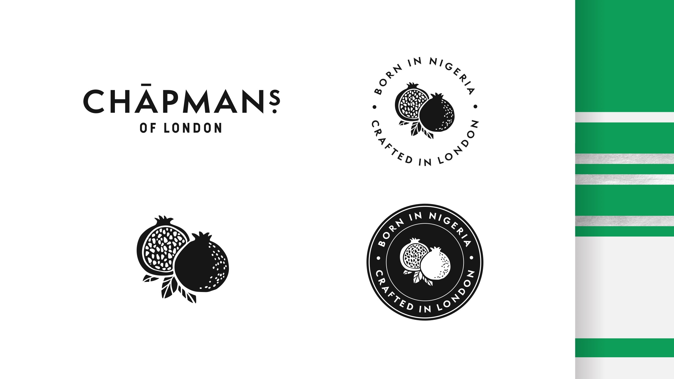
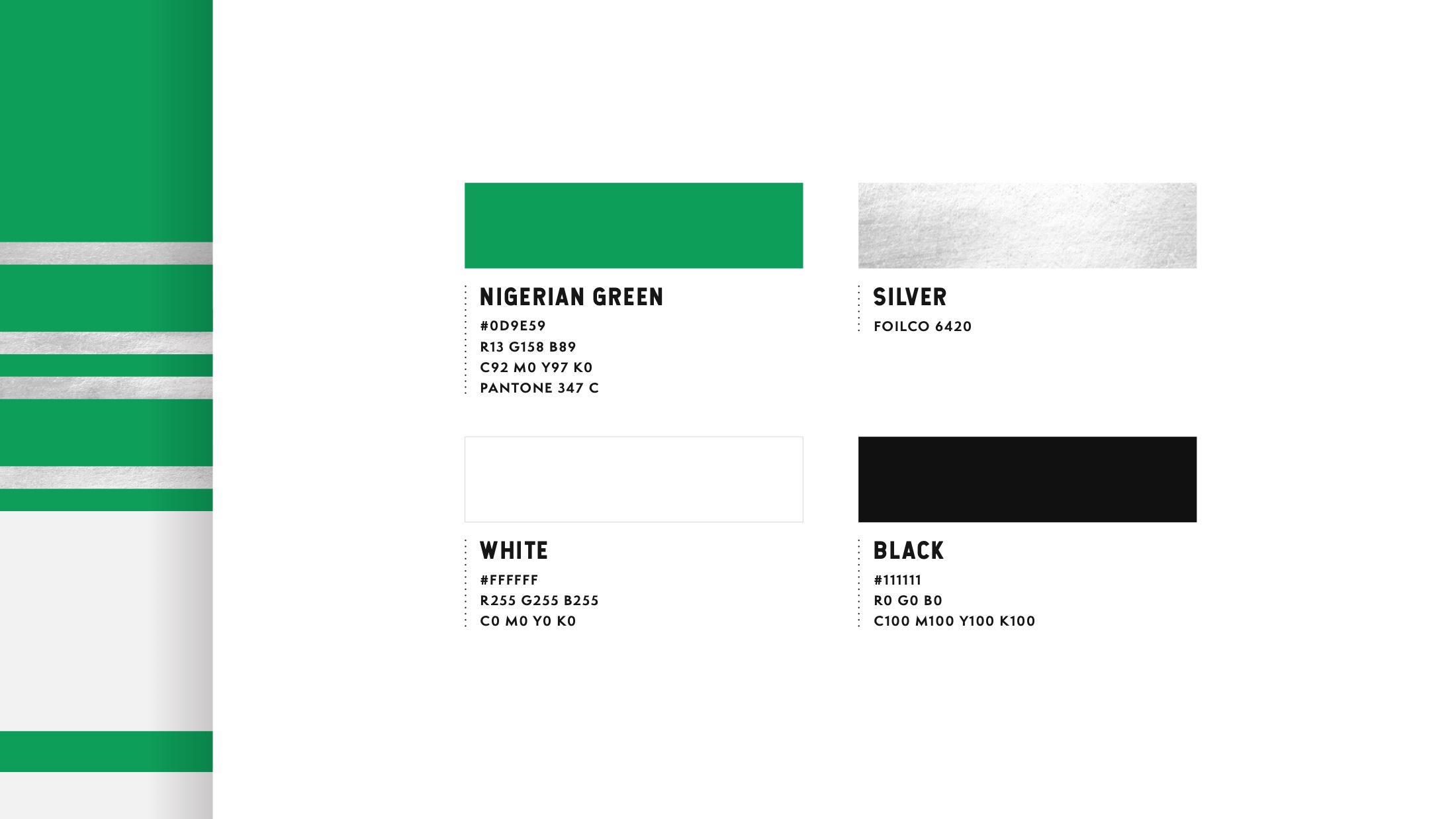
The identity runs on bands of green and silver. Green and white is the Nigerian flag; the swatch is literally named Nigerian Green. But it is deployed as a stripe system rather than a flag, so it reads as heritage on the second look instead of a costume on the first.
Silver is a foil specification, not a screen colour — Foilco 6420. Choosing a foil rather than a grey is what does the premium work at arm’s length in a chiller cabinet, where the whole decision gets made.
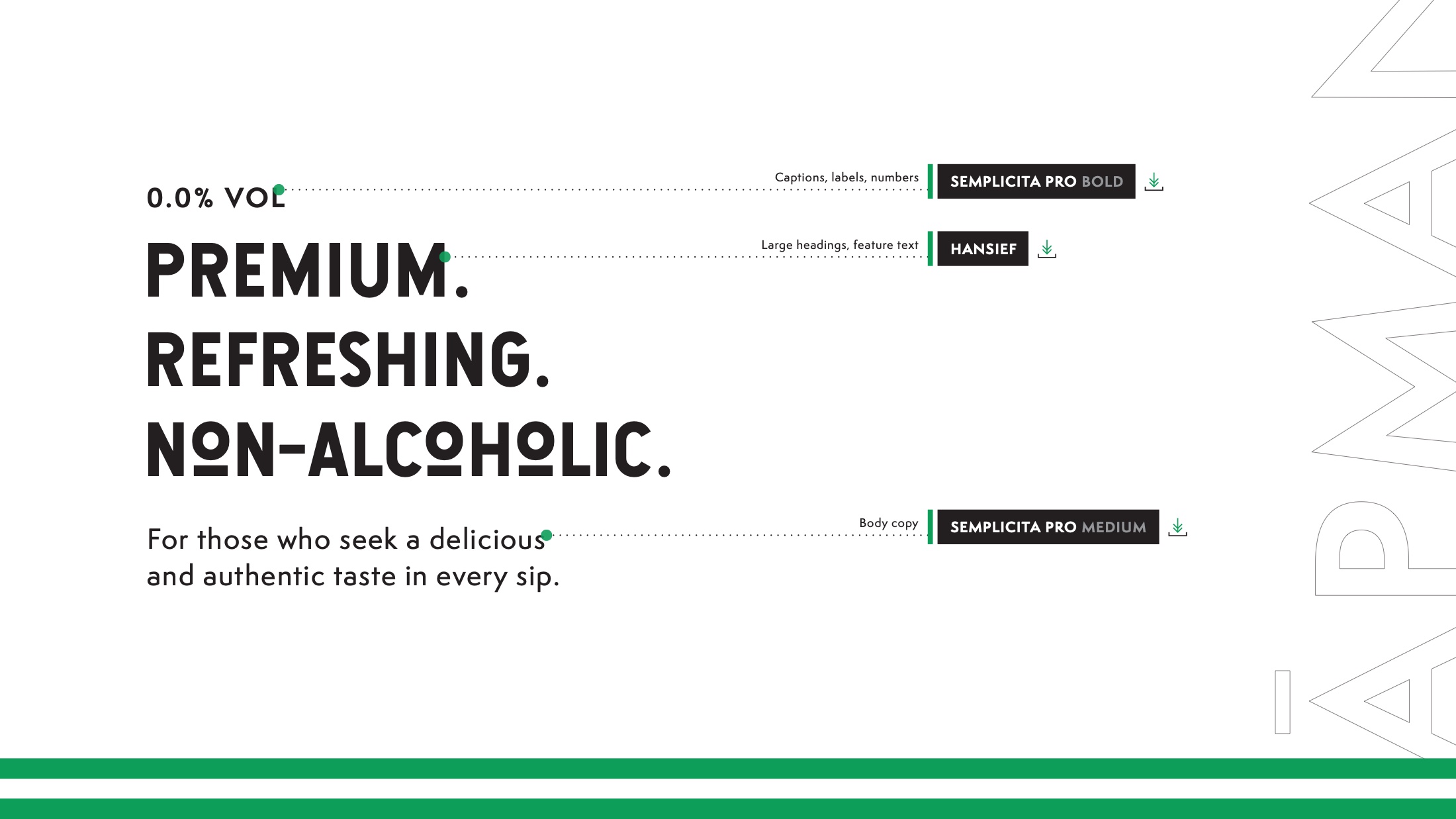
Hanley for the shout, Semplicita Pro for the small print — bold for captions and numbers, medium for body.
The bottle had to work in two colours.
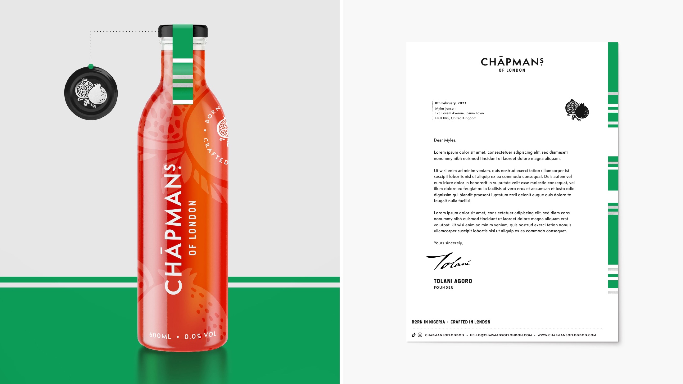
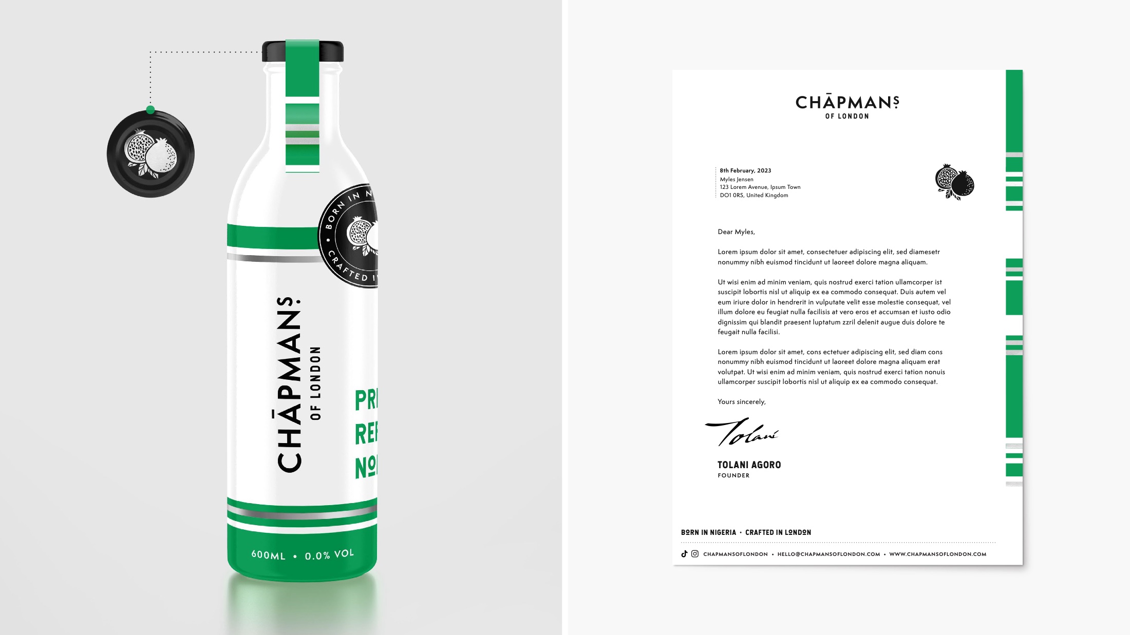
A Chapman is red. The liquid does the appetite appeal on its own, so on the clear bottle the label steps back and lets the drink be the colour. On the can and the green variant, the stripe carries it instead.
Same system, two completely different jobs: one where the pack is a window, one where the pack is the whole billboard.
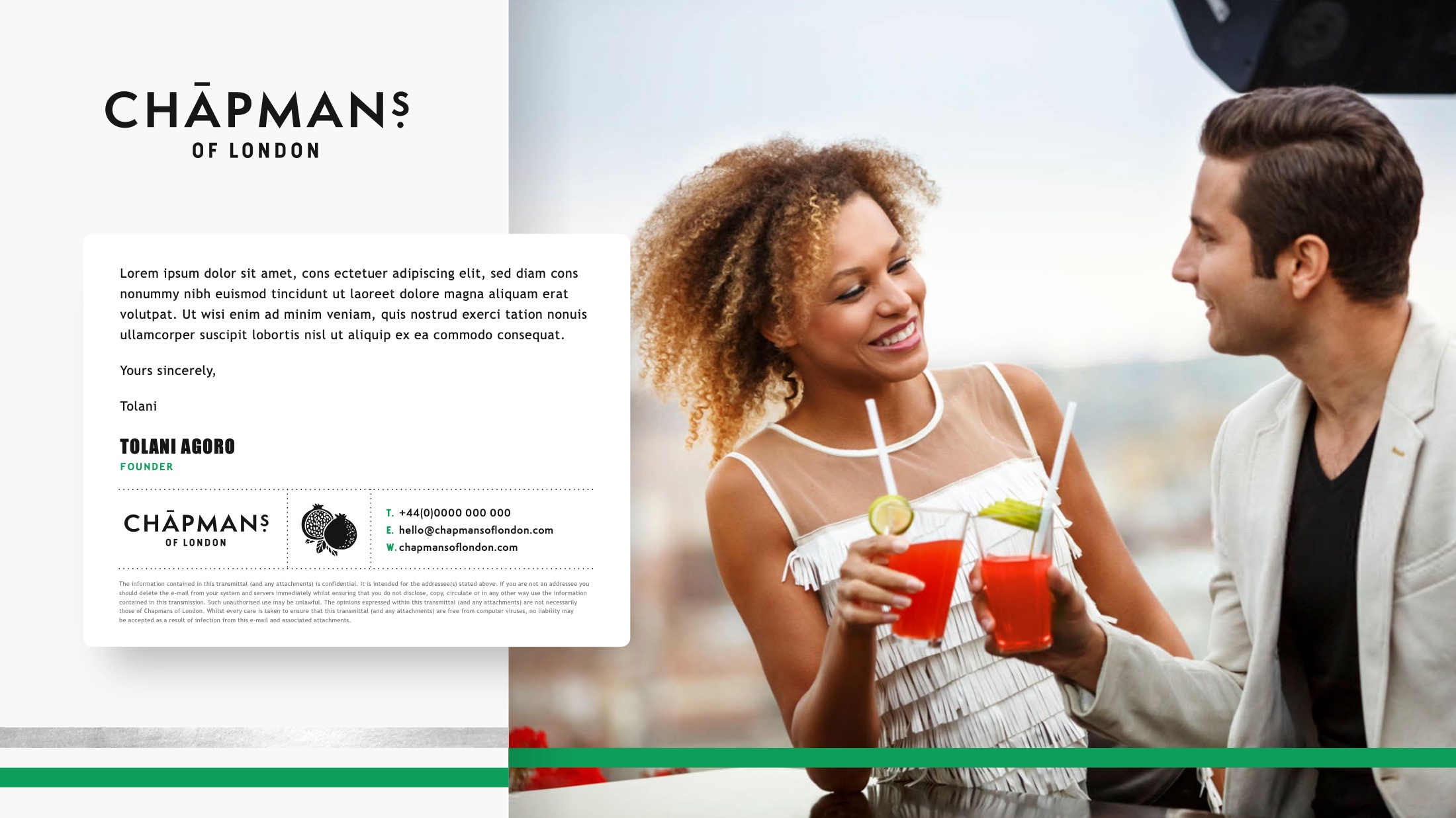
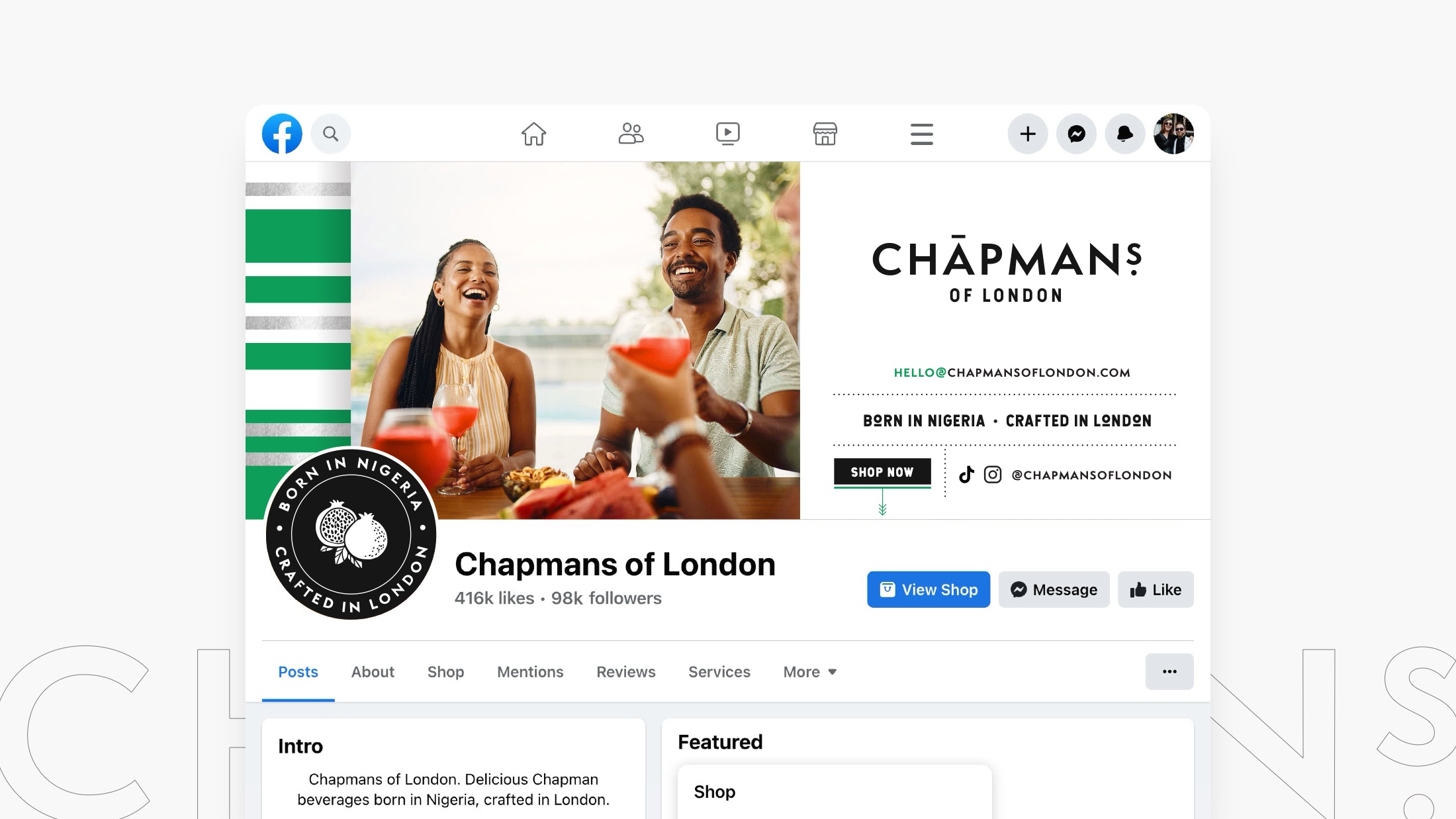
Photographed as a drink people are having, not a product.
Non-alcoholic brands tend to shoot the bottle on seamless. The Chapman is a party drink, so the imagery is people mid-conversation with a glass in hand — the exact situation a shopper is buying for. It also quietly answers the question the category never addresses head-on: who is this for, and will I look odd holding it?

Premium. Refreshing. Non-alcoholic.
Chapmans of London · Brand Guidelines
Led by our founder at Jensen & Jensen.