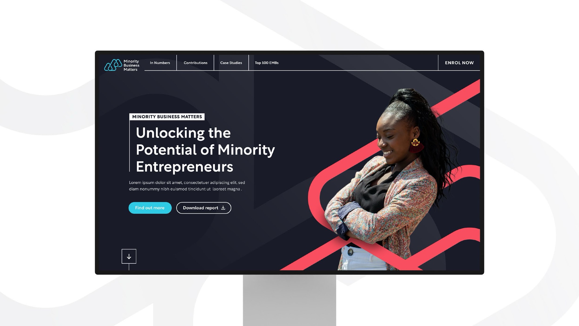
A sector that runs on physics, given a brand that runs on people.
Inclusion and Diversity in Nuclear brings the industry together to change who gets to work in it. The cause was serious and well supported. The brand looked like a committee.
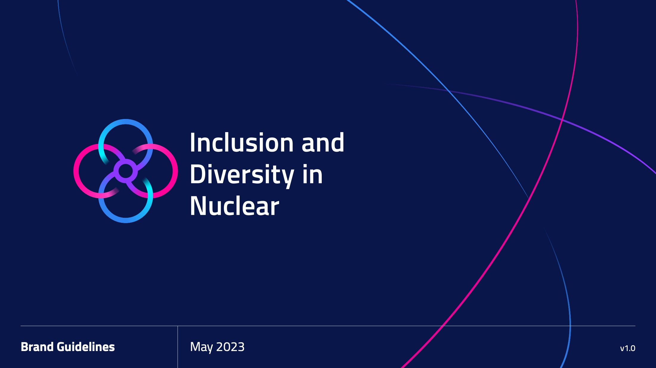
Inclusion work is judged on whether it looks serious.
Nuclear is an industry of national laboratories, defence contractors and hundred-year infrastructure. Its visual language is safety yellow, hard hats and stock photography of people pointing at pipework. An inclusion body inside that world has a specific problem: look too corporate and you are another initiative nobody reads; look too soft and the engineers stop taking you seriously.
IDN needed an identity with the authority to sit alongside the industry’s biggest names and the warmth to be the reason someone joins it.
Four rings that are an atom and a gathering.
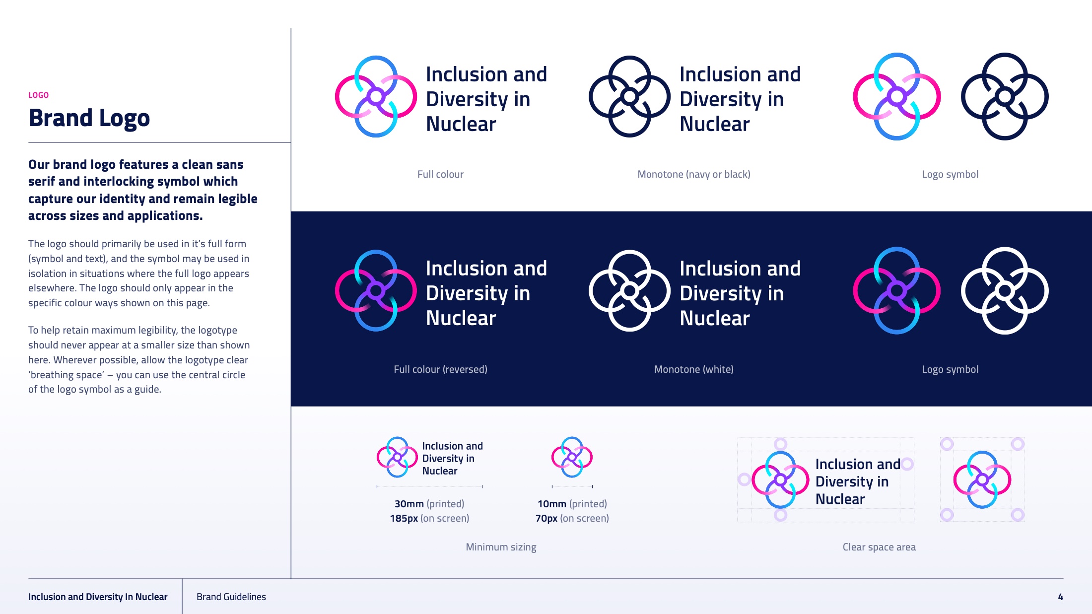
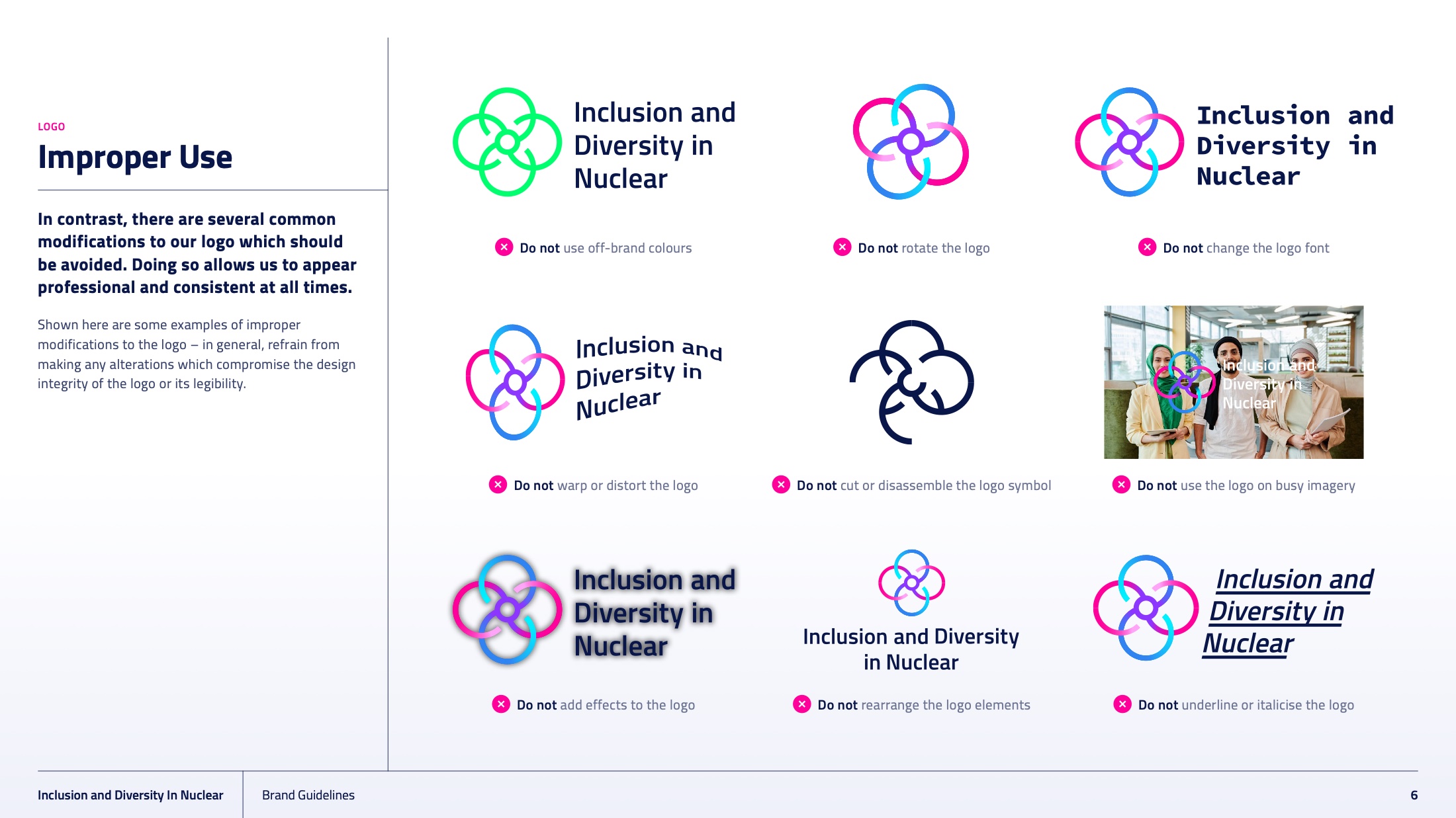
The mark is four interlocking forms turning around a shared centre. Read one way it is an atomic orbital, which is the industry. Read the other way it is four people around a table, which is the point.
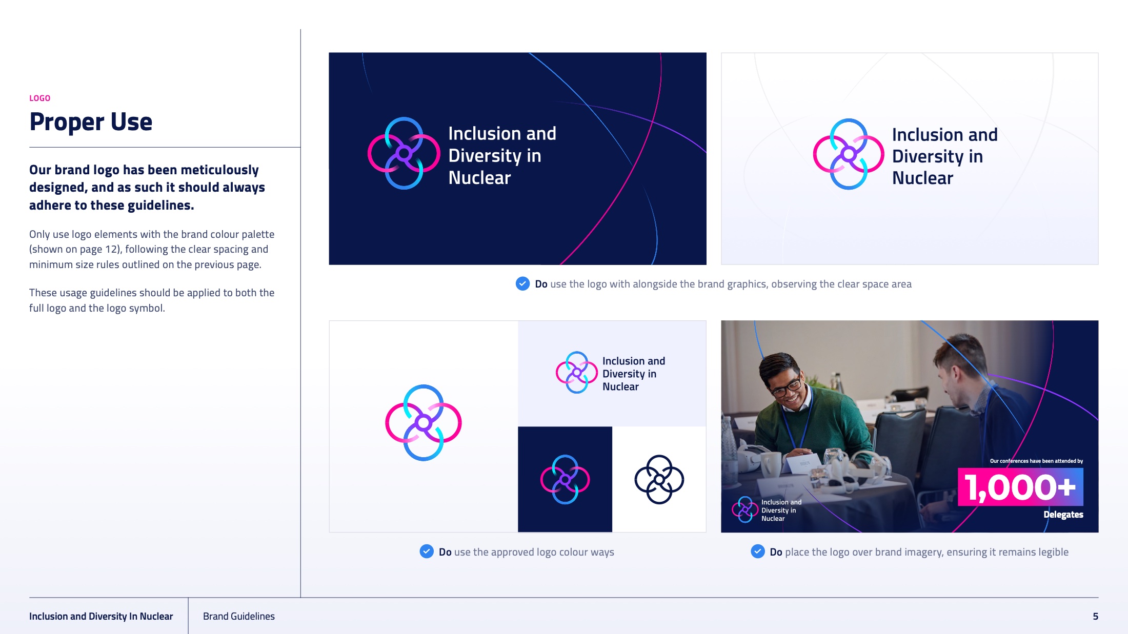
A symbol that only says “nuclear” would have been decoration. A symbol that only says “inclusion” would have floated free of the sector. Holding both is what lets the mark sit on a conference stage in Manchester and on a lanyard at a power station without changing register.
The palette does the arguing.
Navy carries the authority the sector expects. Then the brand does something the sector does not: it leads with a magenta called Proton Pink, against a Cobalt Blue, with Violet in support and gradients between them.
Naming a hot pink after a subatomic particle is the whole strategy in two words. It is unmistakably a nuclear brand and unmistakably not a conservative one, and it settles the seriousness question before anyone reads a sentence.
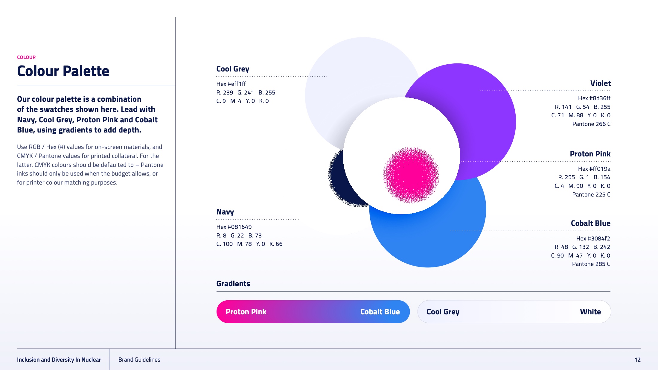
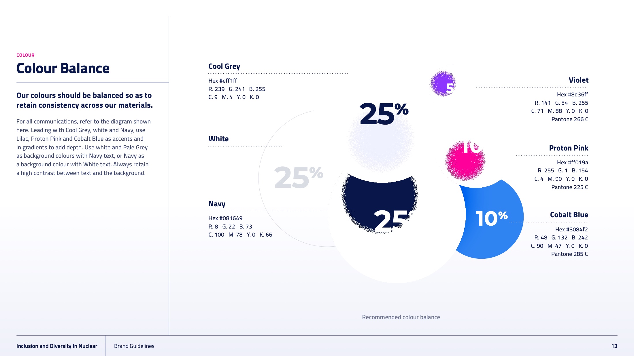
Every colour carries hex, RGB, CMYK and Pantone, with a stated ratio — so a chapter in Cumbria and an agency in London produce the same brand.
Built for people who are not designers.
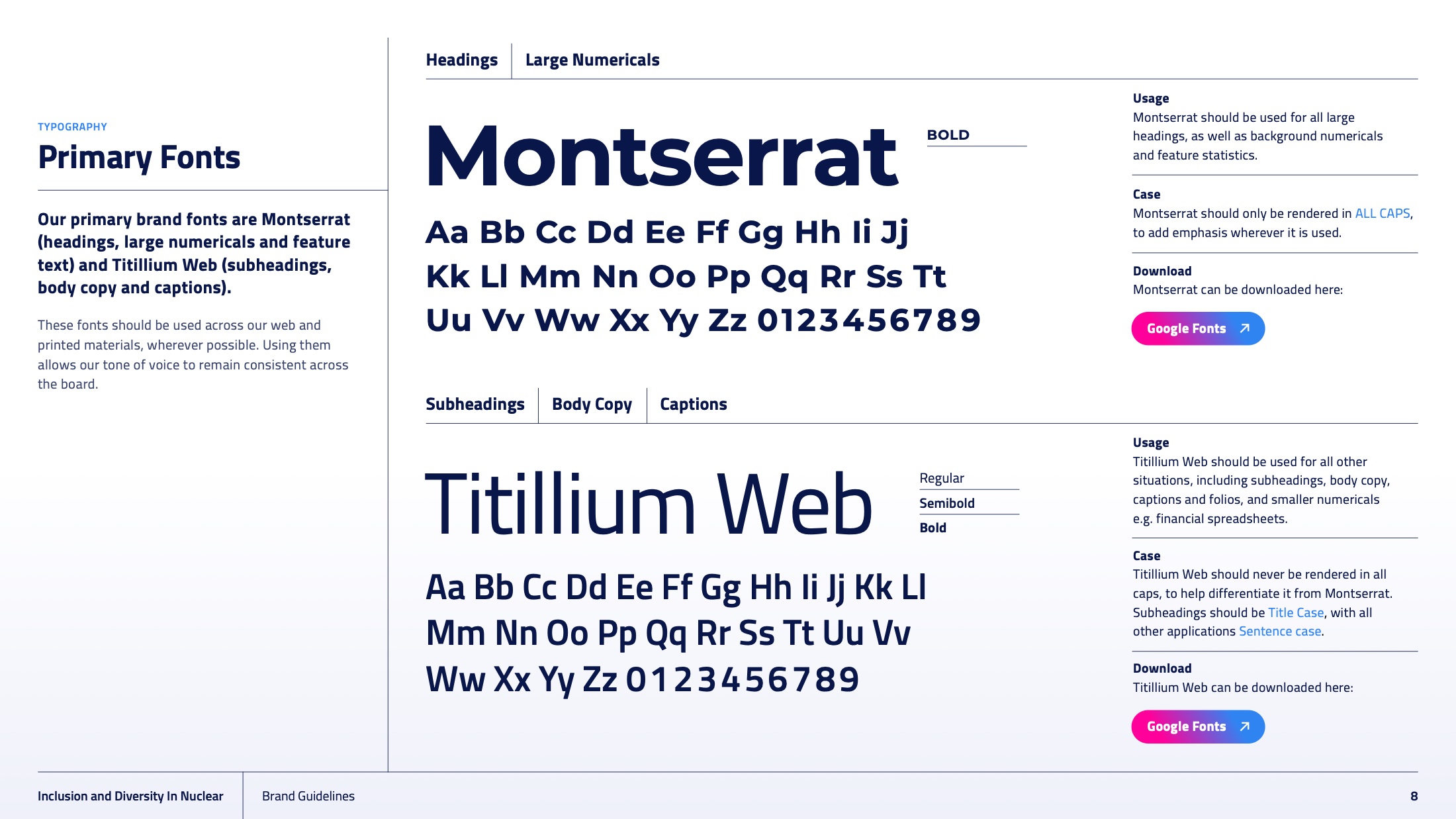
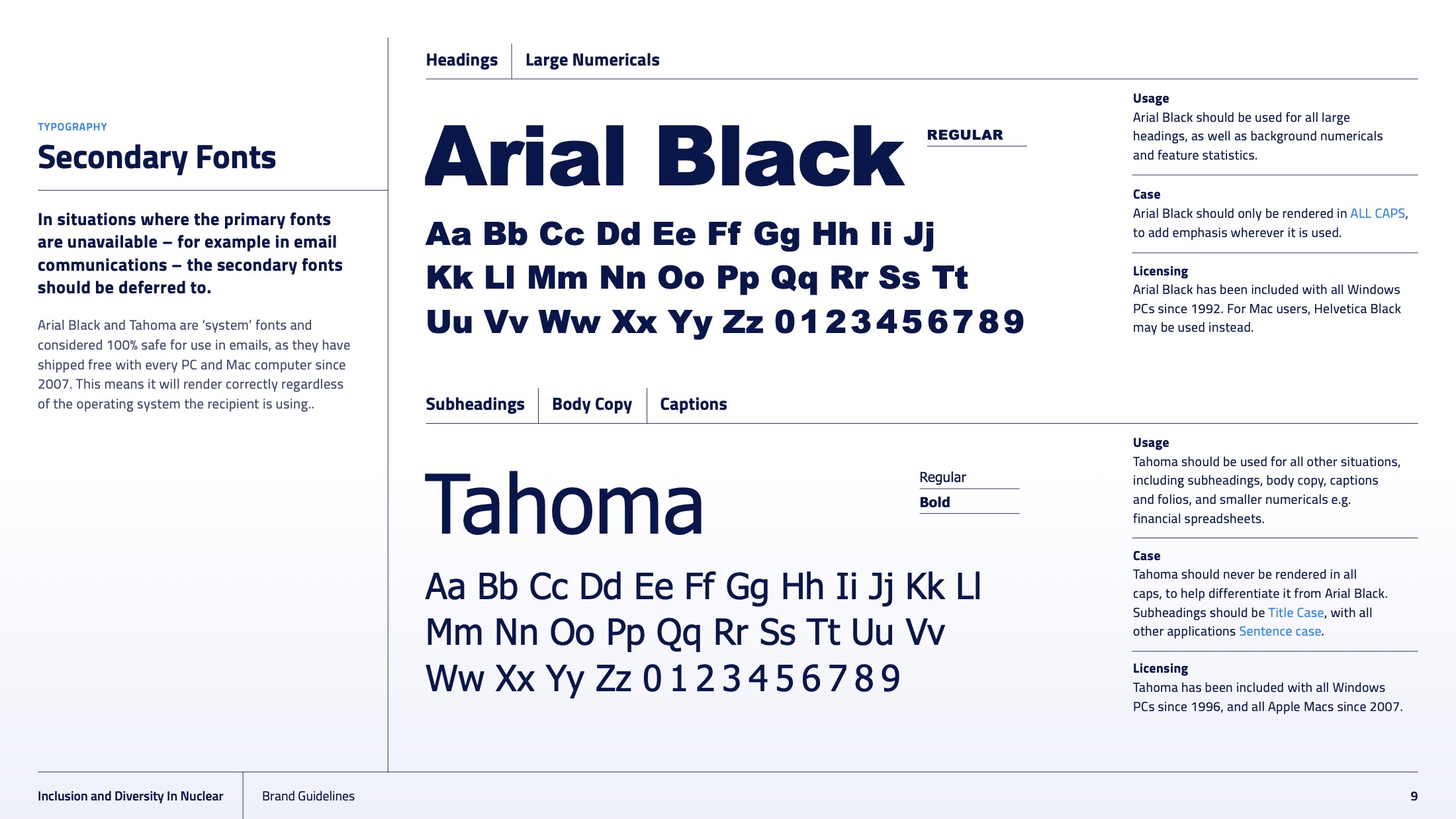
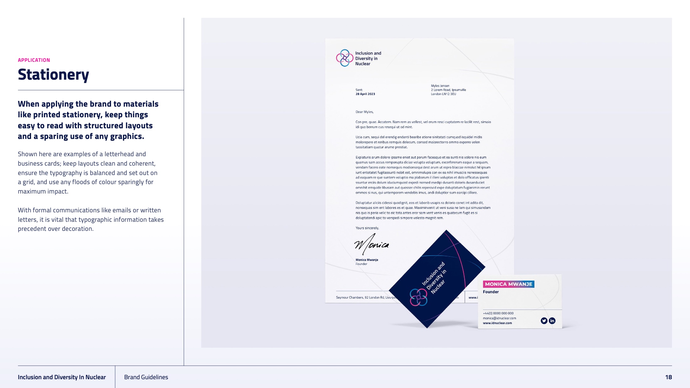
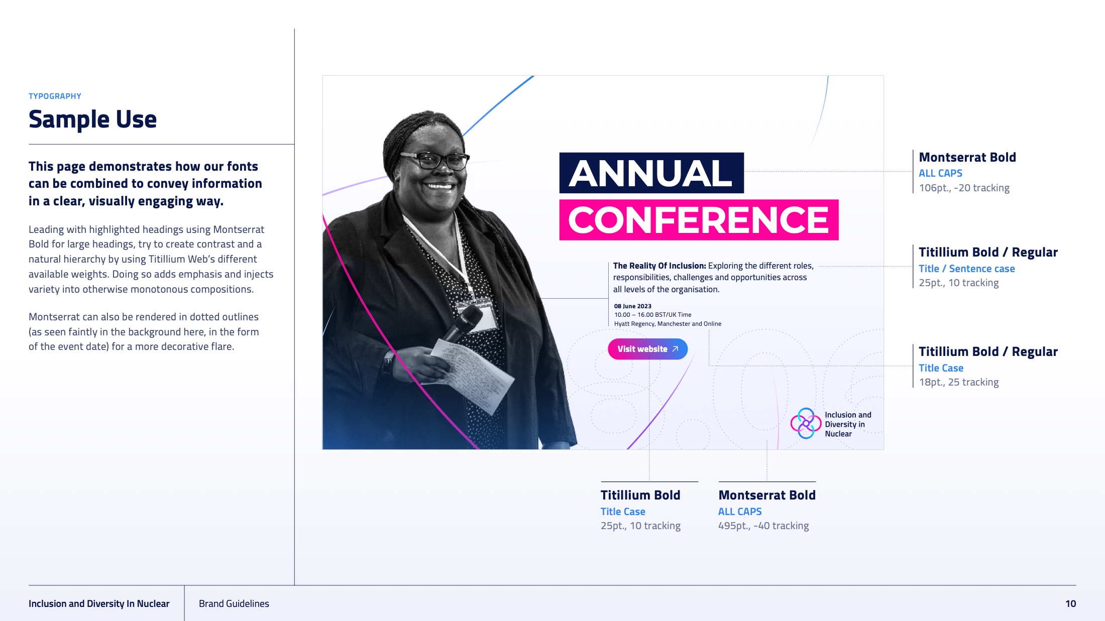
A membership body’s brand is applied almost entirely by volunteers, chapter leads and comms officers in member organisations, usually in PowerPoint, usually at short notice. So the system pairs Montserrat and Titillium Web with Arial Black and Tahoma as the sanctioned fallbacks — a decision that admits how the work actually gets made.
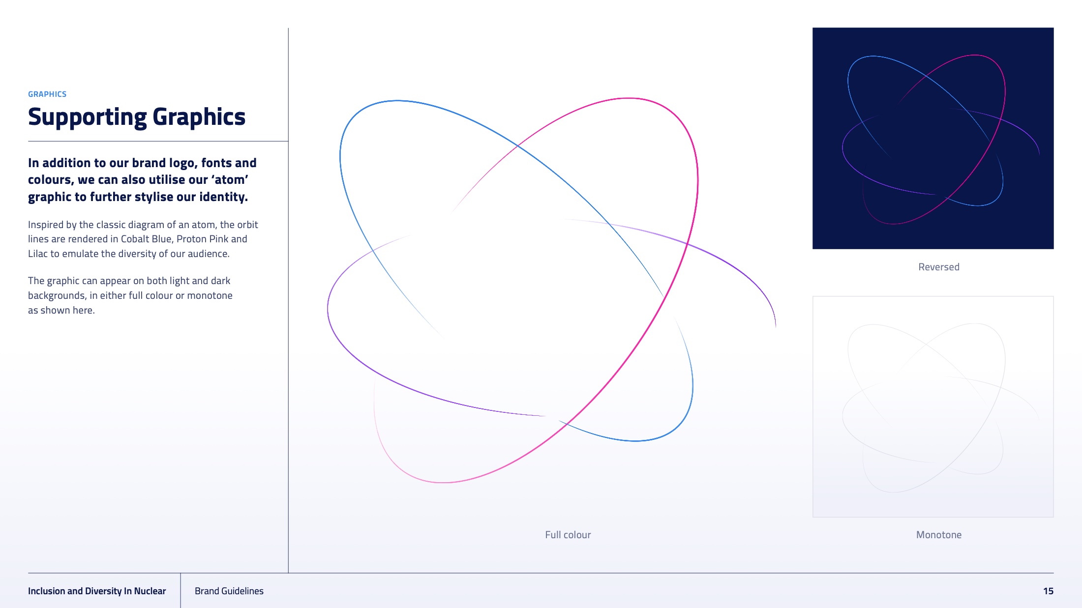
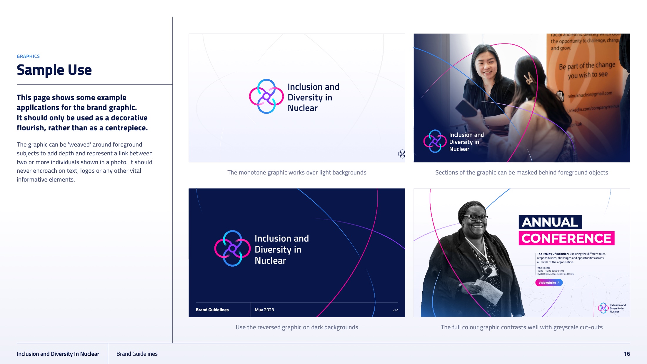
The supporting graphic is a single orbital line that can be scaled, cropped and rotated across a slide, a banner or a backdrop without ever needing to be redrawn.
The annual conference is where a membership body is actually judged.
The brand’s first real test was the IDN Annual Conference — The Reality of Inclusion — at the Hyatt Regency Manchester and online. We took the identity into five poster routes rather than one, so the committee could choose the register: a member-photography grid, a soft gradient field, a hard diagonal, a blocked colour field, and a cut-out portrait treatment.
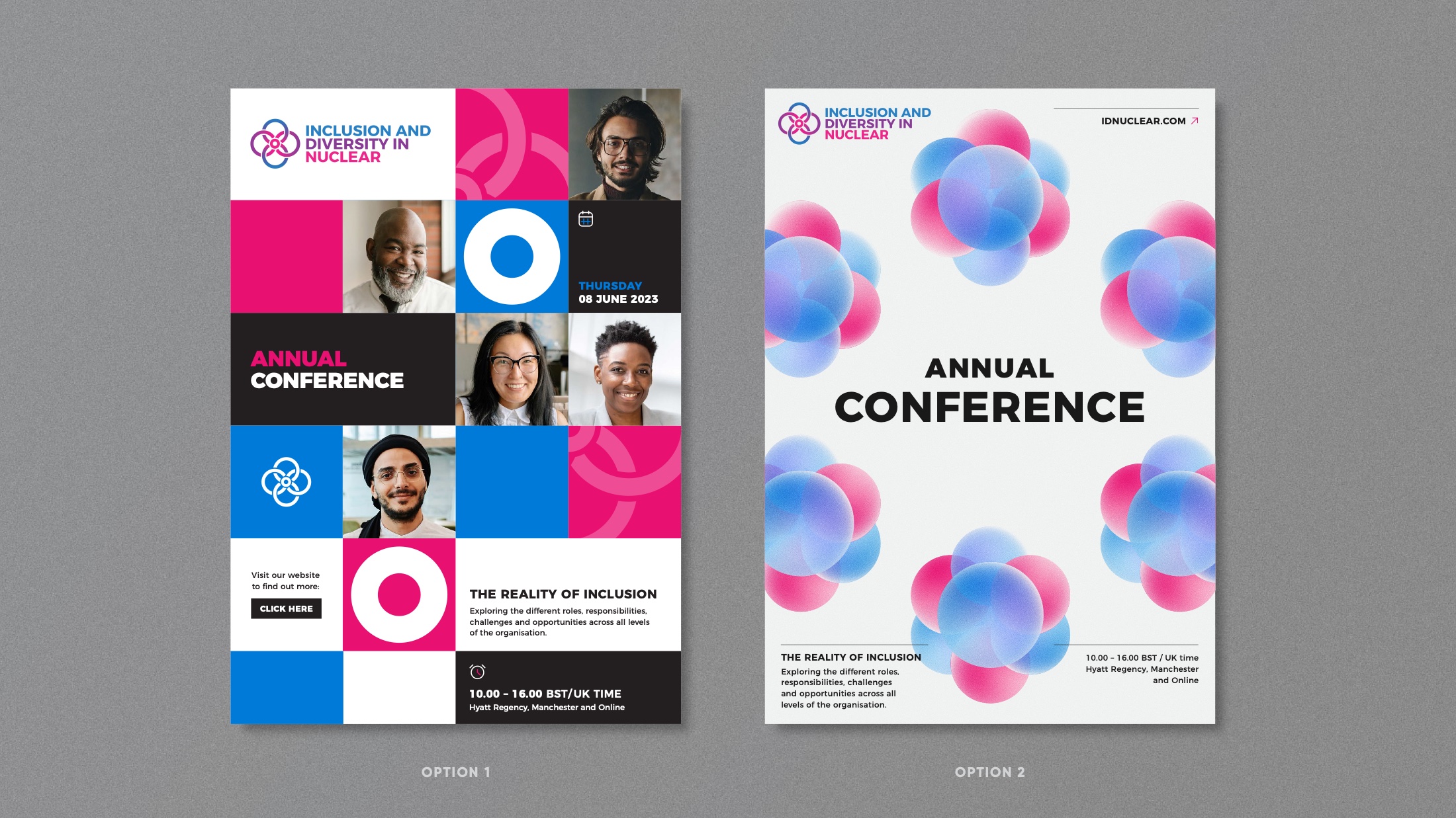
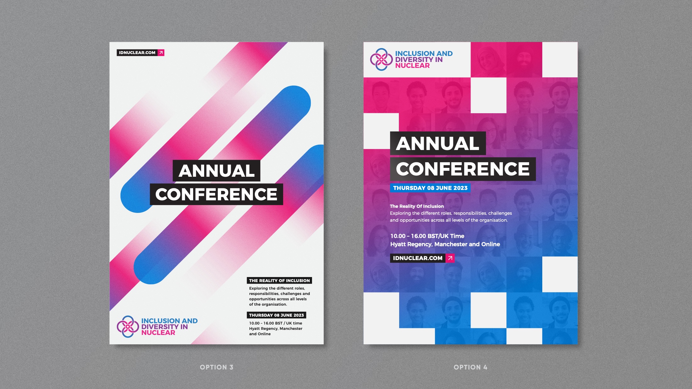
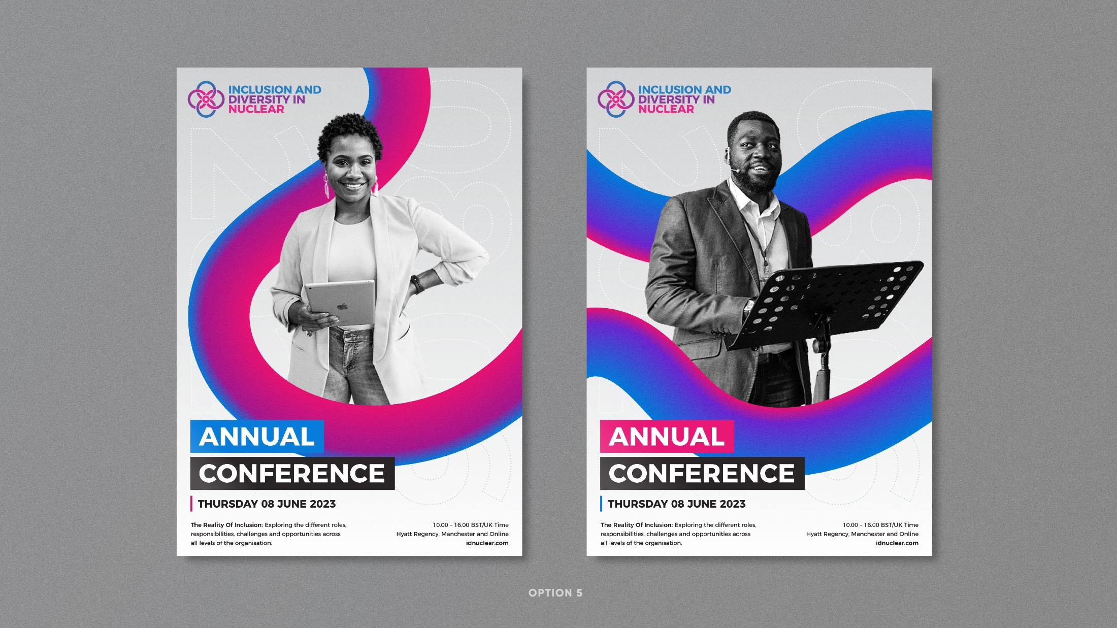
Every route puts real members on the poster. In a sector where the default is stock photography of a hard hat, showing the actual people is both the cheapest credibility available and the entire argument the organisation exists to make.
A brand for a body whose entire job is to be joined.
Inclusion and Diversity in Nuclear · Brand Guidelines v1.0
Led by our founder at Jensen & Jensen.