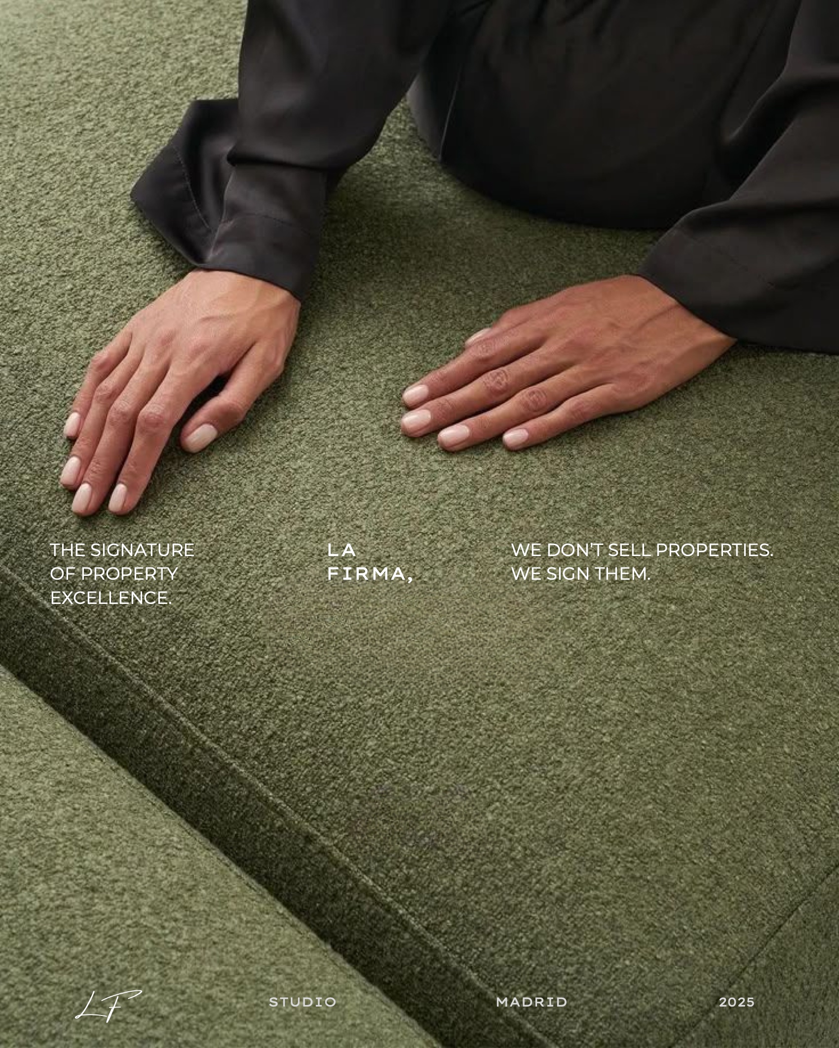
We don’t sell properties. We sign them.
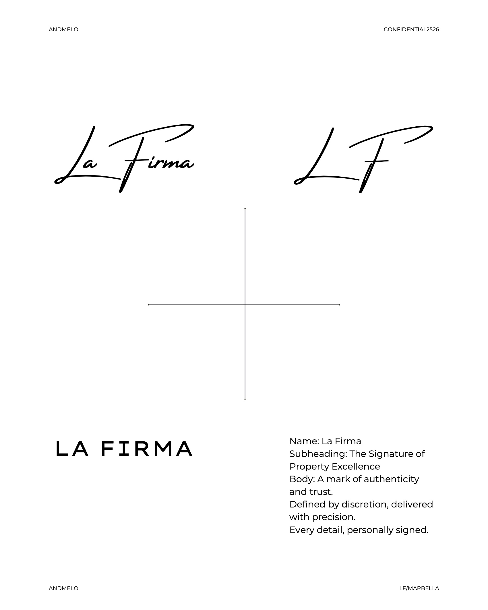
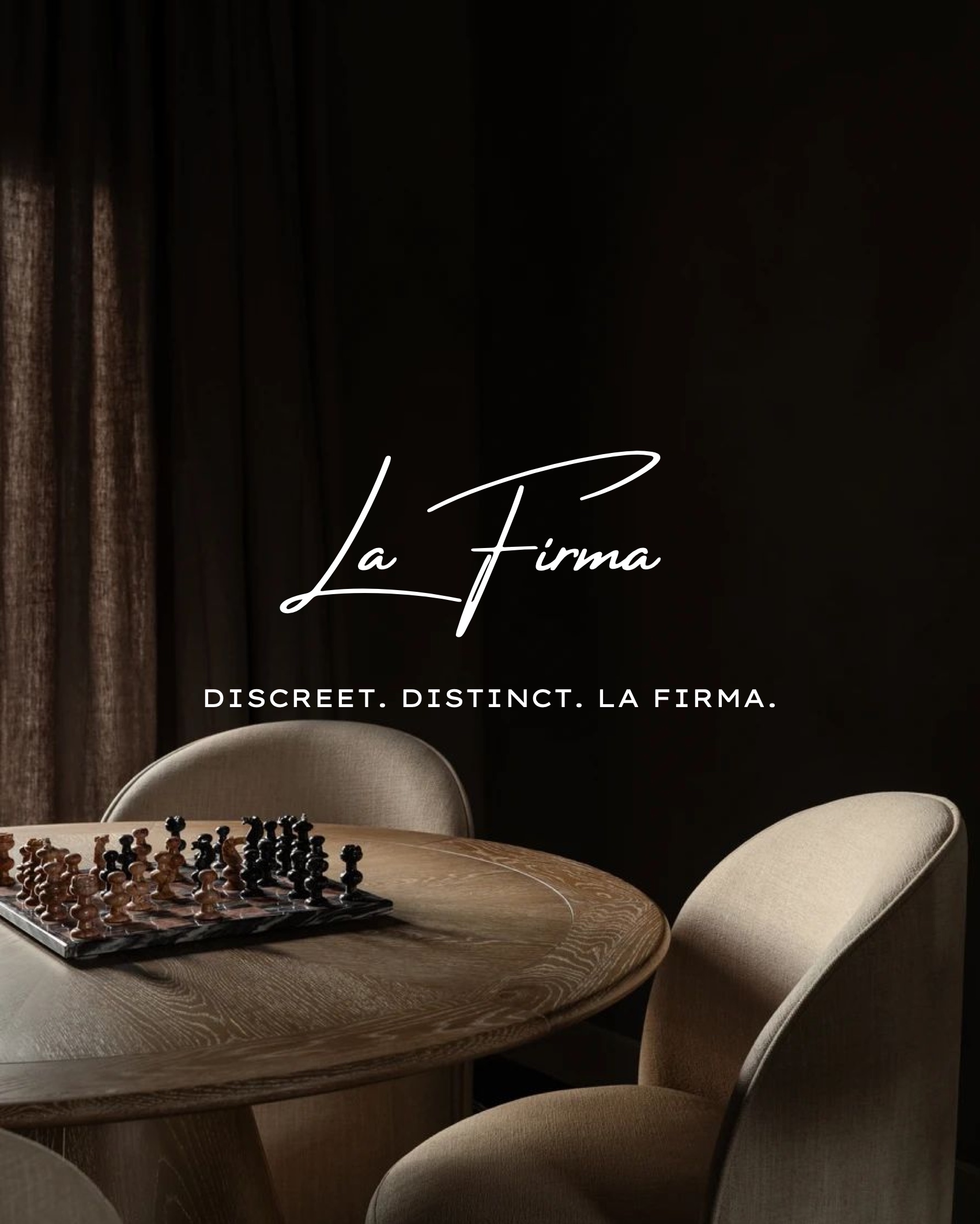
La Firma is Spanish for the signature. The brief was to build a house that feels as exclusive as the clients it represents: rooted in discretion, designed for distinction.
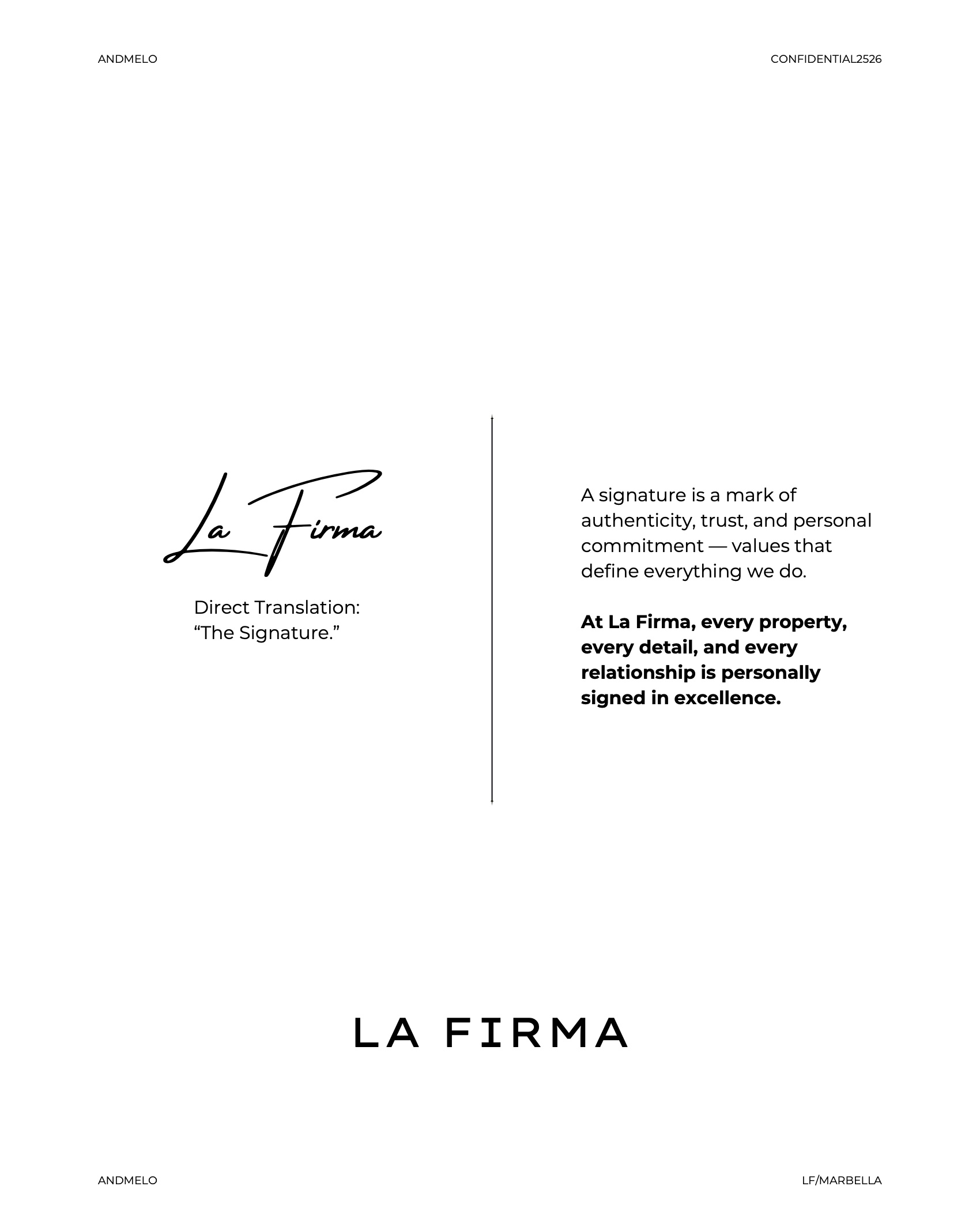
A signature is a mark of authenticity.
La Firma. The Signature.
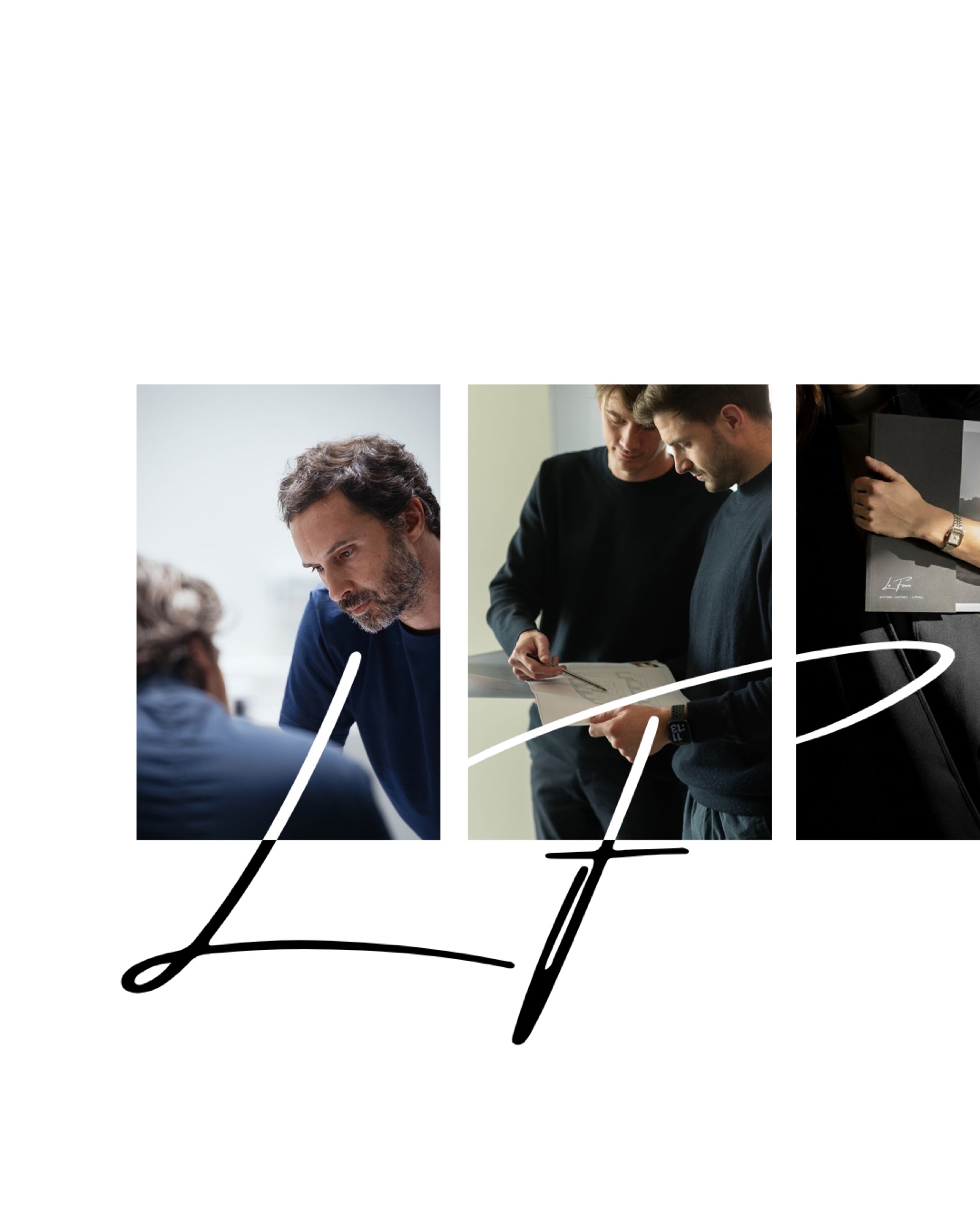
A signature is the shortest possible proof that a person stood behind something. It carries authenticity, trust and personal commitment in a single gesture, and it is the one mark that cannot be delegated.
That gave the business its whole proposition. Every property, every detail and every relationship is personally signed, which is a promise a large agency structurally cannot make.
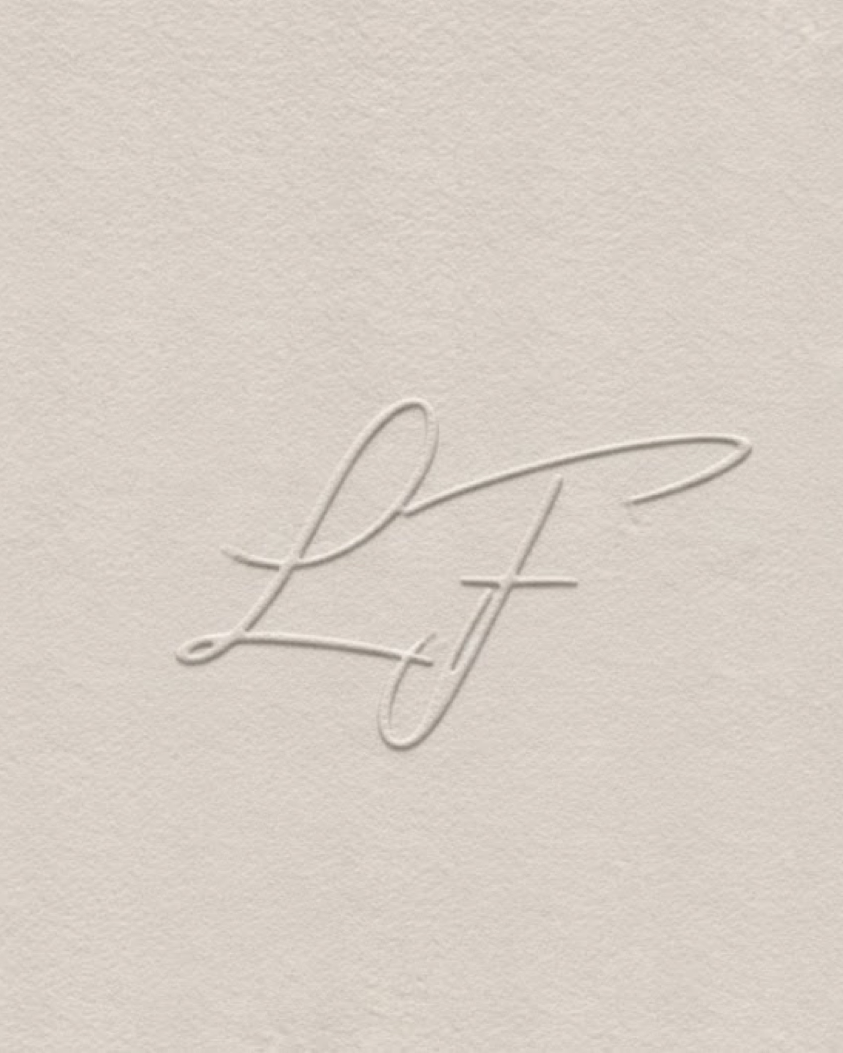
Written, not drawn.
Luxury isn’t loud. It’s precise.
Every element, from tone to typography, had to whisper.
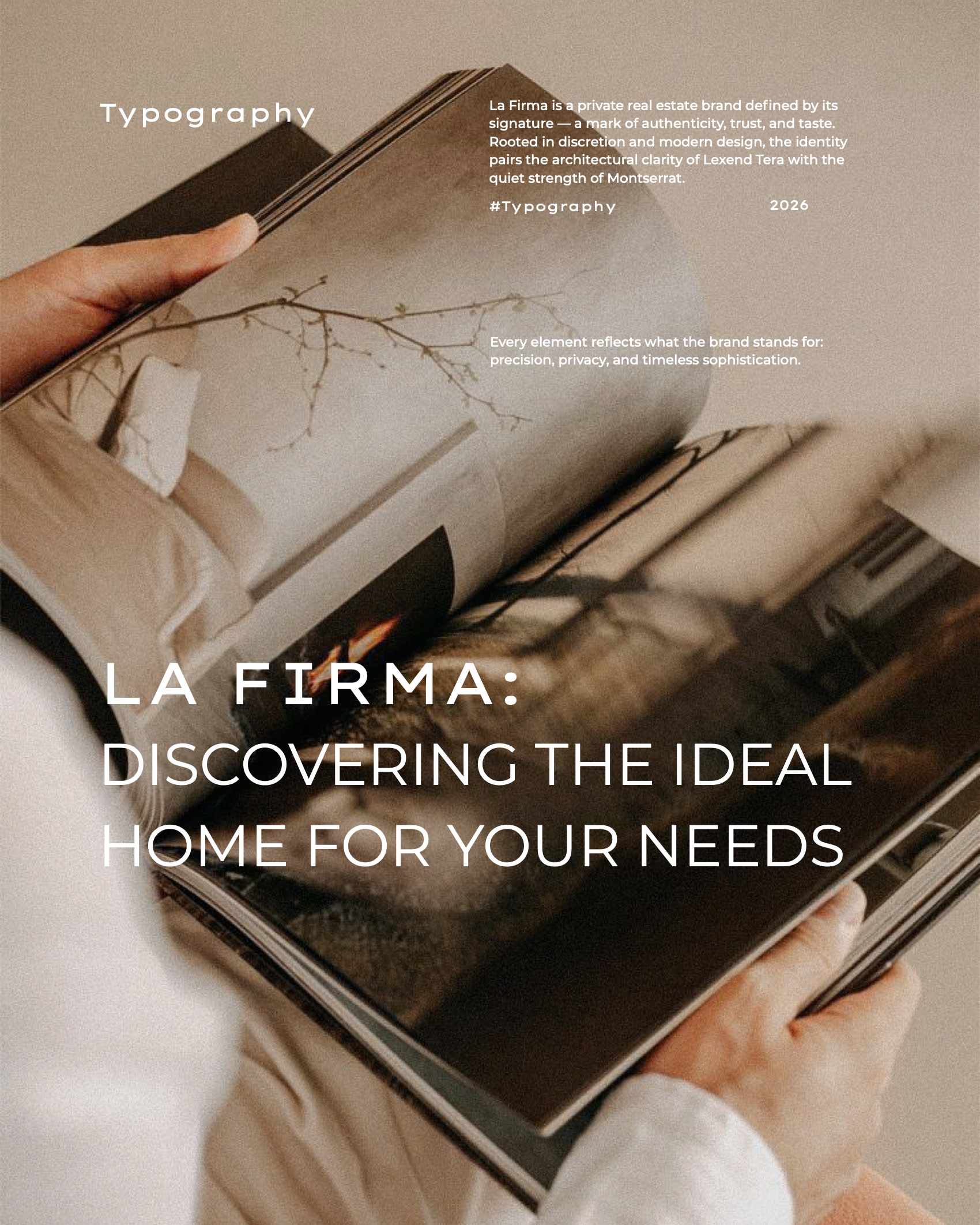
The type pairs the architectural clarity of Lexend Tera with the quiet strength of Montserrat: one to set the structure, one to stay out of the way. The palette is stone, espresso and light, taken from the properties rather than imposed on them.
Discreet. Distinct. Nothing in the system raises its voice, because the audience it is speaking to has already been shouted at by every other agency in the market.
True luxury can’t be pixelated.
No Zooms. No virtual tours.
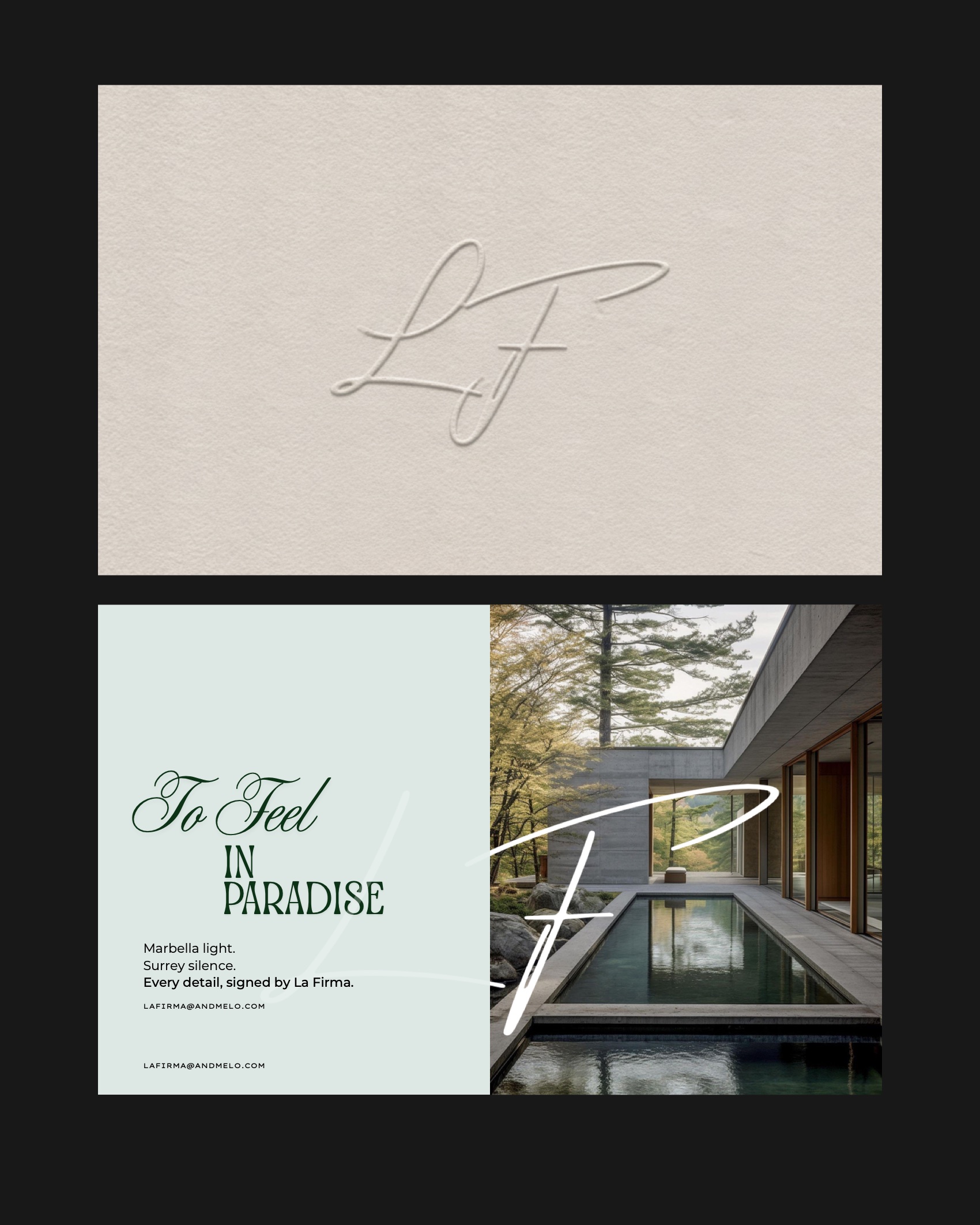
The campaign line came straight out of how the business actually operates. It refuses remote viewings, because a property at this level is texture, light and silence, and none of those survive a screen.
So the campaign never shows a full room. It shows a hand on linen, a hand on wool, a hand on stone. You are being sold the sensation rather than the floor plan.
Everything a house needs to sign with.
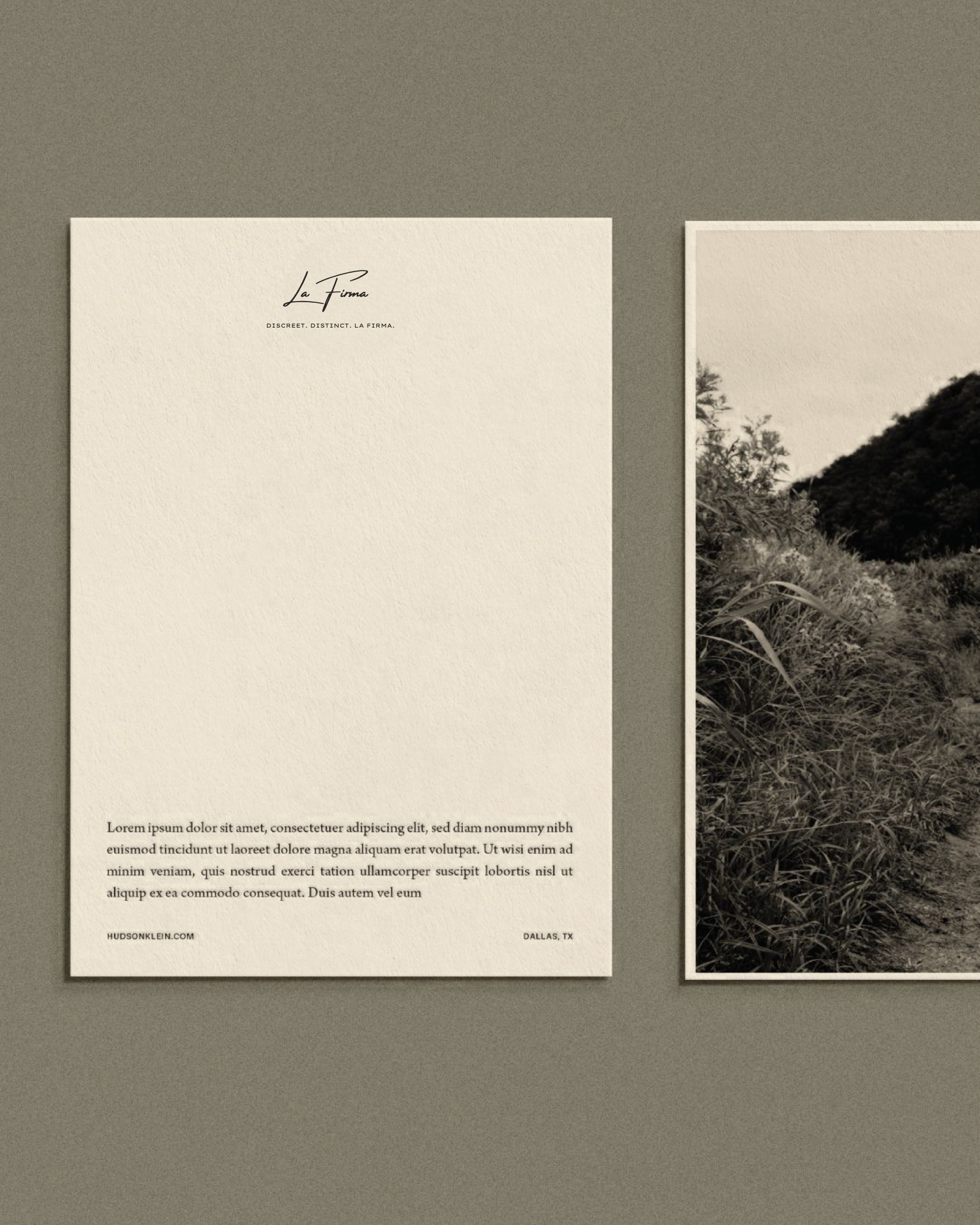
A brand that behaves like the service.
The strongest identities are not descriptions of a business, they are the business made visible. A house that refuses video calls needed a brand that refuses to shout, and a promise of personal accountability needed a mark that could only ever be made by hand.
Luxury isn’t what you see. It’s what you sense.