A collective, not a catalogue.
Sensus brings together the best of fashion, lifestyle and accessories — a curated collective founded by Scarlett Reuben and Matilde Mourinho, built as much around community and events as around what is for sale. Our founder joined as Fractional Brand Director and led the identity end to end: the mark, the type, the palette, the sub-brands and the platform it all lives on.
Not a project. A seat at the table.
Lead the strategy and creative direction for v2, the build-out of the full e-commerce platform. AndMelo came in as fractional Brand Director rather than as a supplier of one deliverable.
The audience is the hard part. When your customer can already buy anything, price is not a lever and novelty is not a hook. The only thing left is taste: what you choose to show them, and how you choose to show it.
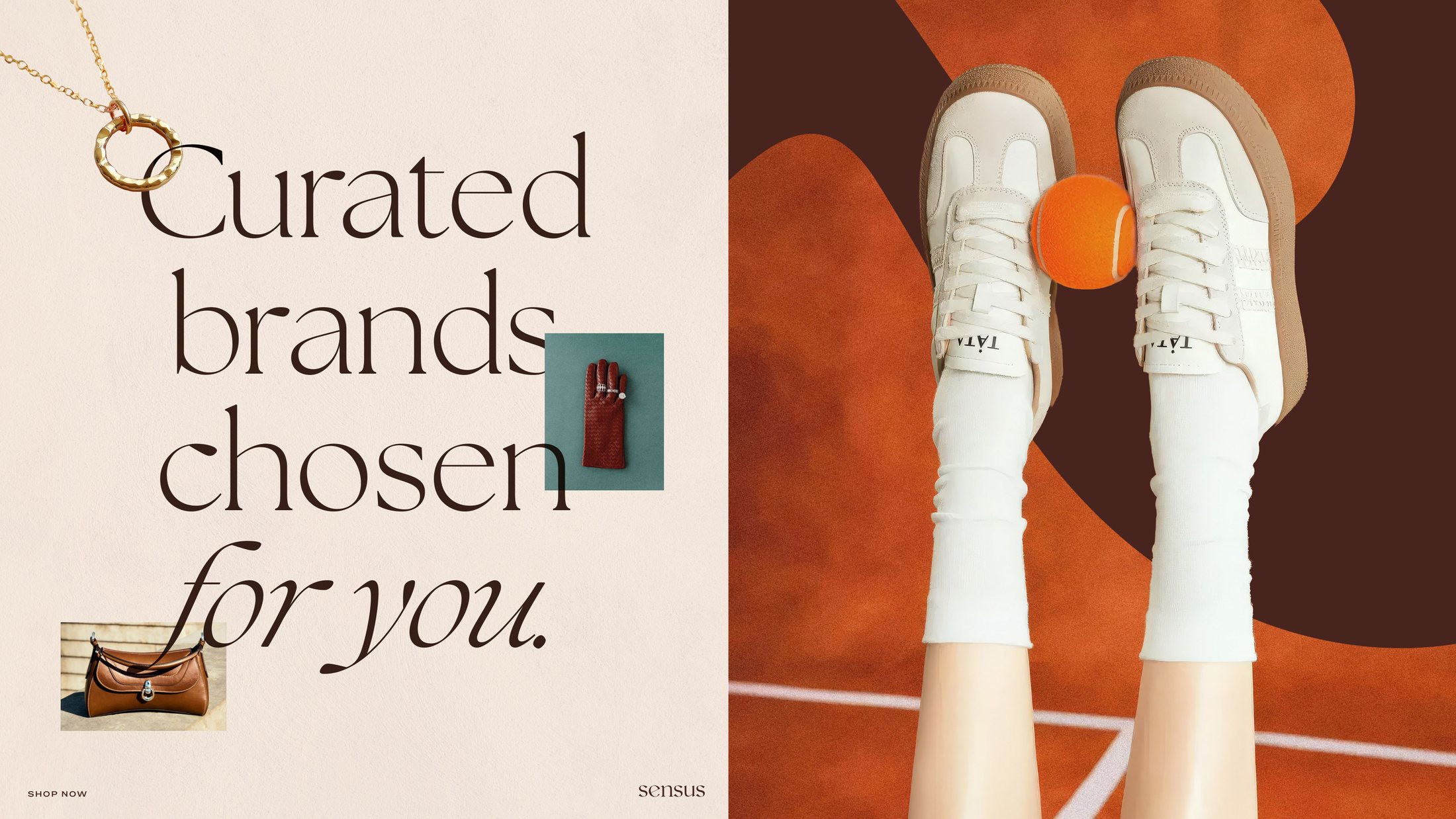
So the identity had to do something most e-commerce branding never attempts, feel edited rather than merchandised.
Warm where luxury is usually cold.
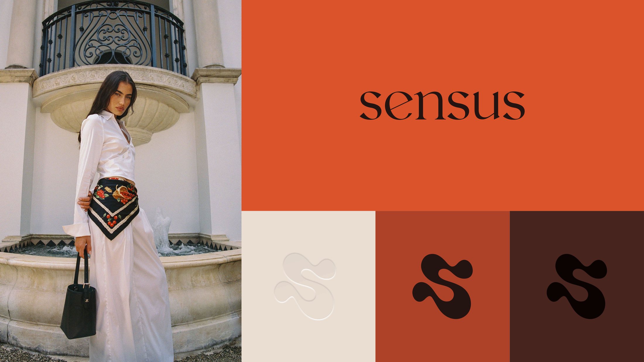
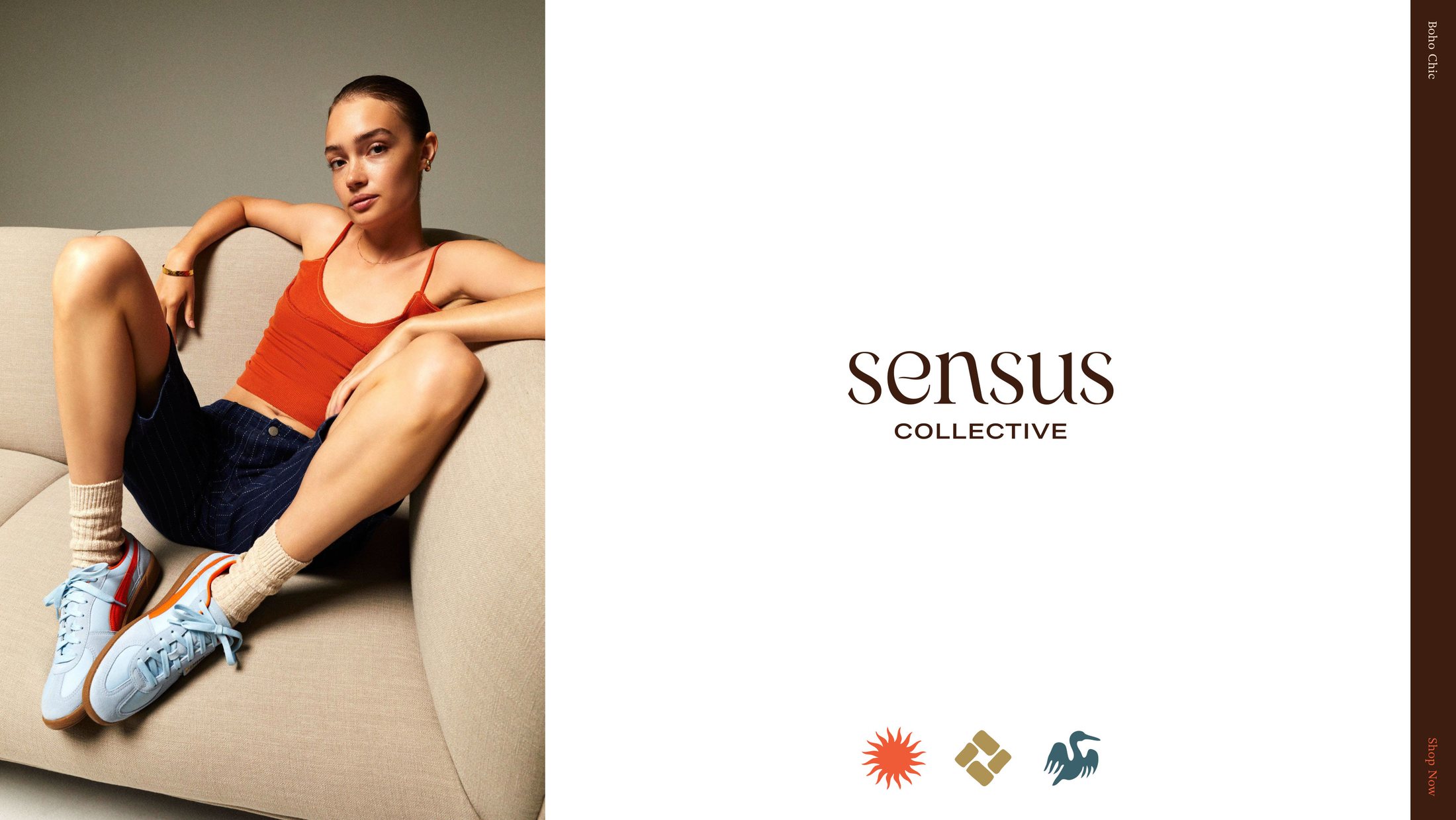
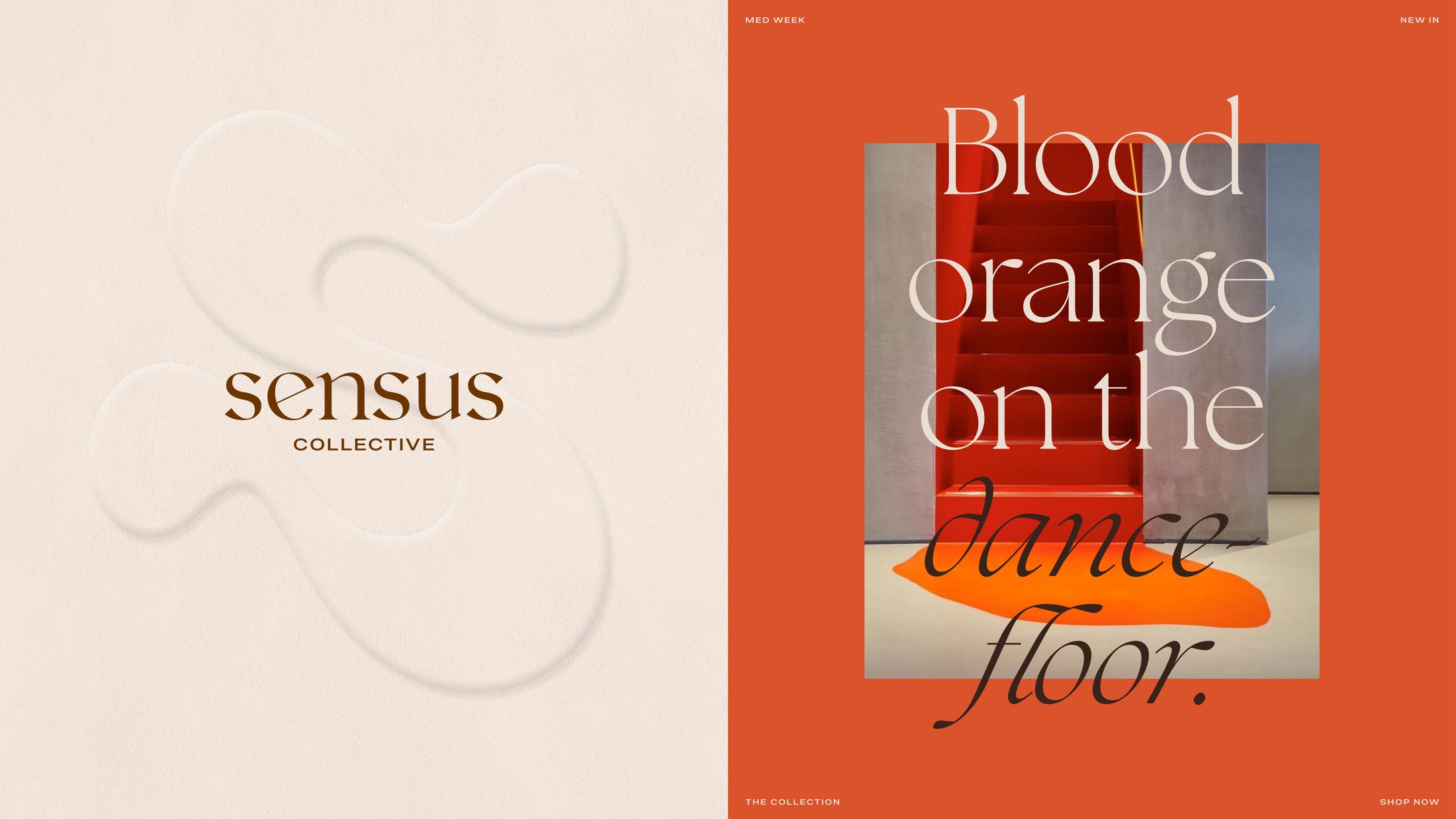
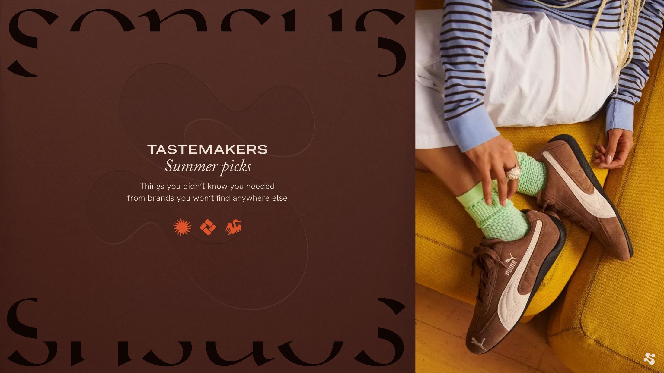
Most premium e-commerce sites reach for black, white and grey, and end up indistinguishable from each other. This one goes the other way: six warm tones with earth under them, so the brand reads as a point of view rather than a shopfront.
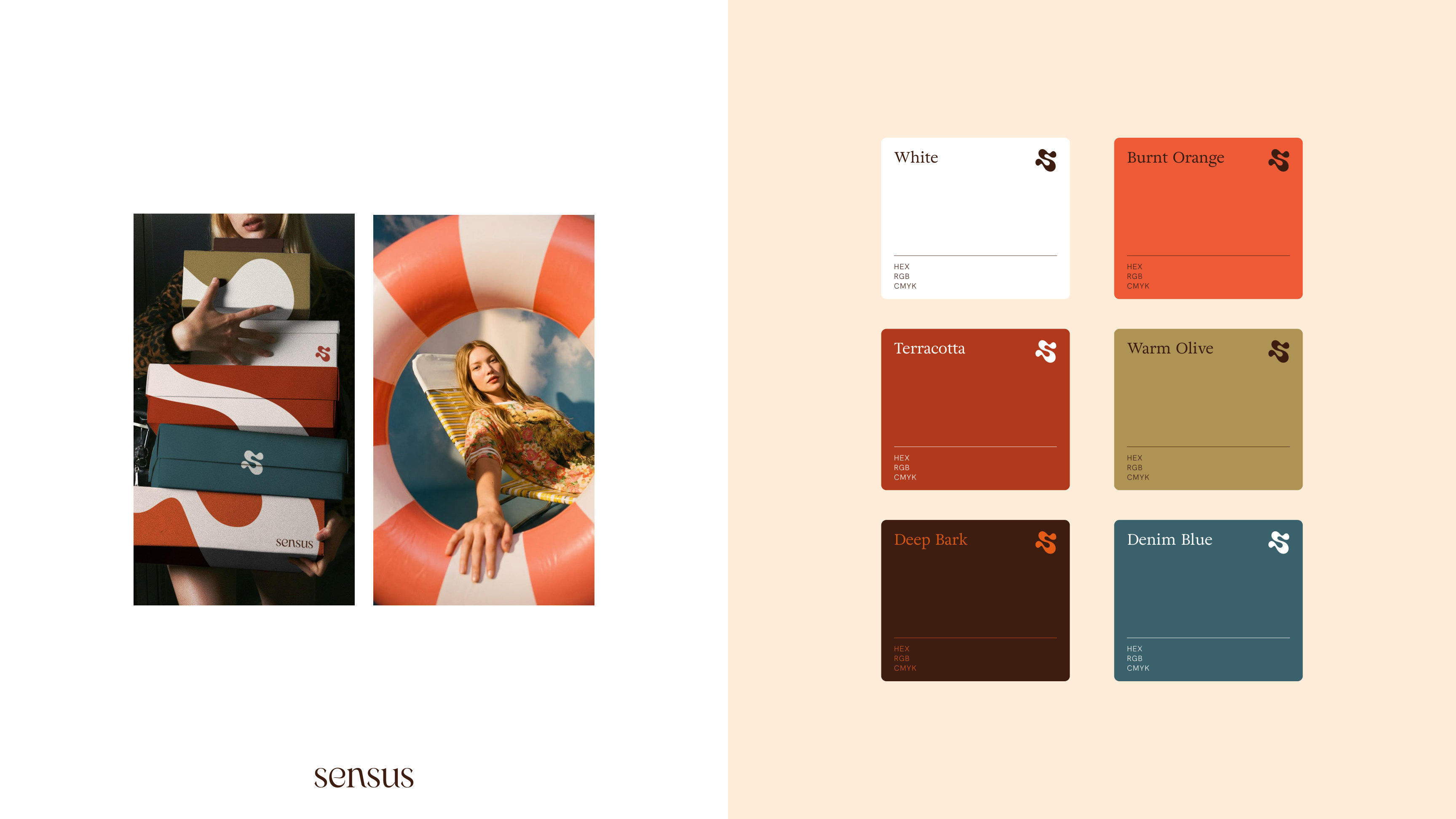
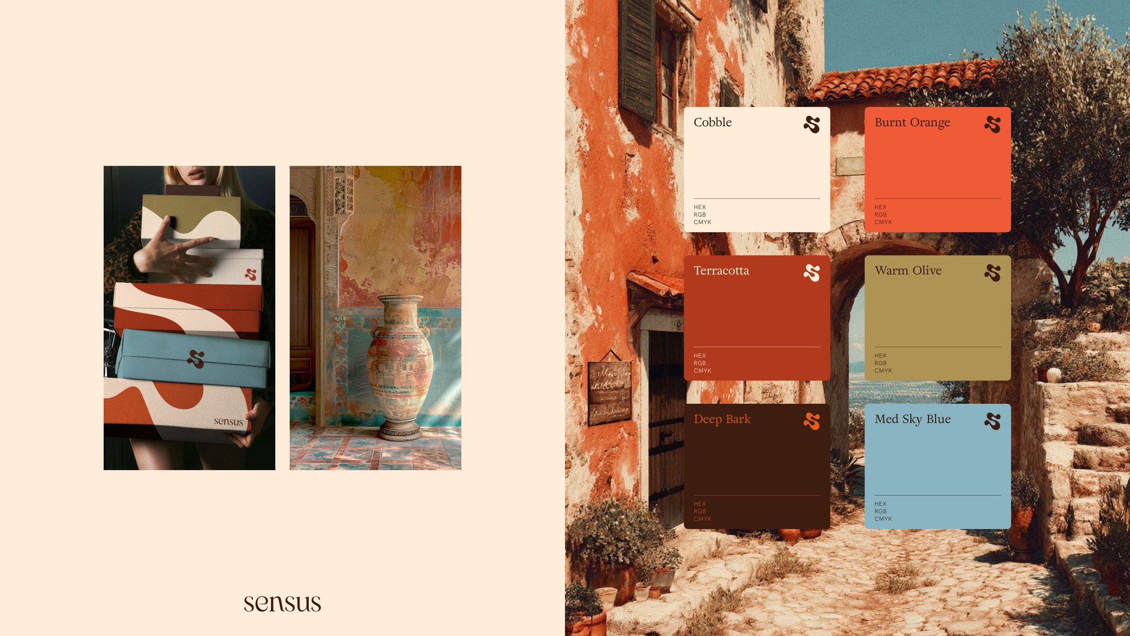
A system that behaves like an editor.
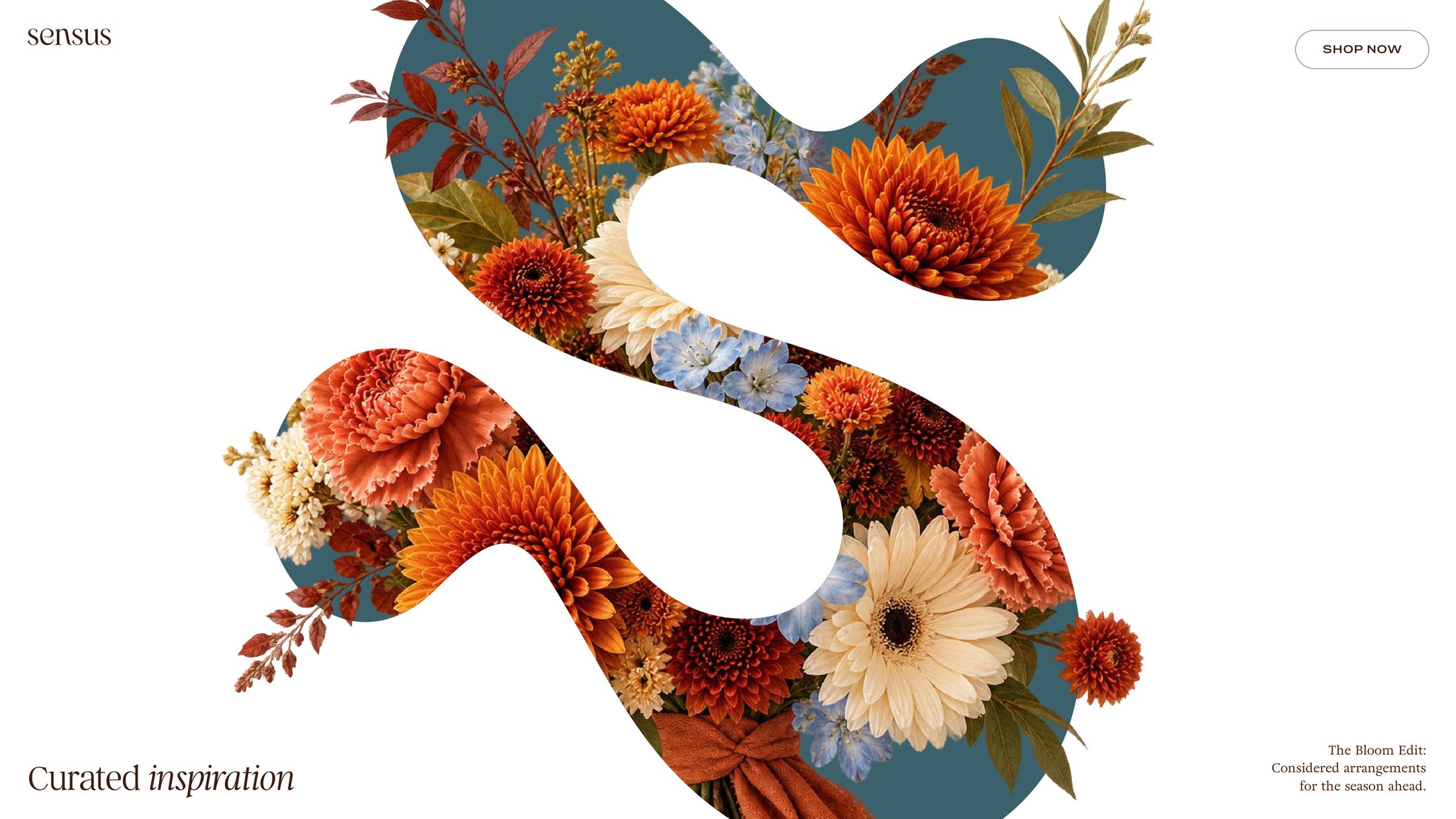
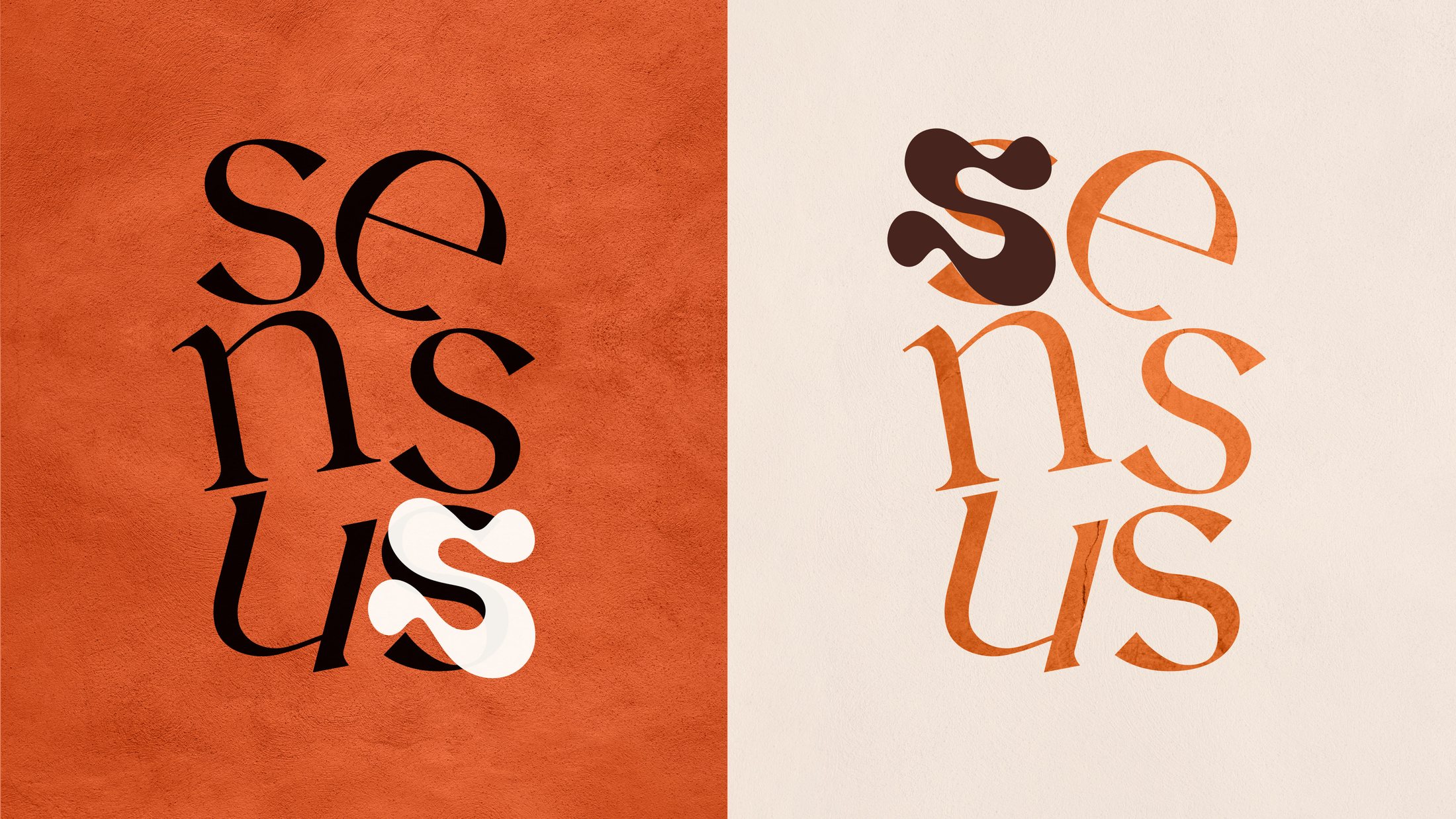
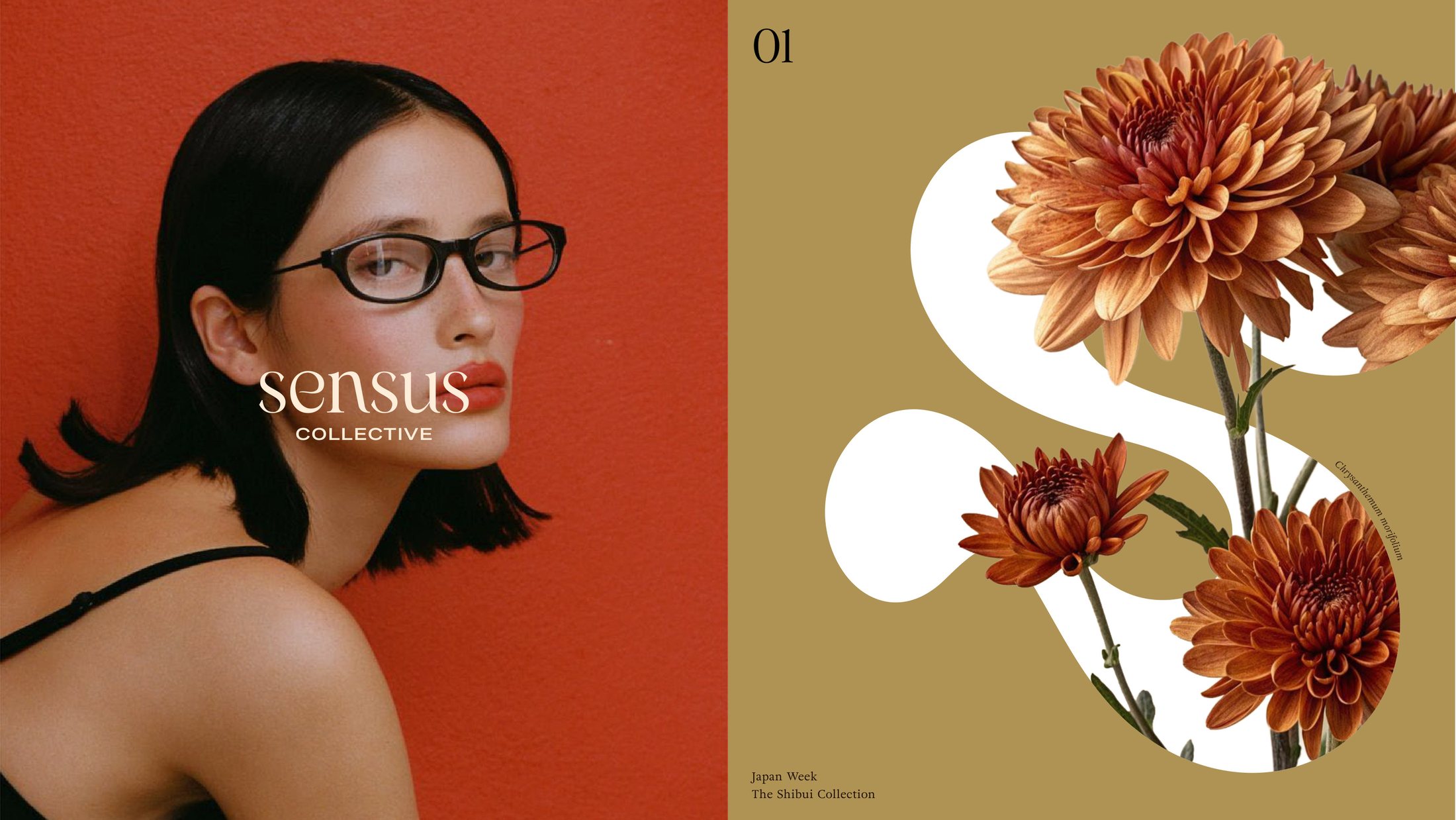
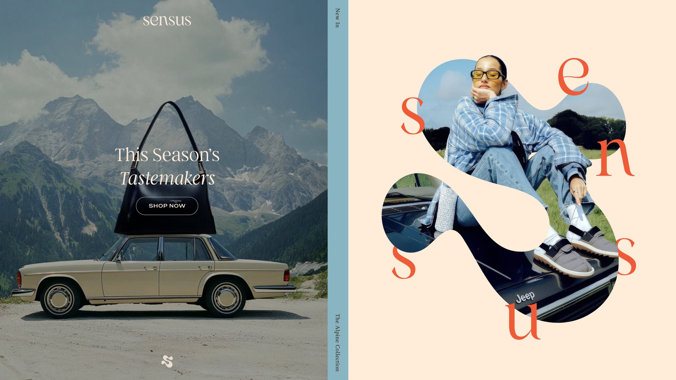
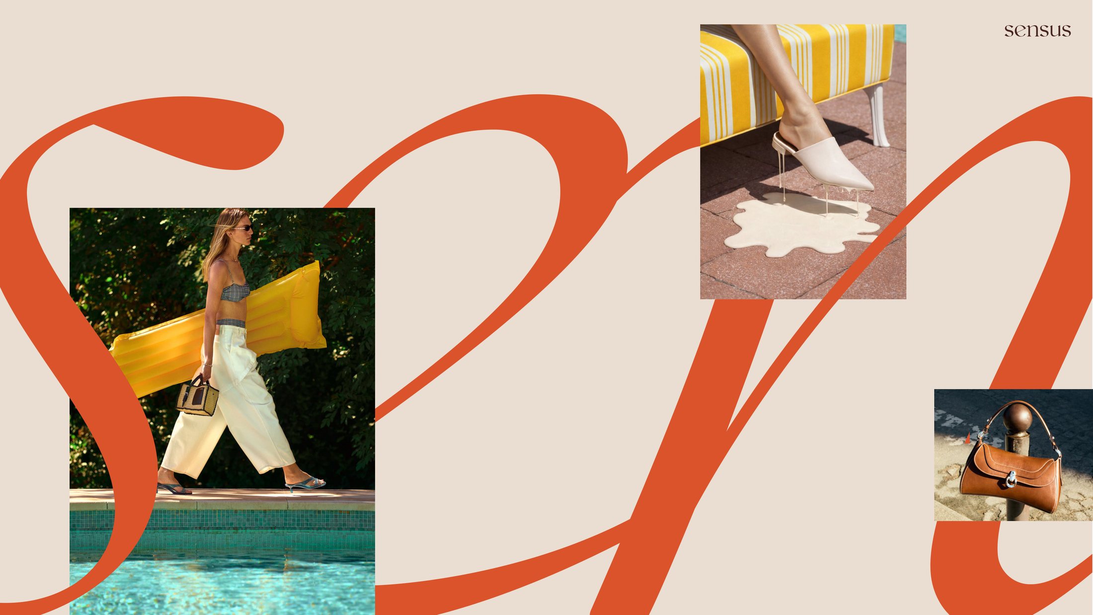
The monogram is the engine. It crops into photography, fills with flowers for a seasonal edit, holds a figure inside it, and scales from a favicon to a full-bleed hero without ever repeating itself.
Around it, an asset system built to run: photography and imagery direction, social, corporate and pitch decks, positioning and key messaging, so the brand holds its voice whether it is selling a season or raising a round.
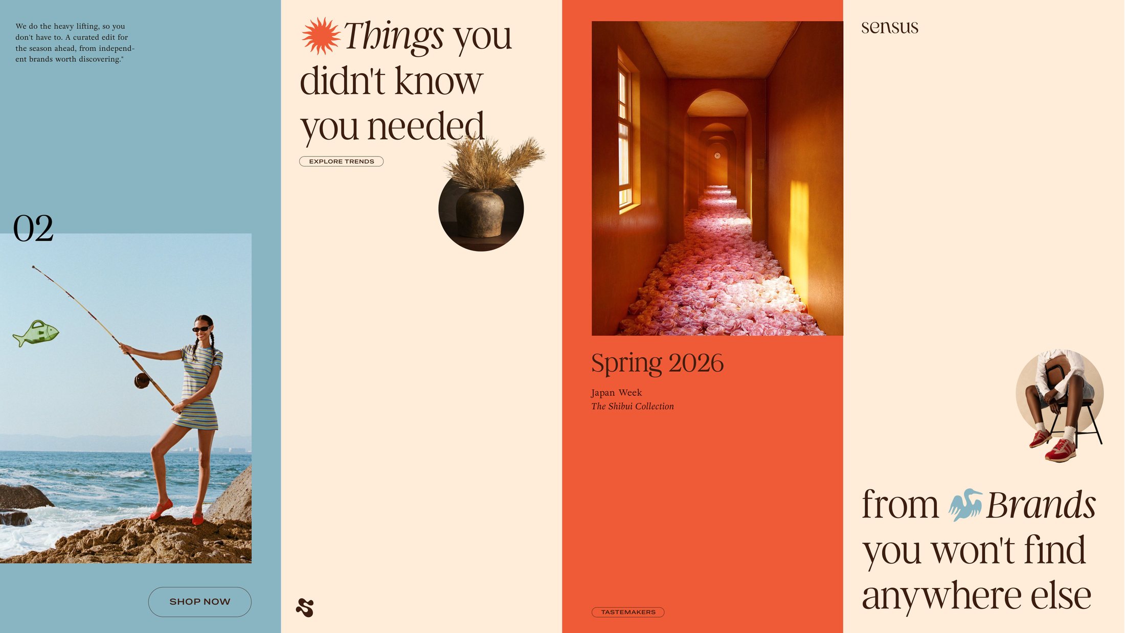
Then we built the thing it all had to live in.
Complete UX and UI design for the platform itself, the part most identity work hands off and hopes for the best on. Doing both is the reason the brand survives contact with the product.
When the customer can buy anything, the only thing you are really selling is taste.
Private Luxury E-commerce · Fractional Brand Direction