← All Work
Build a Brief
Film, TV & advertising

Everyone in the room had heard of them. Nobody could picture them.

A TV and film agency with a name everyone in the industry knows. The reputation was already there. The brand had not been touched in years and was quietly arguing the opposite.

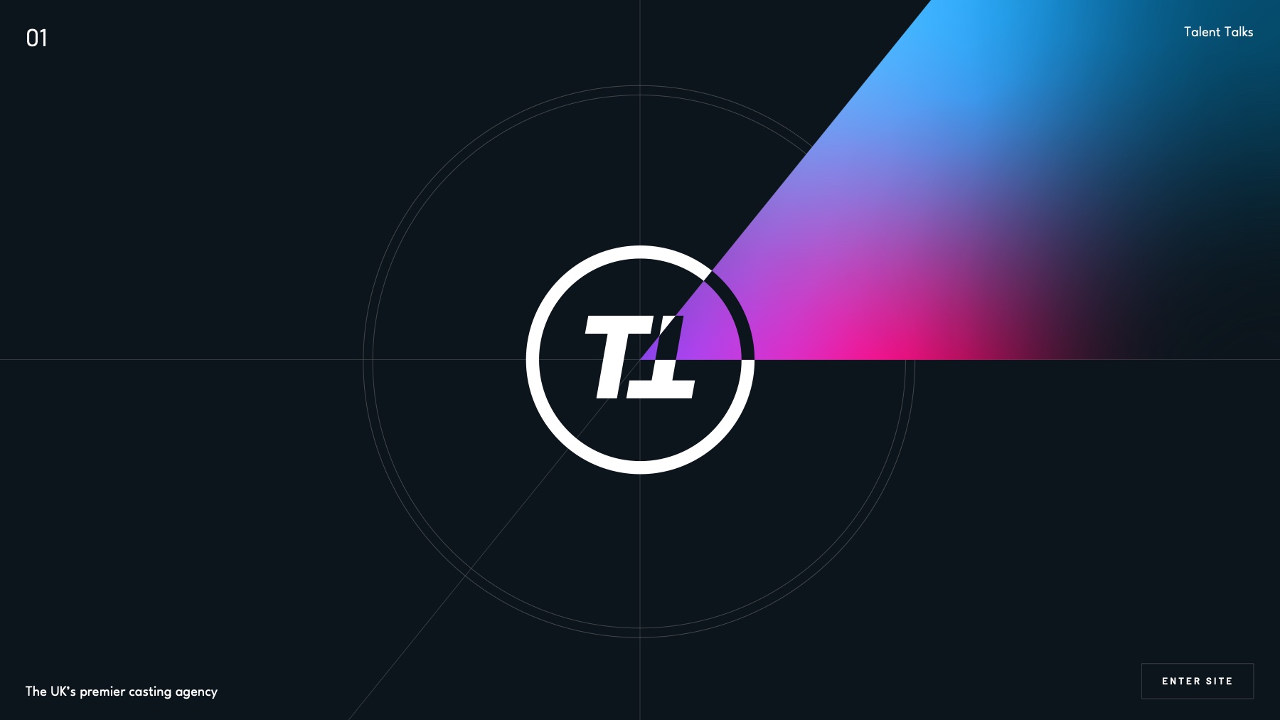
The refined the client TT monogram on a gradient ground
ClientPrivate · Under wraps
SectorTV & Film
DeliverablesBrand identity · Website design
WebsiteIn development
/01The Challenge

A brand that had stopped agreeing with its own reputation.

Refresh it without losing what people already recognise.

They cast for Disney, Netflix, Apple, Samsung, WhatsApp, Dyson, Nike, Adidas and Sky. For the Premier League, Arsenal and the FIFA World Cup. For Spider-Man, Star Wars: Andor, Squid Game, Top Boy and Love Is Blind. For Idris Elba, Jorja Smith, Chunkz and the Sidemen.

The work is genuinely at the top of the category. But the identity had not been updated in years and the digital presence had fallen behind it, so a business that leads its market was presenting like one still trying to enter it.

That makes the brief harder than a blank-page rebrand. Recognition is an asset once you have it, and throwing it away to look new is the most common way an established brand loses ground. The mark had to stay legible as itself and still read as the leader.
/02Three Routes

One brief, argued three different ways.

This is the part of the process most studios do not show. Each route takes a different position on how far to move. Presenting them together is the point: it turns an aesthetic conversation into a strategic one, because the founders are not choosing a colour, they are choosing how much recognition to spend.

Route 01

Refine and sharpen

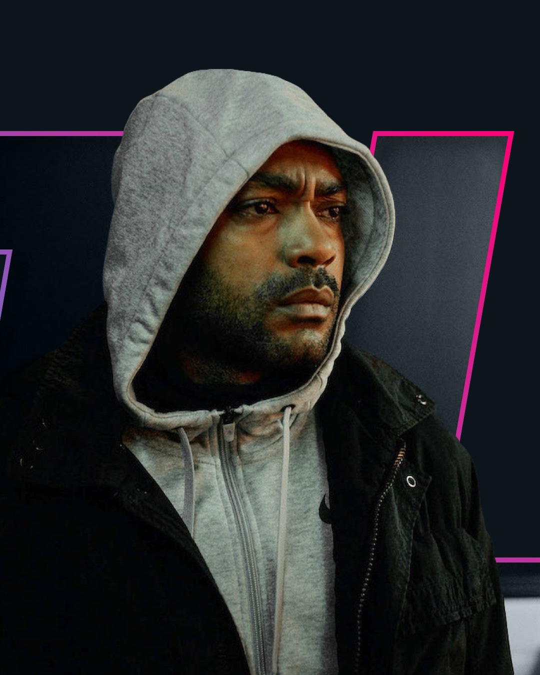
A slightly refined version of the existing logo and palette, leaning on the monogram as a rounded mark, with cut-out imagery of the client list, vivid neon accents and a darker, higher-contrast ground. The least spent, the most recognisable.

Route one lockup
Route one palette
Route one monogram construction
Route one applied to a production still
Route 02

Lighter, warmer

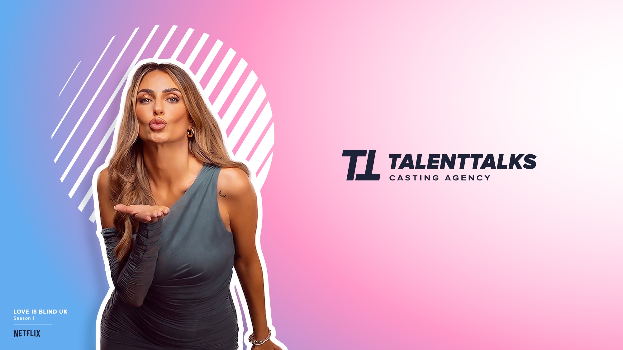
The logo drawn thinner and more legible, the palette moved off the existing colours into pastel tints, and bold typography carrying the weight instead. Spotlight-inspired circular patterns and gradient floods, with cut-out casting imagery over them.

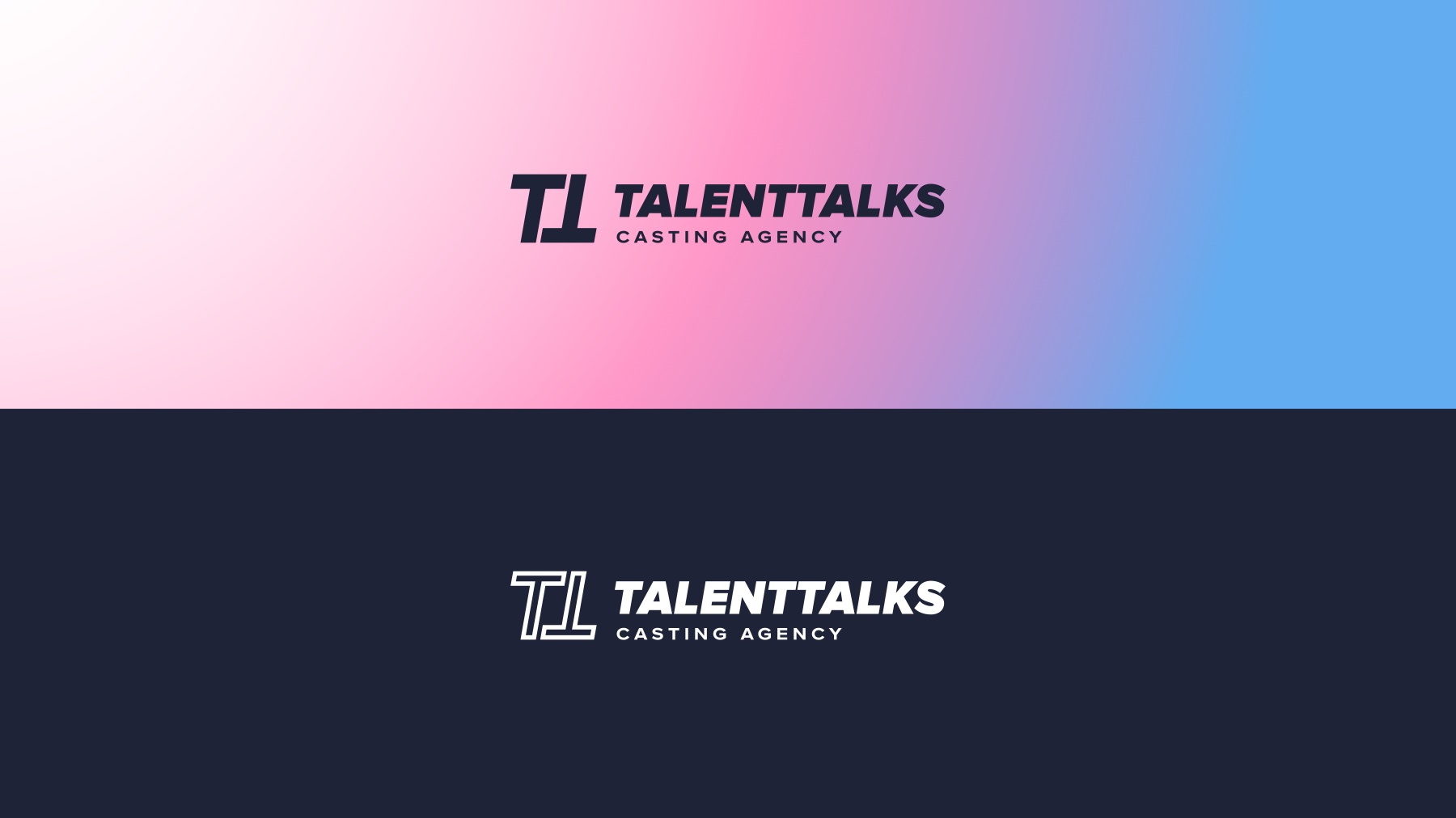
Route two lockup
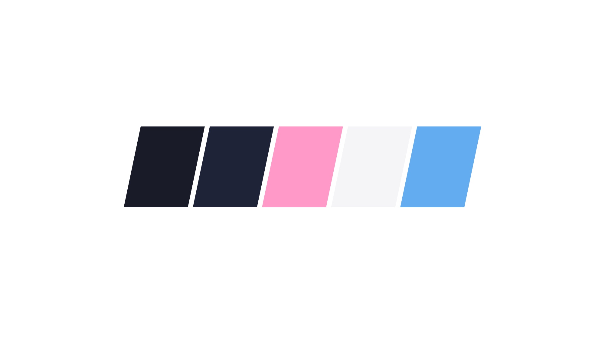
Route two palette
Route two gradient treatment
Route two applied to an editorial frame
Route 03

Prestige, and distance

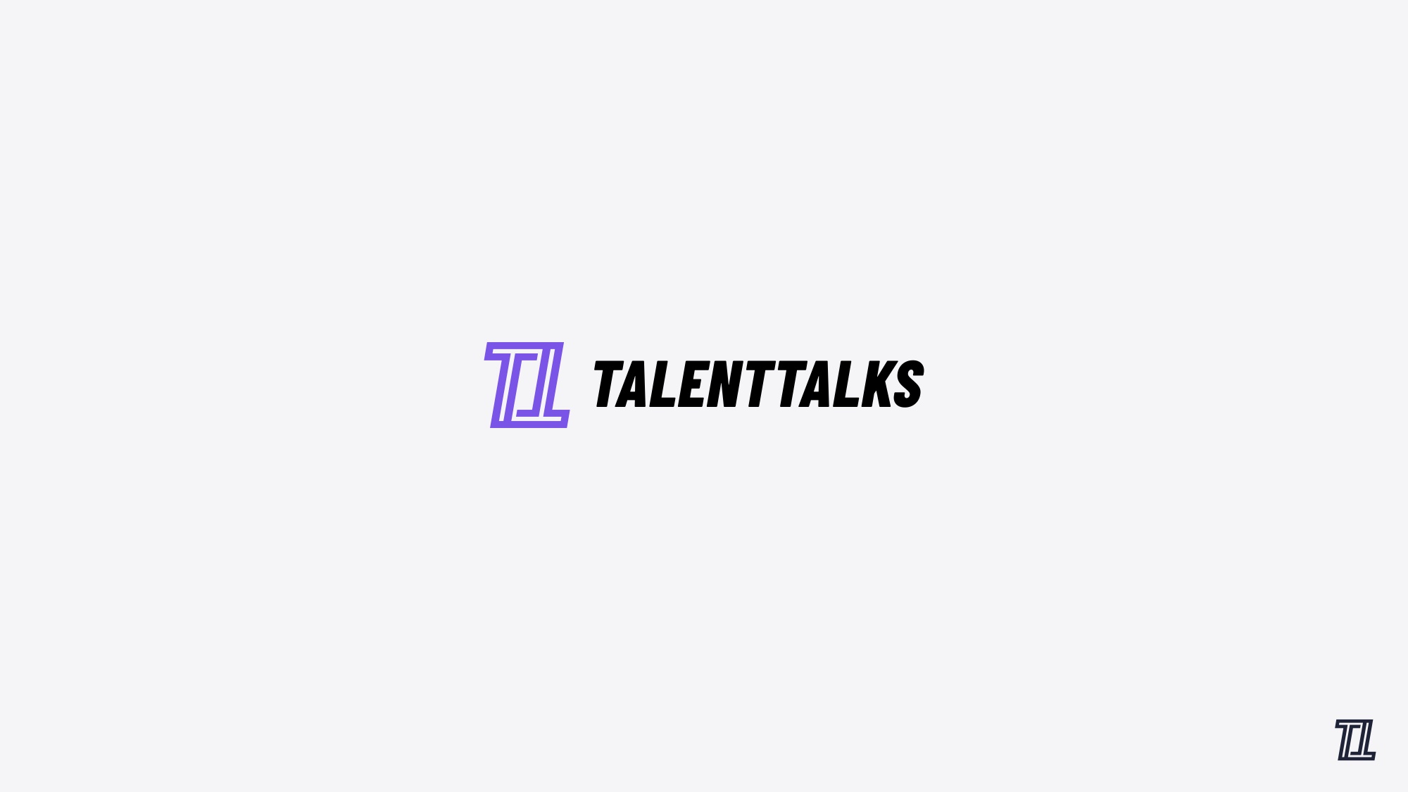
Pink and blue dropped entirely for a single prestigious purple, the monogram refined again with an outline ribbon treatment to make it more distinctive, and subtle gradient flares over a deep navy alluding to stage lighting. The furthest from where the brand started.

Route three lockup
Route three palette
Route three monogram pattern
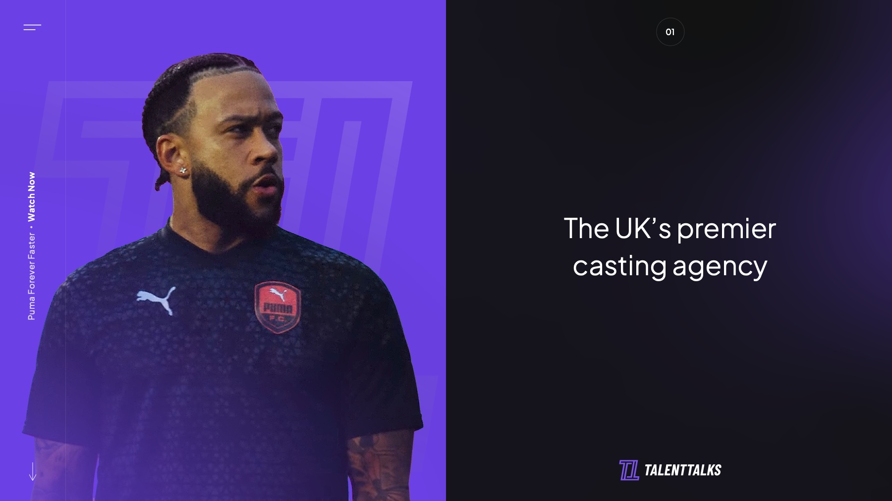
Route three applied to a sport campaign
/03The Identity

The mark people already knew, drawn like it meant it.

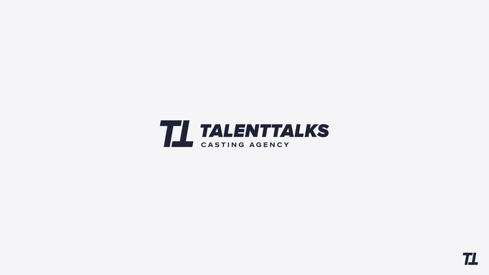
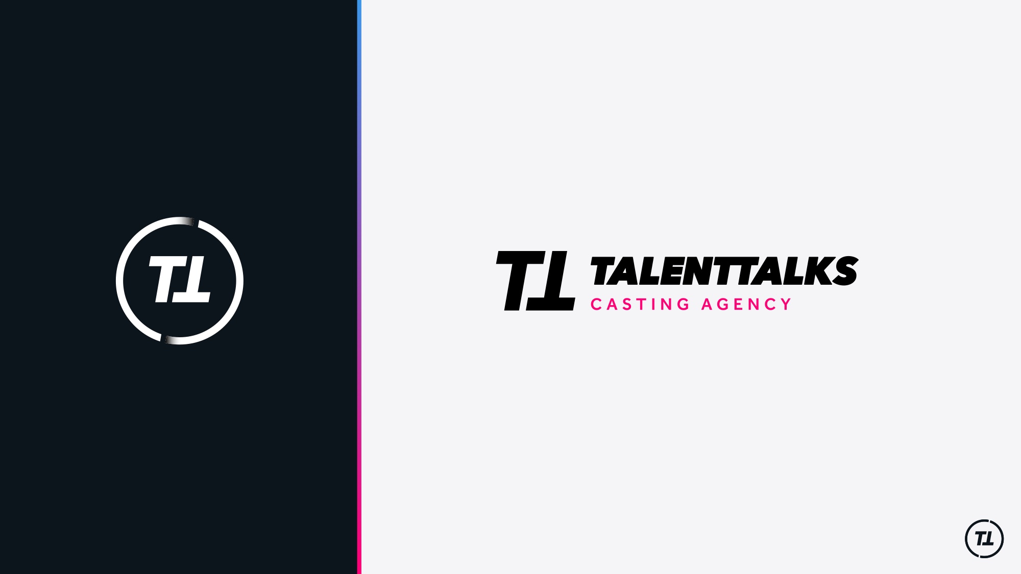
The final the client lockup: TT monogram and wordmark
The TT stays a TT. What changes is the confidence with which it is drawn
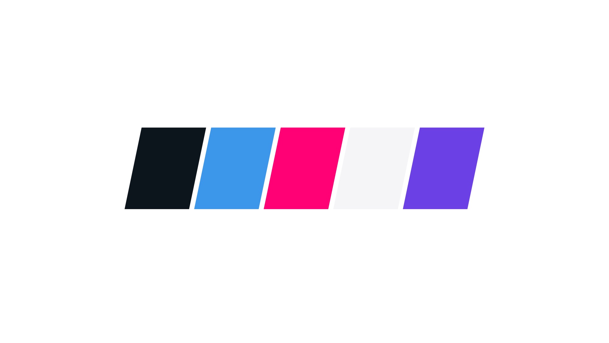
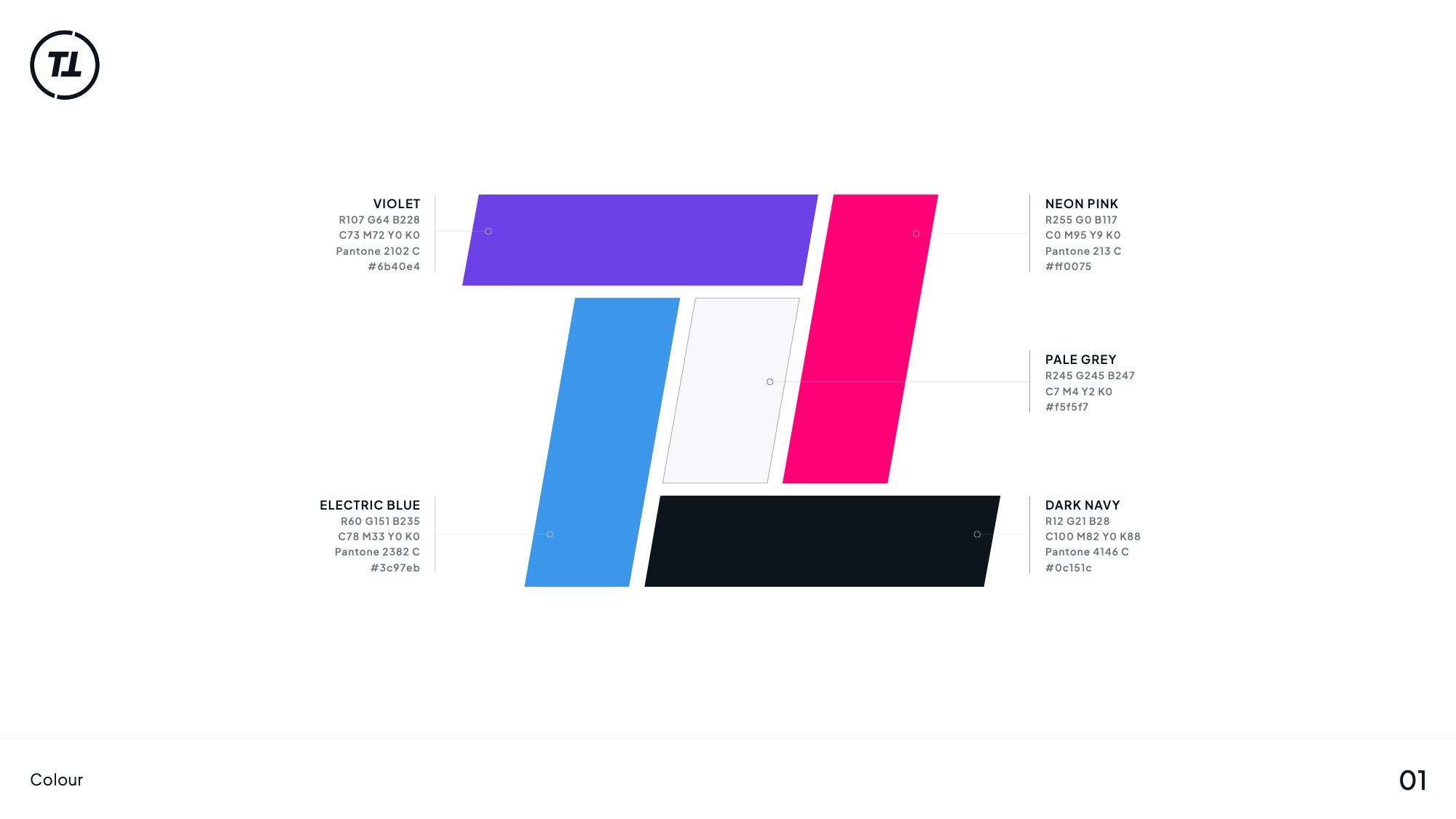
Colour system: electric blue, neon pink and dark navy
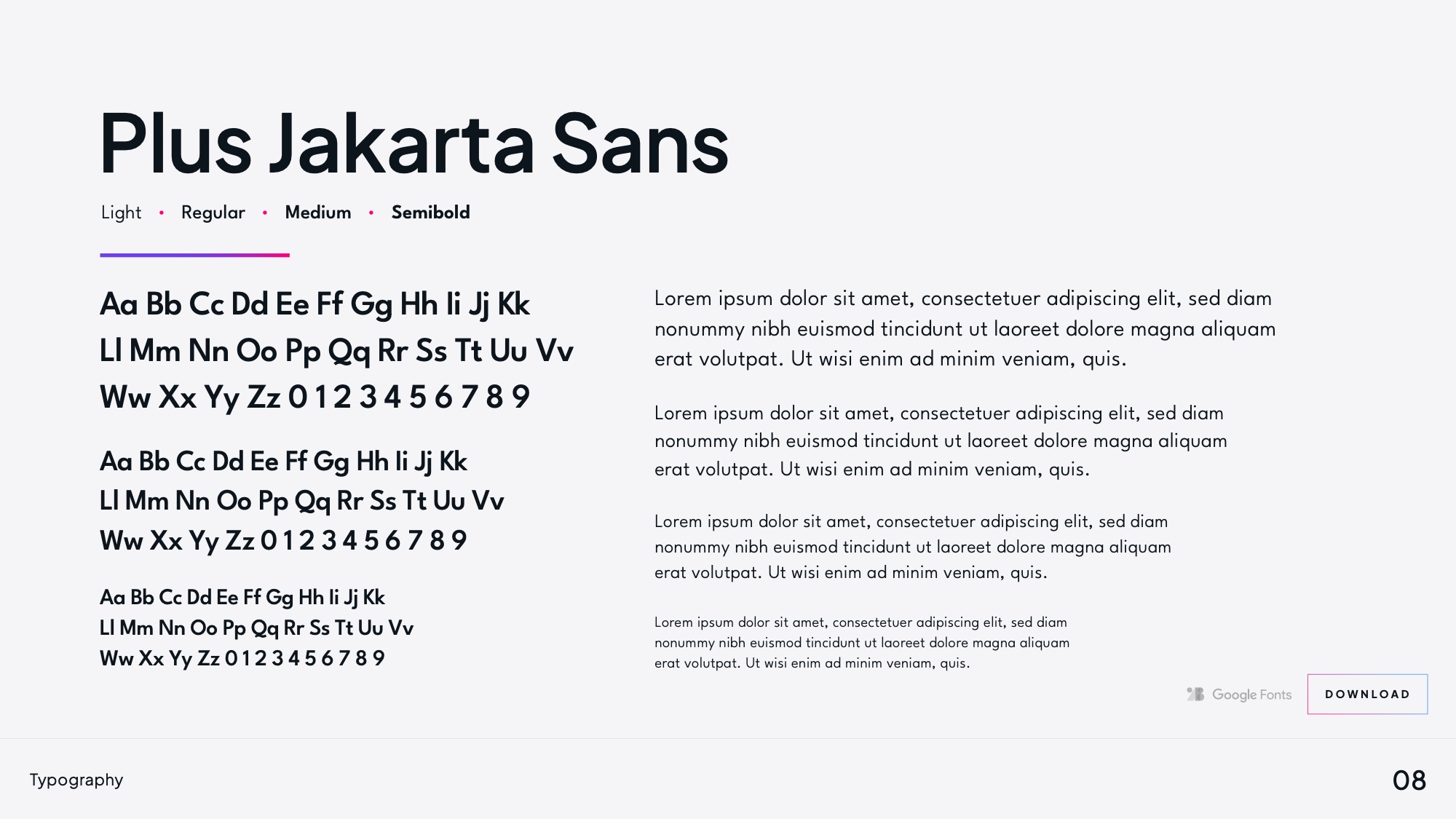
Typography: Plus Jakarta Sans across four weights
Electric blue, neon pink and dark navy, with Plus Jakarta Sans doing the talking. Digital-first, because that is where casting actually happens
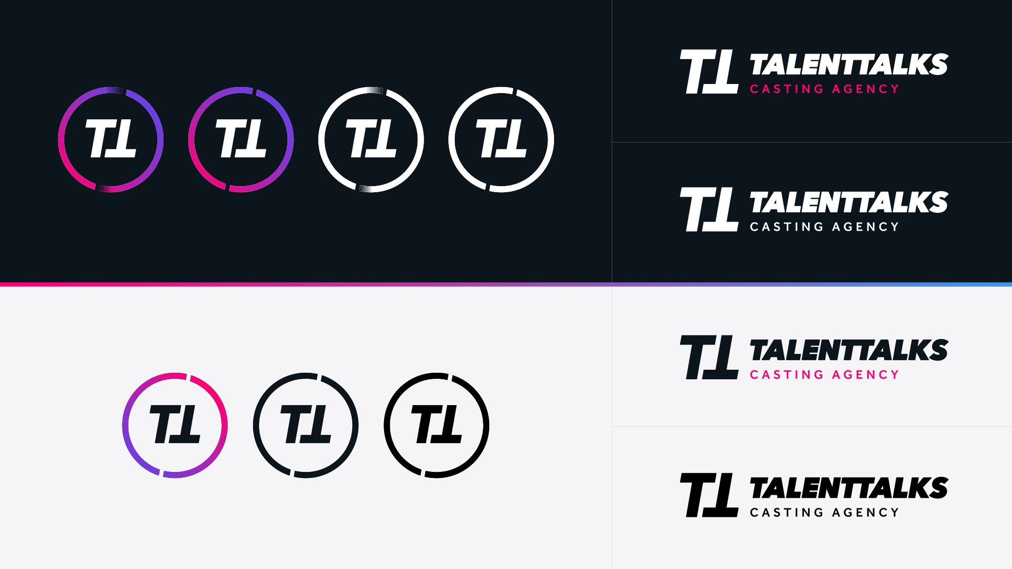
Logo variants across grounds and lockup arrangements
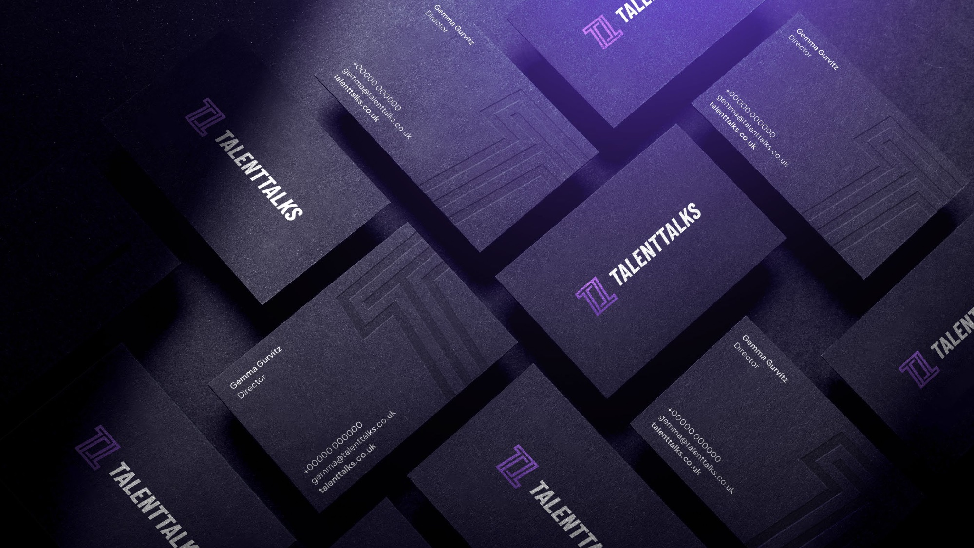
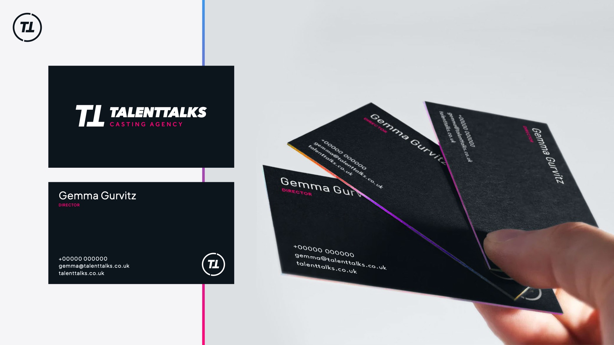
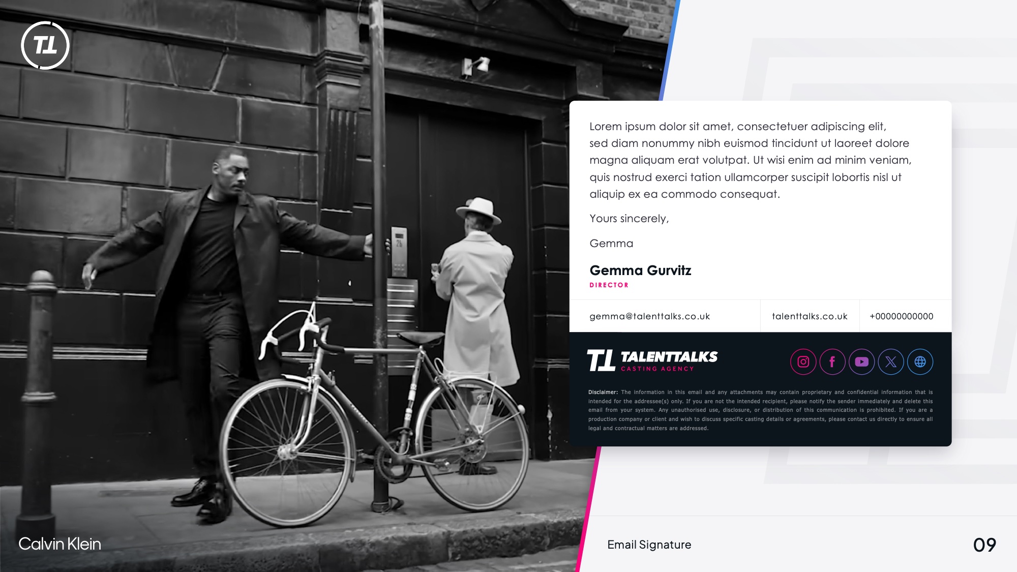
Business cards in dark navy with neon edge
Every permitted arrangement decided up front, because this mark ends up on other people’s call sheets
/04The Proof

The client list is the campaign.

The the client client list set against the monogram pattern
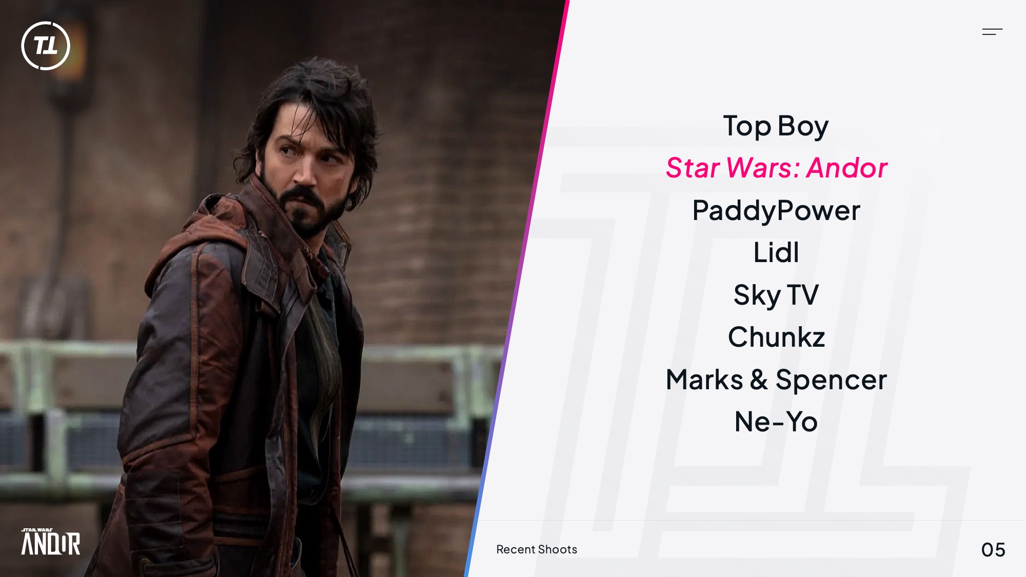
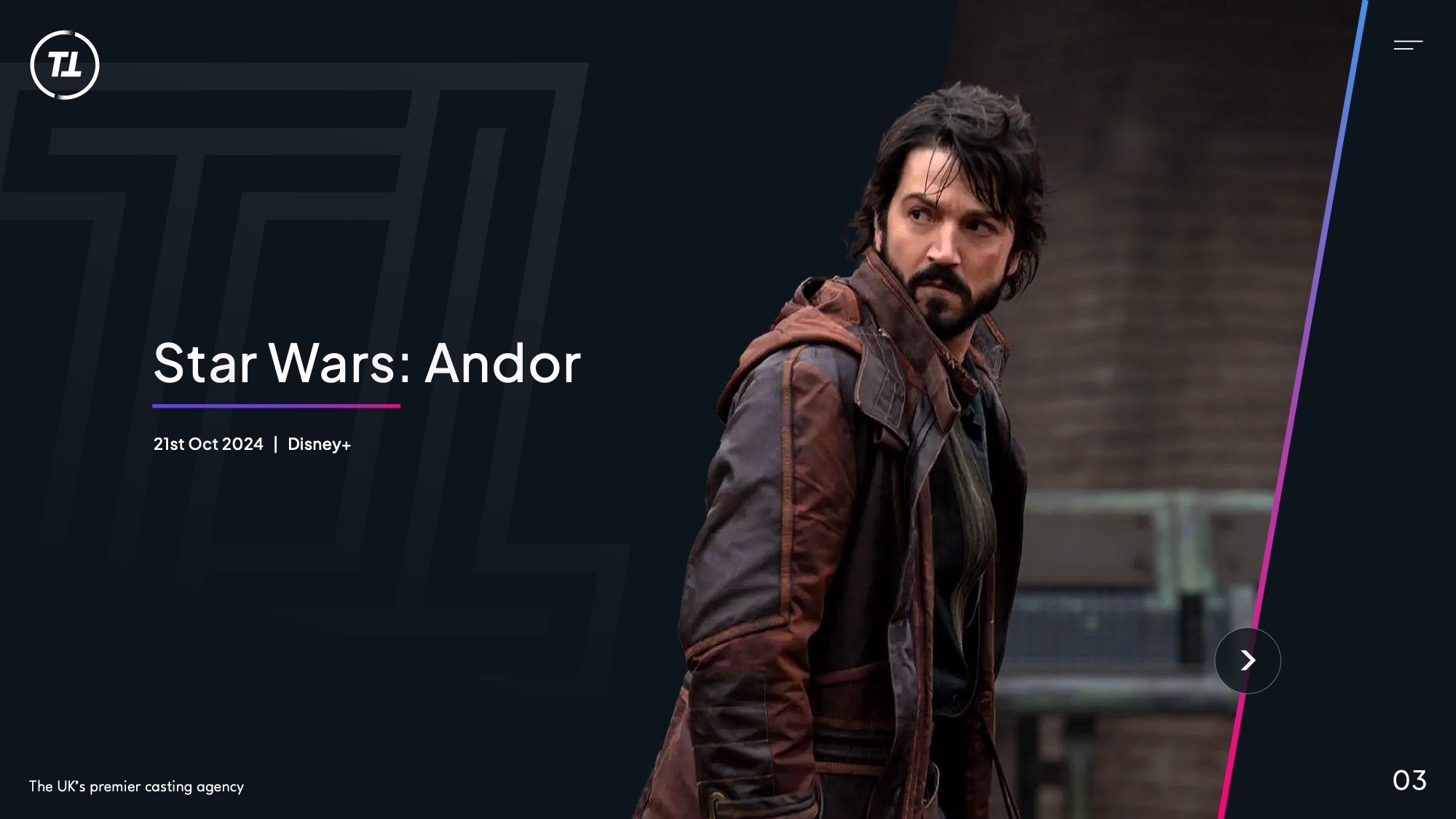
Star Wars: Andor casting still within the brand frame
An agency at this level does not need to describe what it does. It needs to name what it has worked on, and the list runs from Star Wars and Squid Game to Nike, Adidas and the World Cup
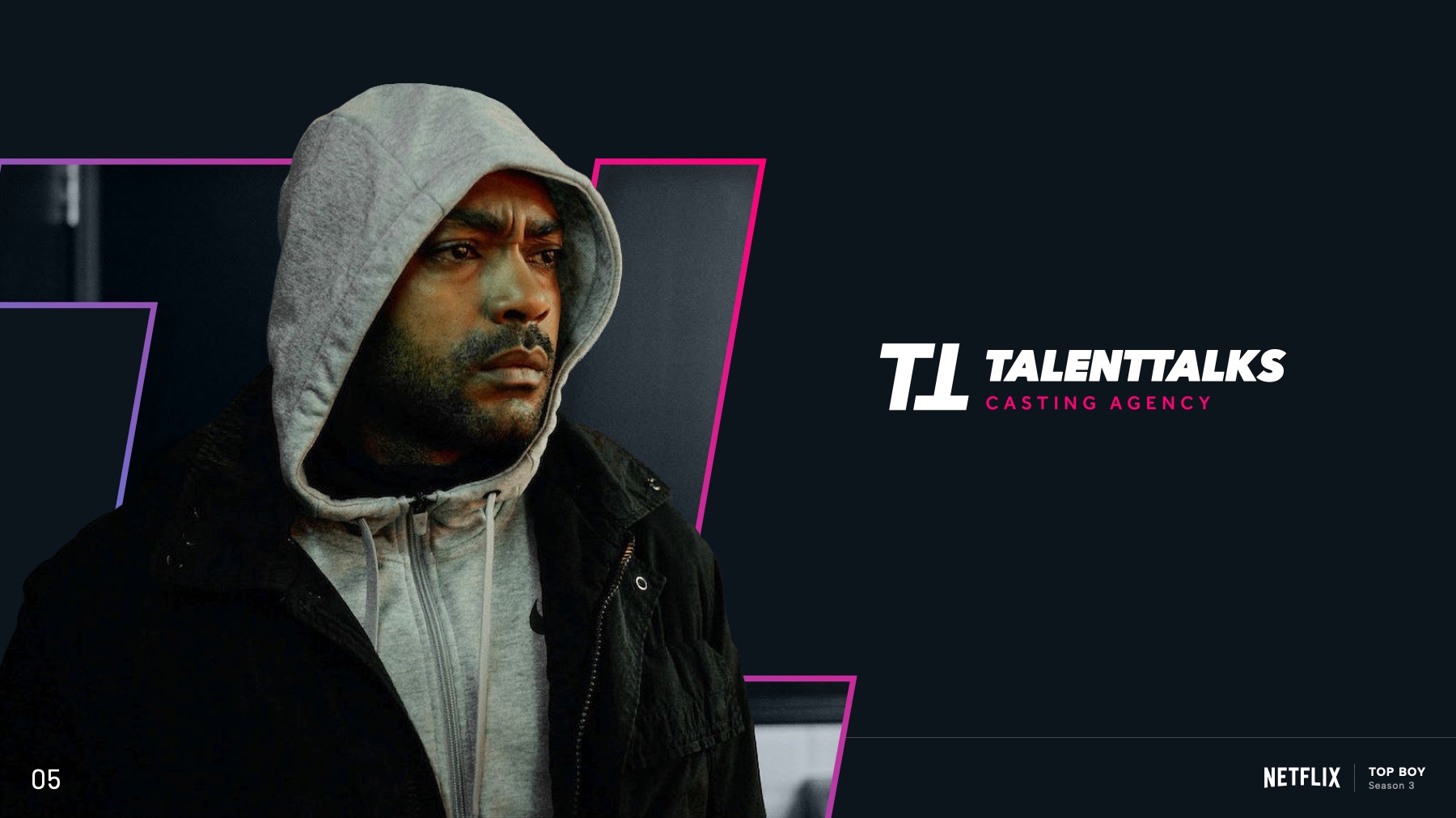
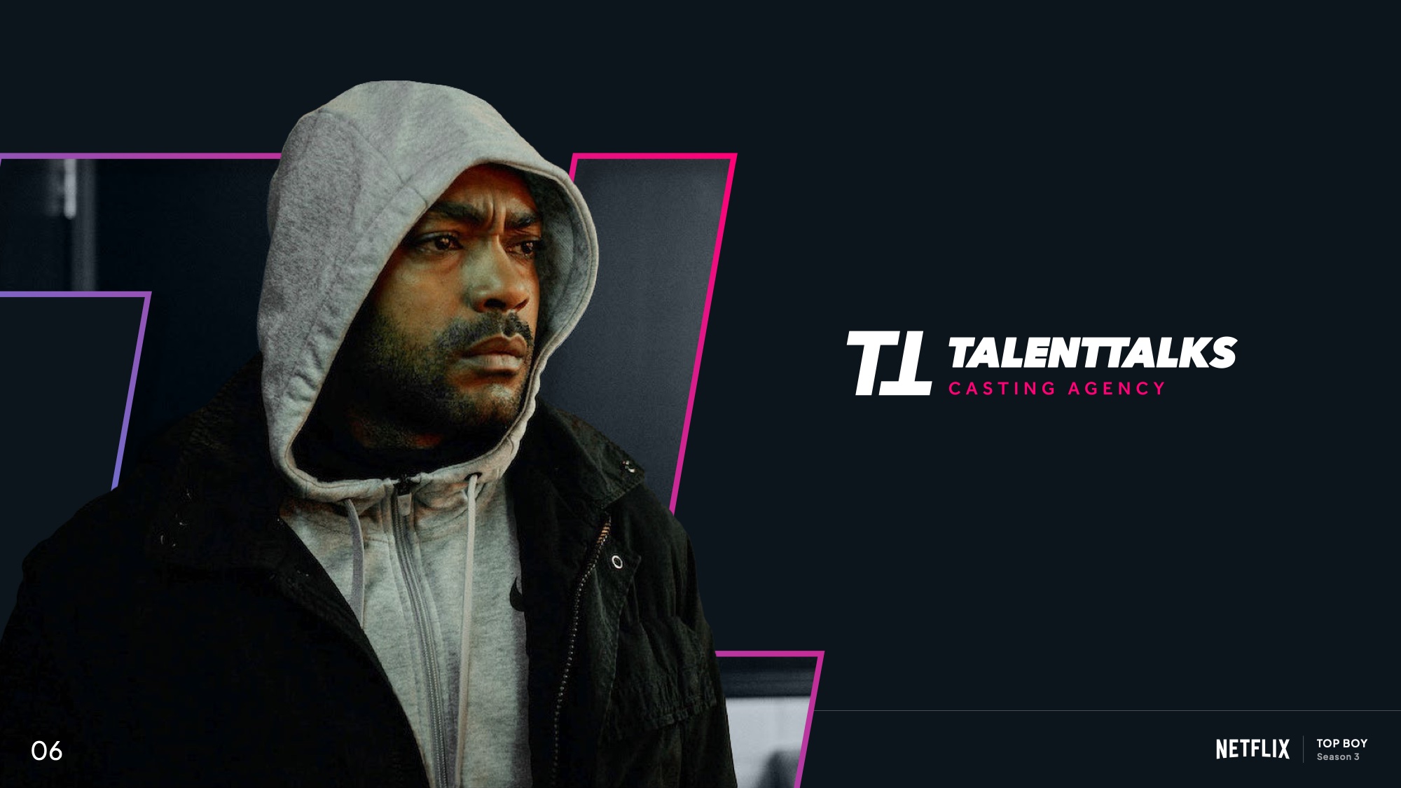
Top Boy casting still within the brand frame
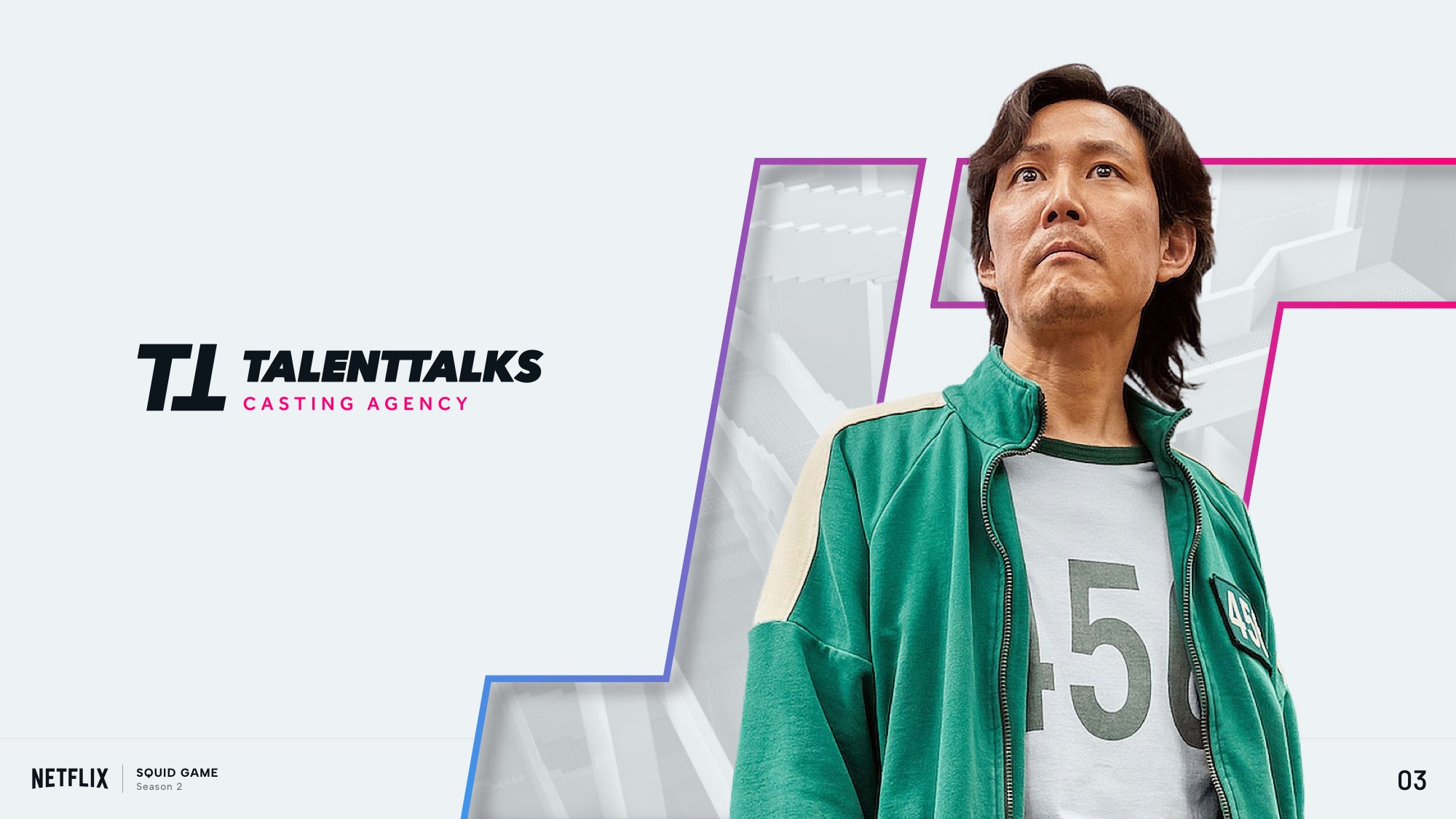
Squid Game casting still within the brand frame
Cut-out treatment so a still from someone else’s production still arrives as the client
Nike, Rip the Script. Cast by the client
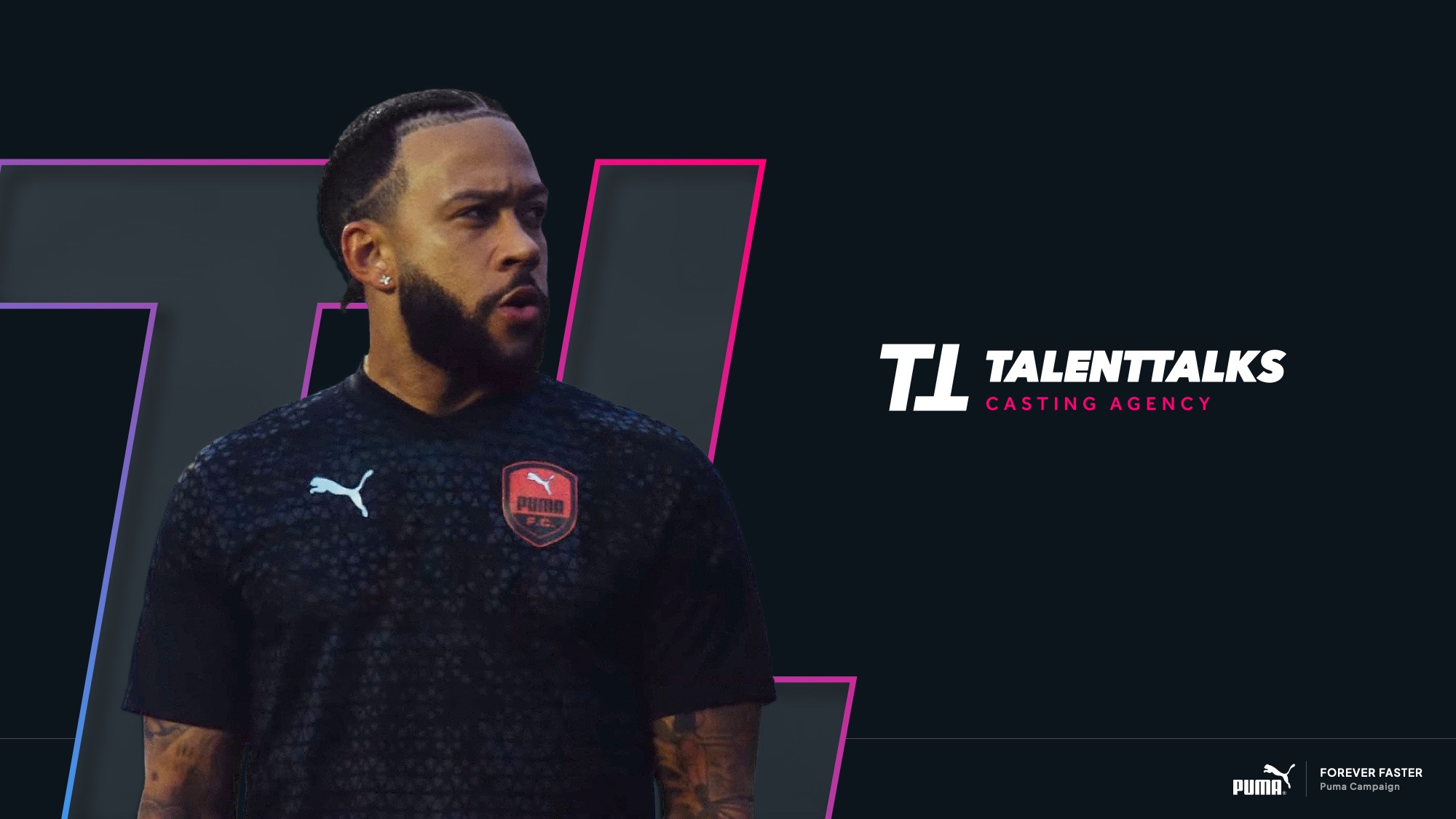
Sport campaign still within the brand frame
Fashion campaign still within the brand frame
Drama, sport, fashion and advertising, held in one system. Idris Elba and the Sidemen sit in the same frame as a World Cup
/05The Website

Two audiences who want opposite things.

Talent wants to be seen. Production wants to find.

Most agency sites try to serve both with one homepage and end up serving neither. Talent arrives wanting to know how to get on the books; a production client arrives wanting evidence and a way to brief. Those are different journeys and they were competing for the same space.

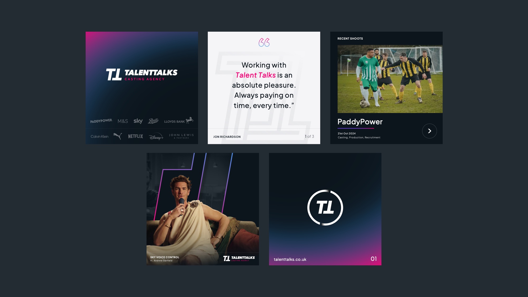
So the redesign splits them from the first screen, then gives each what it actually needs: recent shoots and credits for the client side, a clear sign-up flow for the talent side, and testimonials where they carry weight rather than where they fit.

Website design across desktop and mobile screens
Website design: card modules for talent and production journeys

Three routes were designed and prototyped. Walk the final prototype → The site is in development.

/06Why it matters

Rebranding a leader is a different job to rebranding a challenger.

A challenger can afford to be unrecognisable, because nobody is looking for it yet. A leader cannot. The value already sitting in the mark is the thing most likely to be destroyed by a rebrand, and the temptation to prove effort by changing everything is exactly the trap.

Three routes existed to make that trade-off visible rather than aesthetic. What got chosen was the version that keeps the recognition and spends the effort on confidence instead.

01Brand Strategy
02Identity Routes
03Logo & Monogram Refinement
04Colour & Typography
05Brand Guidelines
06Website Design
WhatsApp