One company. Two audiences that must never see the same brand.
BrandStak sells to retailers and to the people who shop with them. Those are opposite conversations, and most platforms pick one and lose the other. We built an identity that runs in two registers without becoming two companies.
Truly integrated retail.
BrandStak was a venture-backed platform trying to close the gap between physical retail and everything digital that now sits around it. Our founder joined as part of the founding delivery team, which meant the brand and the product had to be worked out at the same time as the pitch that funded them.
That is a specific kind of job. Investors need to see a category leader. Retailers need to see infrastructure they can trust. Shoppers need to see something they would actually use. All three had to come out of the same identity, in the same quarter.
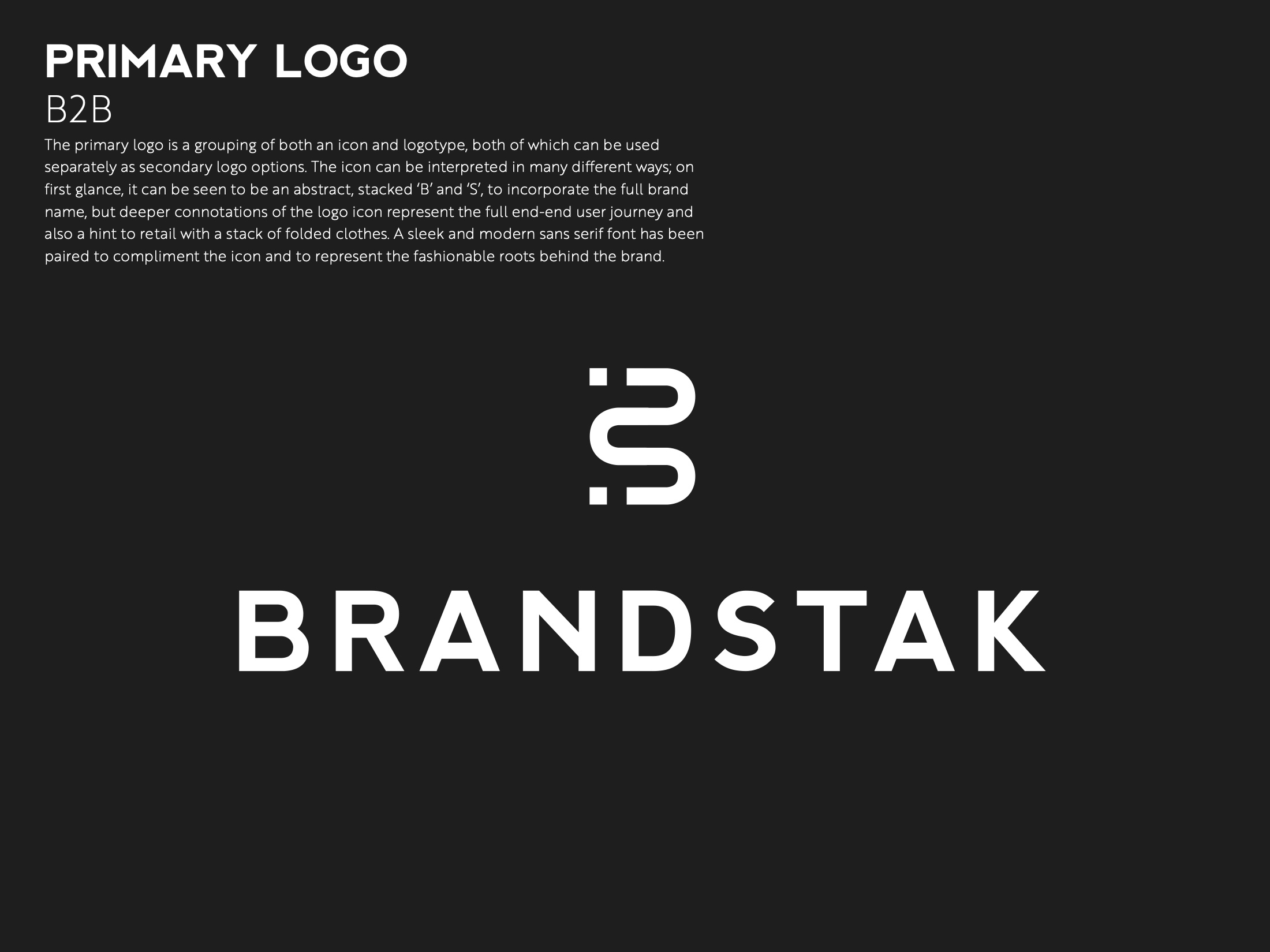
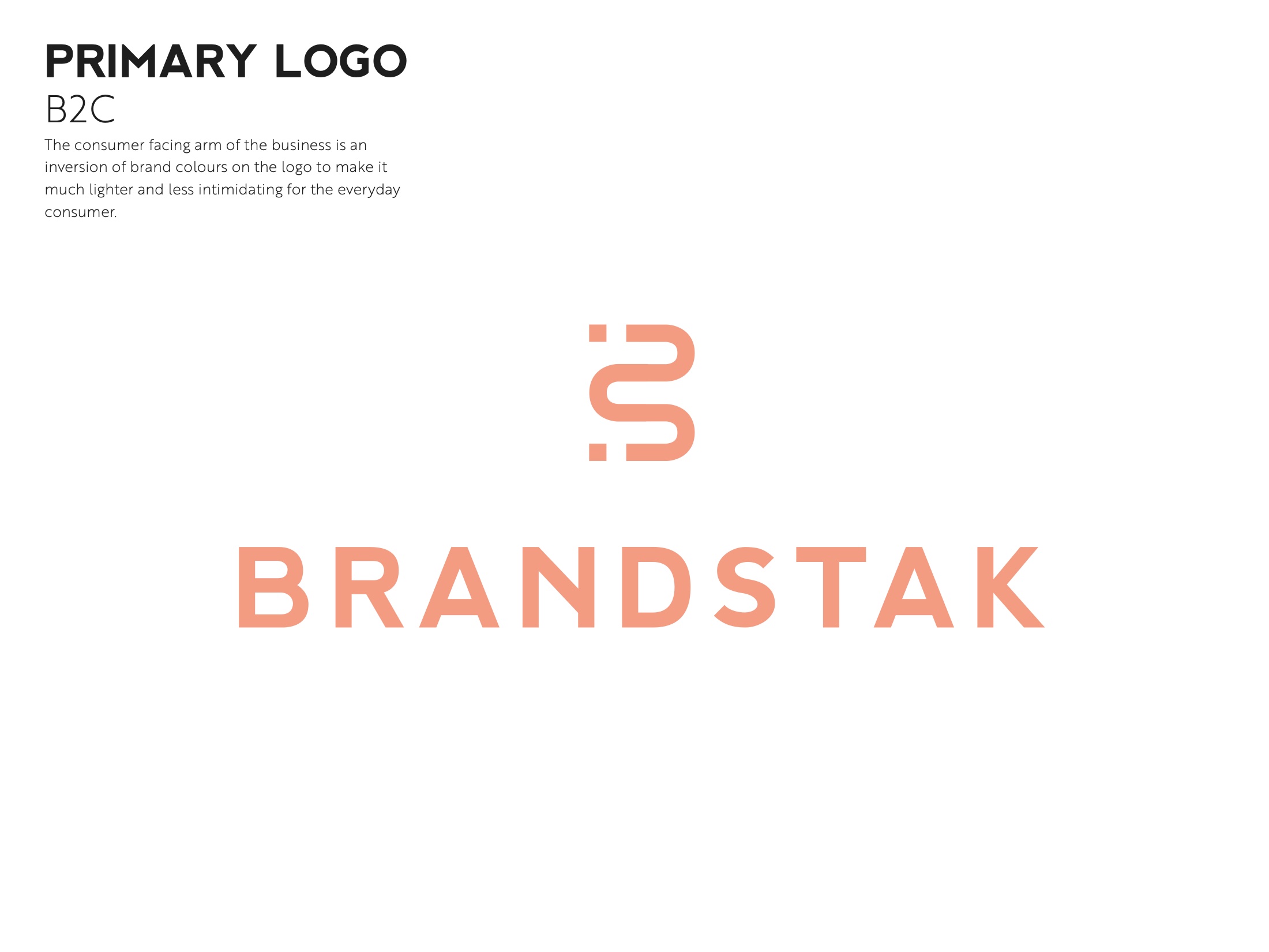
A B2B lockup and a B2C lockup, from one mark.
The system carries two primary logos. The B2B lockup runs monochrome and structural — the register of a supplier being evaluated on a spreadsheet. The B2C lockup takes the coral and the softer setting, because a shopper is not evaluating anything, they are deciding whether they like it.
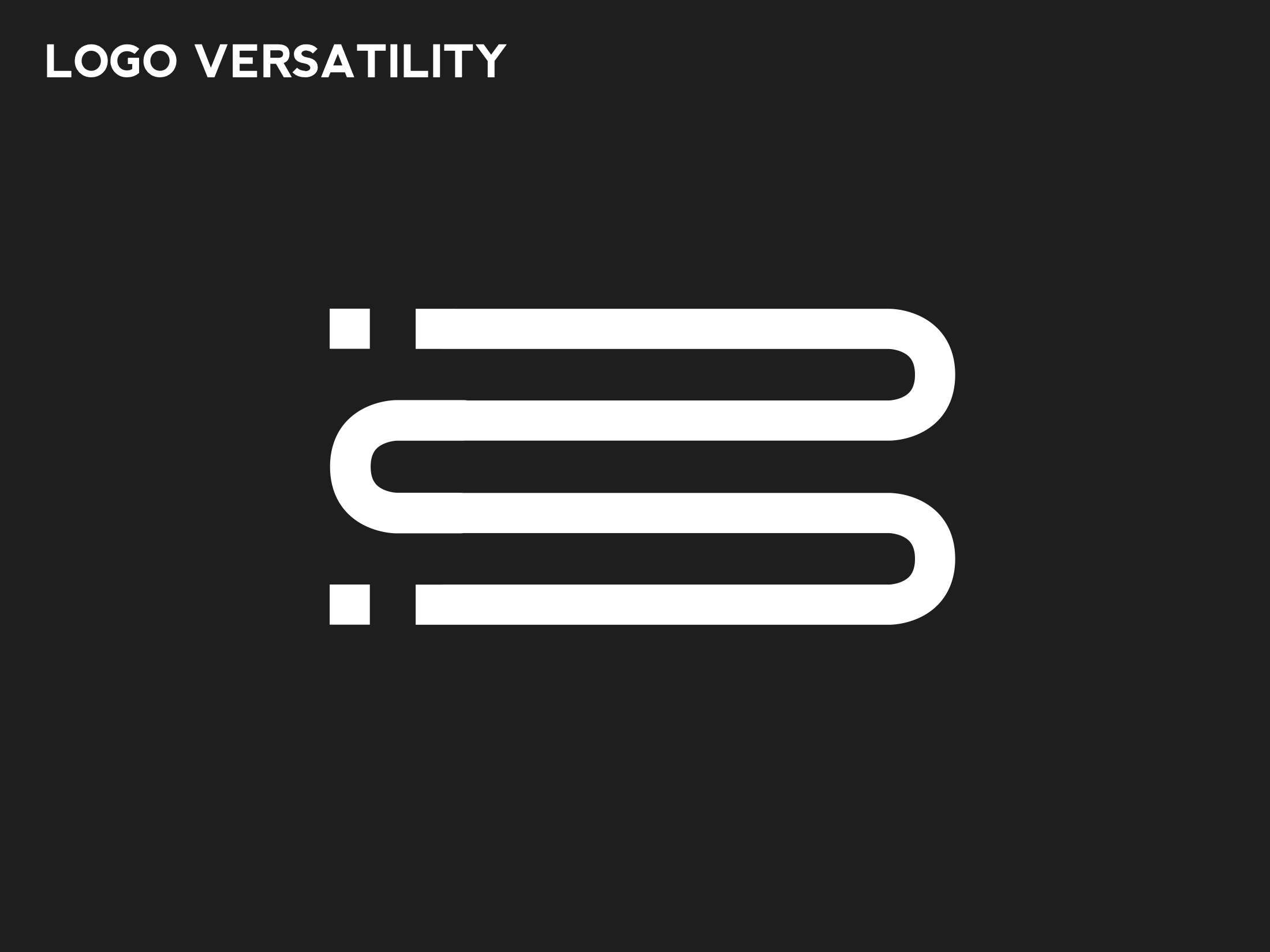
Both are built from the same monogram: stacked linked forms that read as layers, which is exactly what the product does to a retail stack. Splitting the lockup rather than the mark is what stops this becoming two companies with a shared investor.
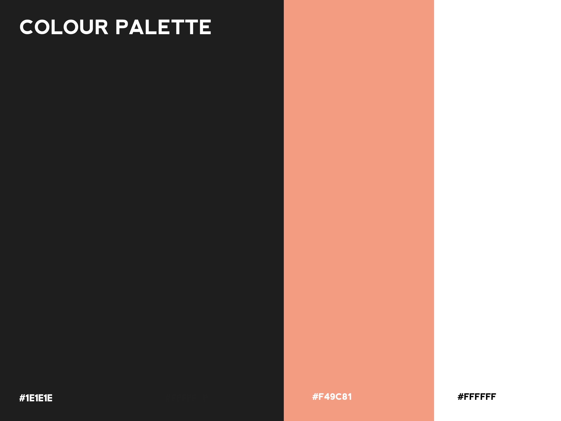
A three-colour palette is a discipline, not a limitation — it is what lets one identity carry two registers without drifting.
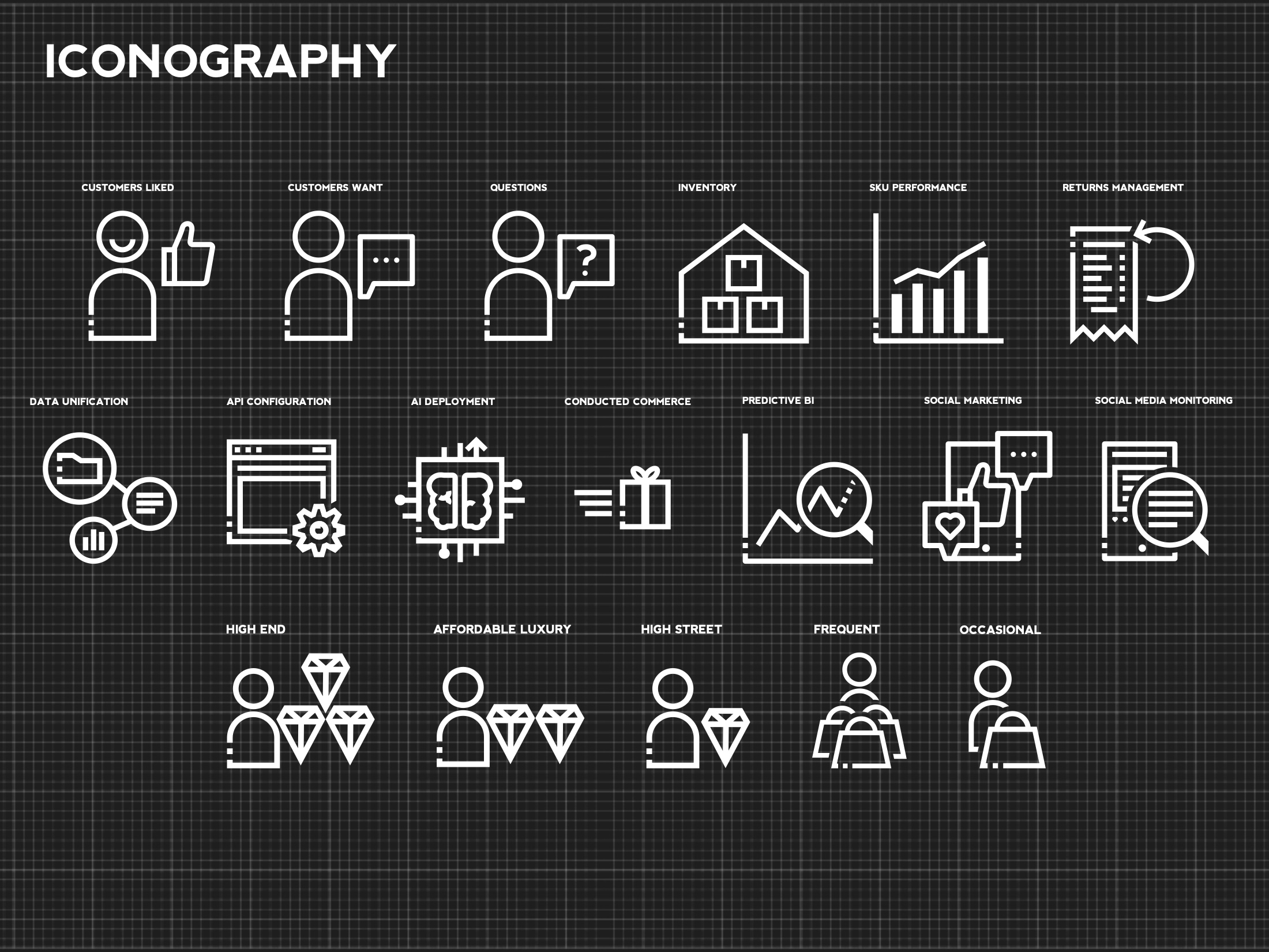
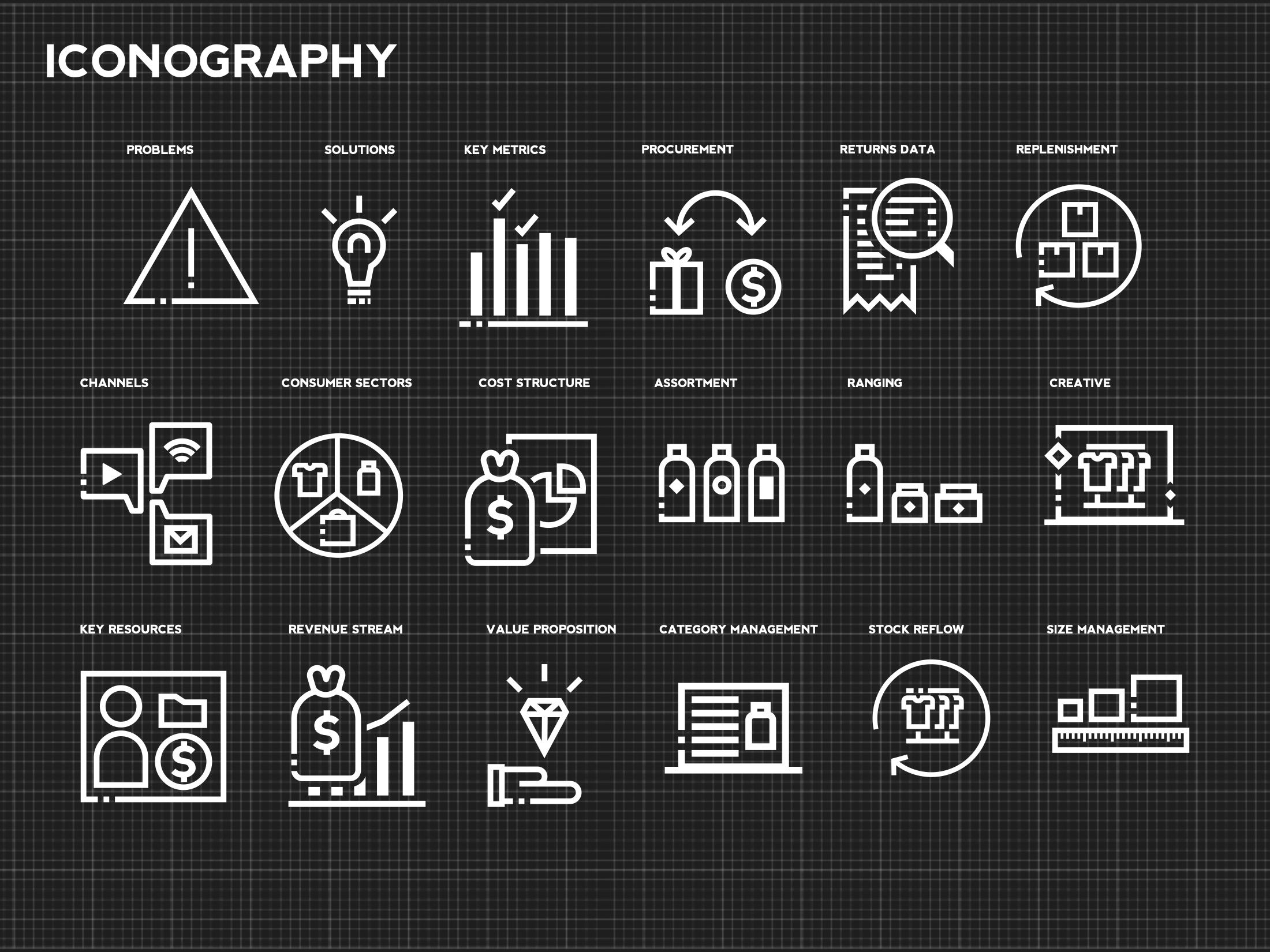
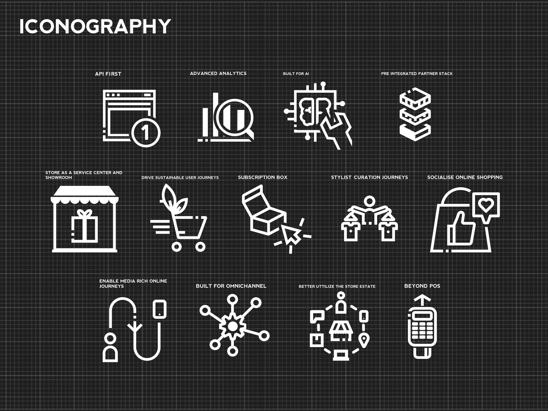
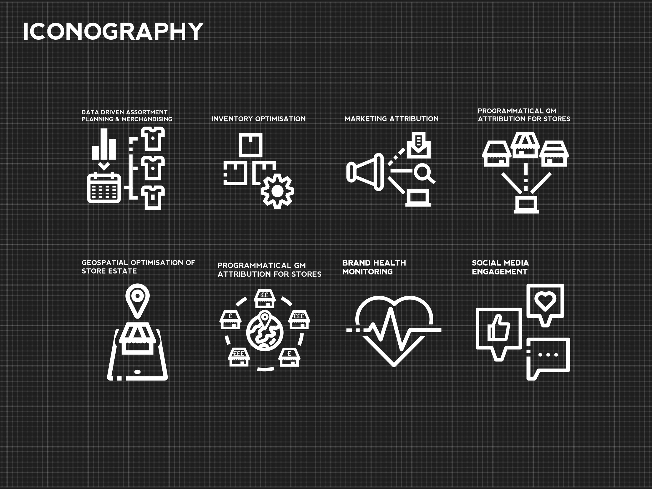
A platform brand lives or dies on its icon set.
Software brands get judged inside the product, where the logo barely appears. What people actually see, hundreds of times a session, is iconography. So the set was drawn as a system rather than sourced — one stroke weight, one corner logic, one grid, across stock, logistics, payments, analytics, marketing and store operations.
Eighty-nine pages of wireframe, before a pixel of design.
The website and platform were wireframed end to end first — navigation, dashboards, product pages, the flows between them. Greyscale, no typography decisions, nothing to argue about except whether the thing works.
On a founding team that sequence is the difference between a brand that decorates a product and a brand that describes one. It also makes the investment deck honest: you are showing a system, not a mood board.
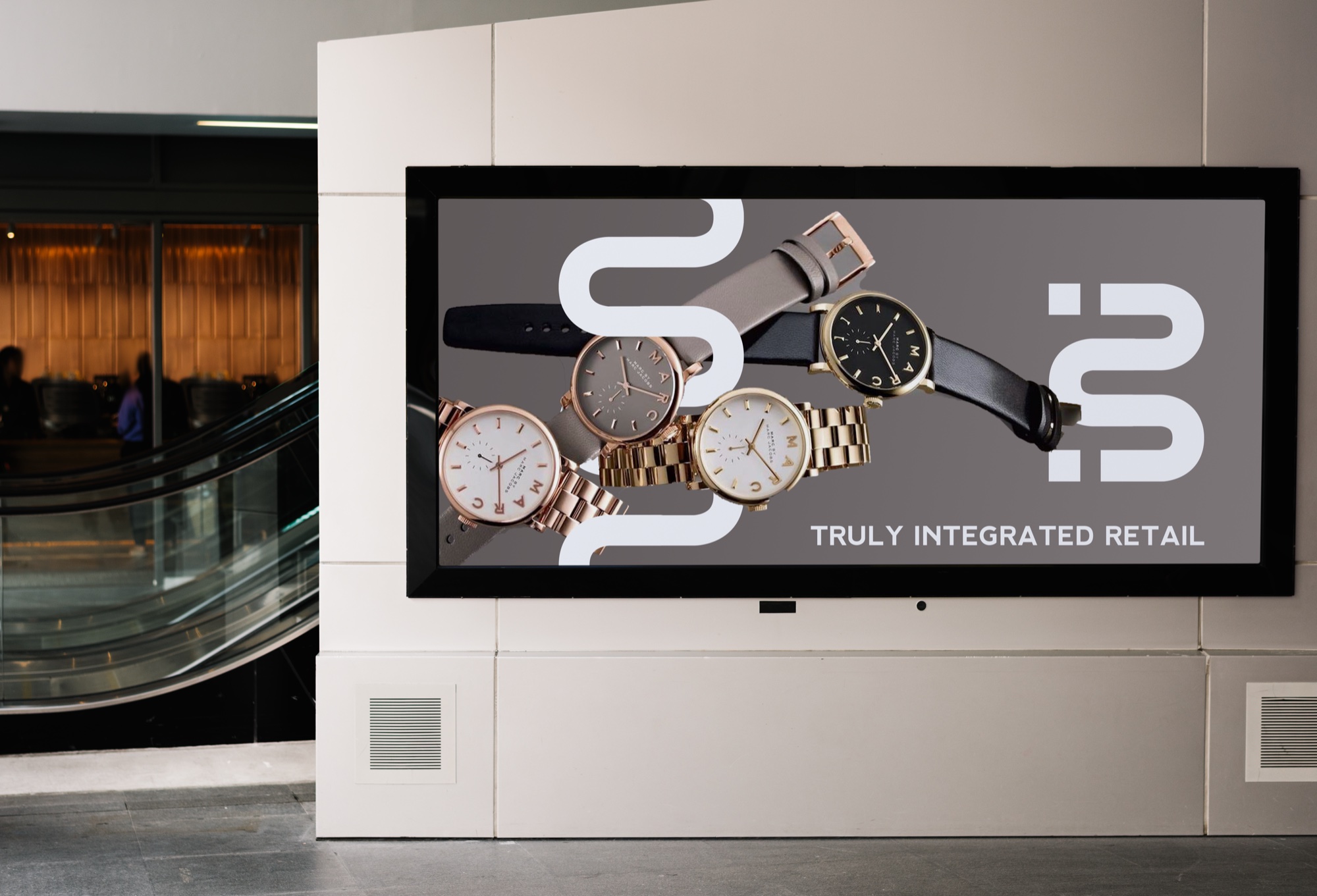
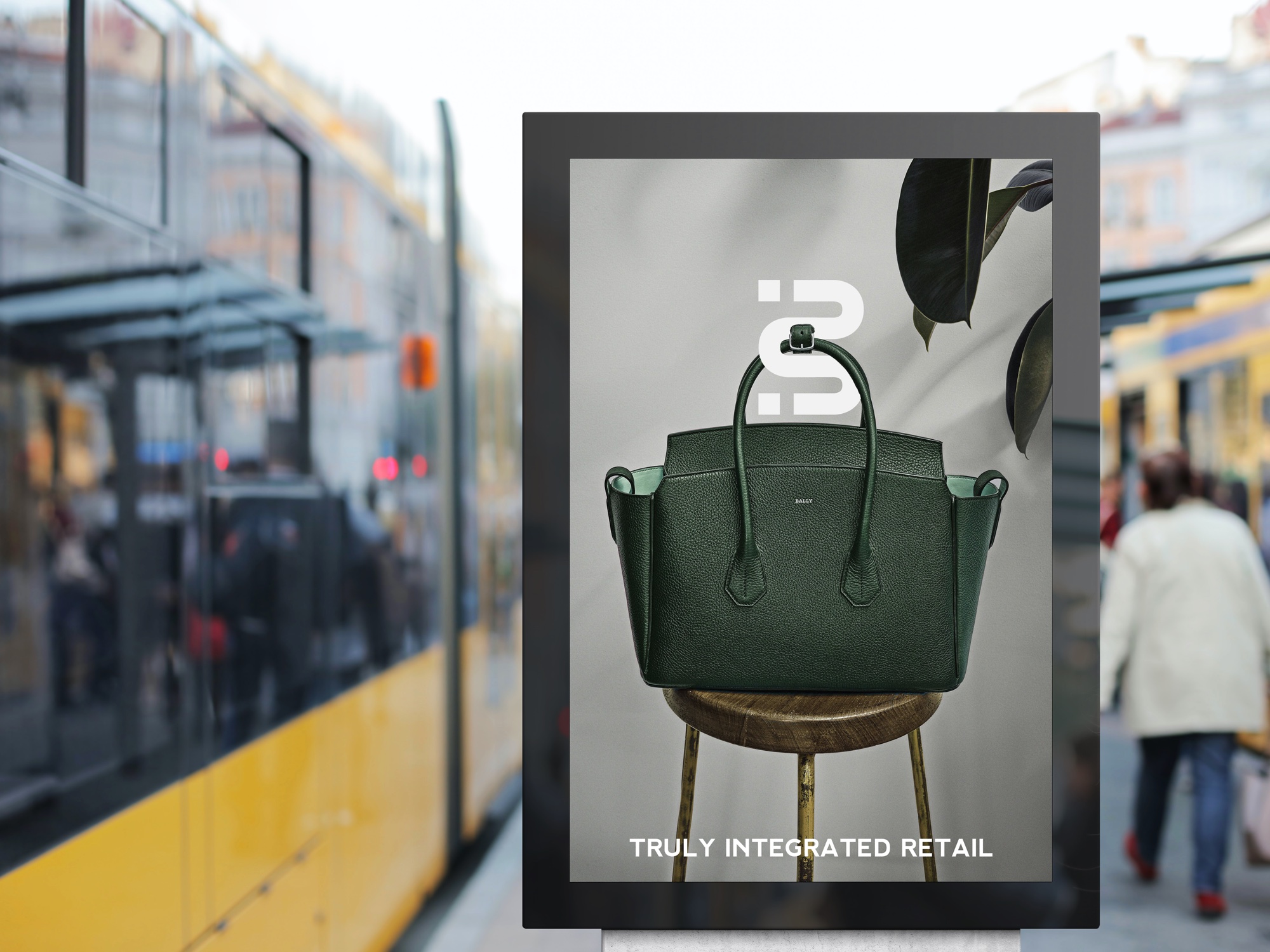
The test of a three-colour system is a bus shelter at forty miles an hour.
Out-of-home and social were built from the same three colours and the same monogram. Nothing new was invented for the campaign, which is the point — if a system needs a new element every time it meets a new format, it was never a system.


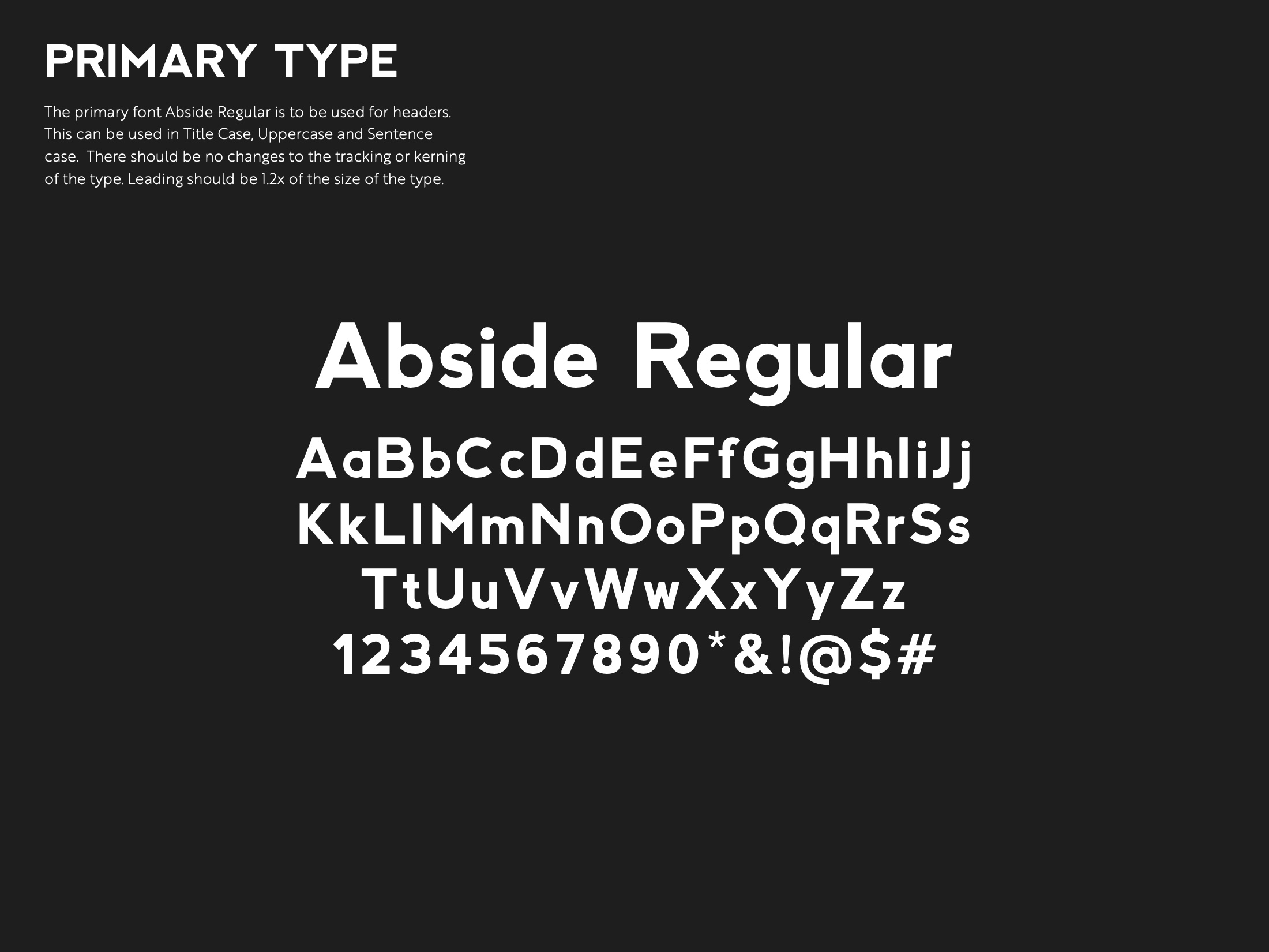
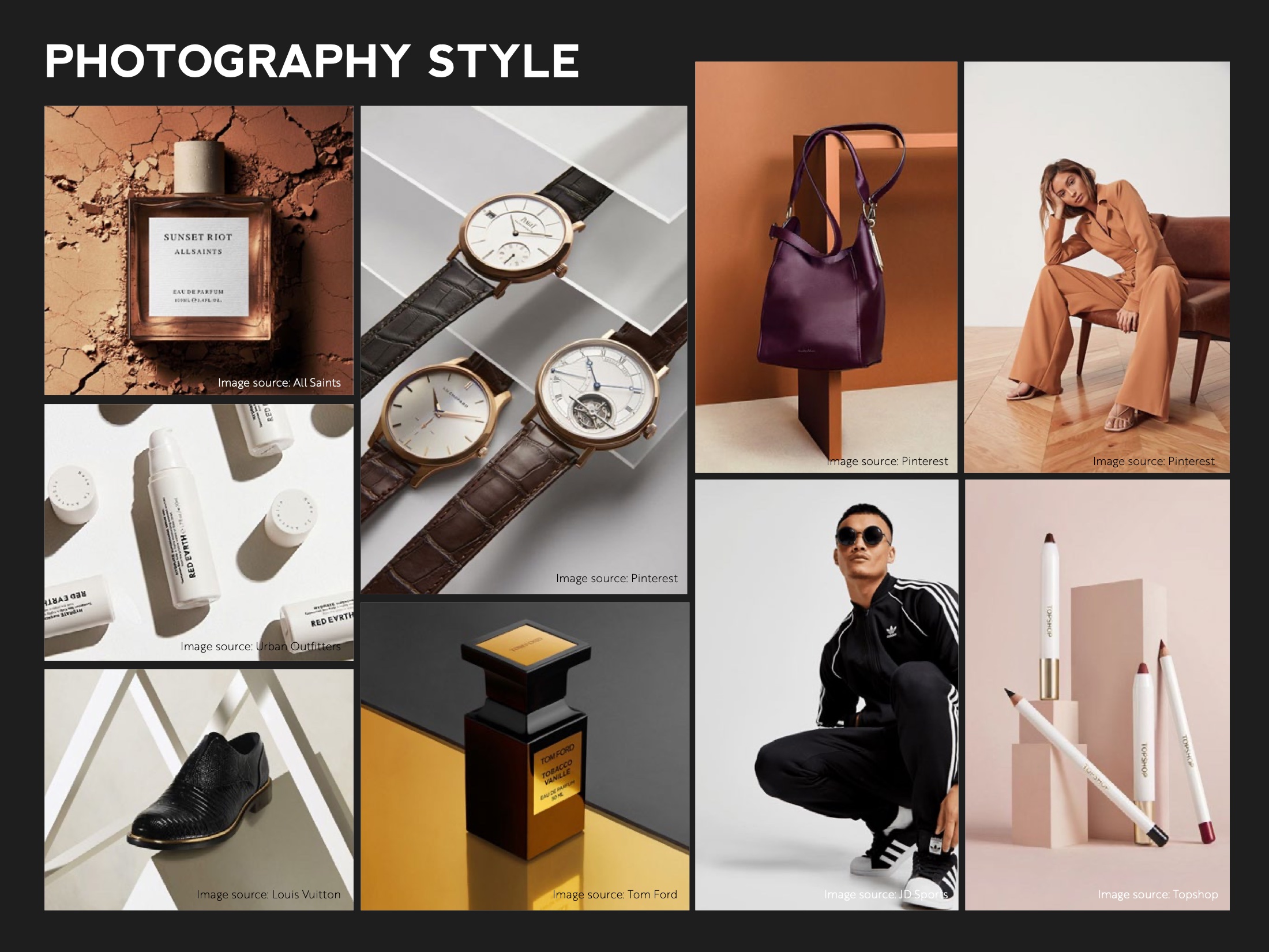
Abside Regular and Brother 1816 Thin · photography on warm neutrals so product and people sit in one world.
Brand and product, built in the same room, at the same time.
BrandStak · Brand Guidelines 2021
Our founder was part of the founding delivery team · delivered at Jensen & Jensen.