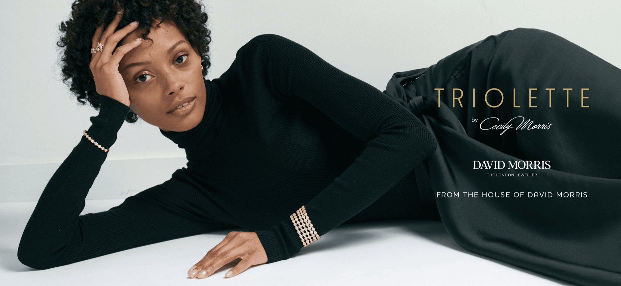
✱ Case 01JewelleryLondon
Heritage, refracted.
A global visual identity for Triolette, the next generation of the House of David Morris.
AndMelo understood my vision for Triolette from the very beginning. They created a world in which Triolette can live confidently, both within the house and on its own.
Cecily Morris · Global Brand and Retail Director, David Morris
A global visual identity for the next generation of David Morris.
David Morris is a three-generation London jeweller with 180 New Bond Street at its heart: a house that has dressed royalty, red carpets and the Bond franchise. Triolette was Cecily Morris’s debut collection, and AndMelo’s founding engagement.
The brief: build the global visual identity for a collection designed to be more approachable than the house’s fine jewellery, without conceding an inch on craftsmanship. Six weeks, worldwide rollout.
Built from scratch: the mark, the motif system, the typography, the palette, the packaging and the campaign, then handed over as one identity that runs the same in a Mayfair window as it does on a phone in Dubai.
Triolette wasn’t just launching in London. It was launching in the Middle East too, in Dubai and Abu Dhabi, and that duality was the brief.
It had to sit inside London’s quiet luxury and the Middle East’s more opulent register at the same time, without becoming two brands.
So we made it confident and inherently David Morris, then brought a modernity to it: an approachable set of contemporary pieces carrying decades of David Morris craftsmanship. On that timeline there was no room to wander, so we ran a rigorous conceptualisation, landed three creative routes, and refined to the one Cecily felt represented her and Triolette without translation.
Myles JensenFounder · AndMelo
One cut, drawn as a system.
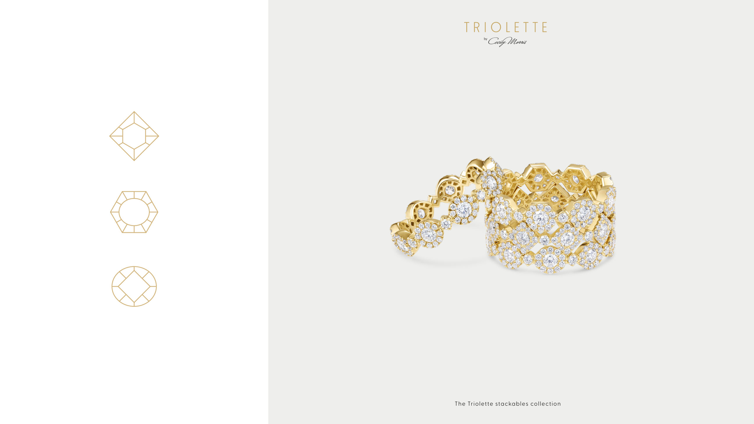
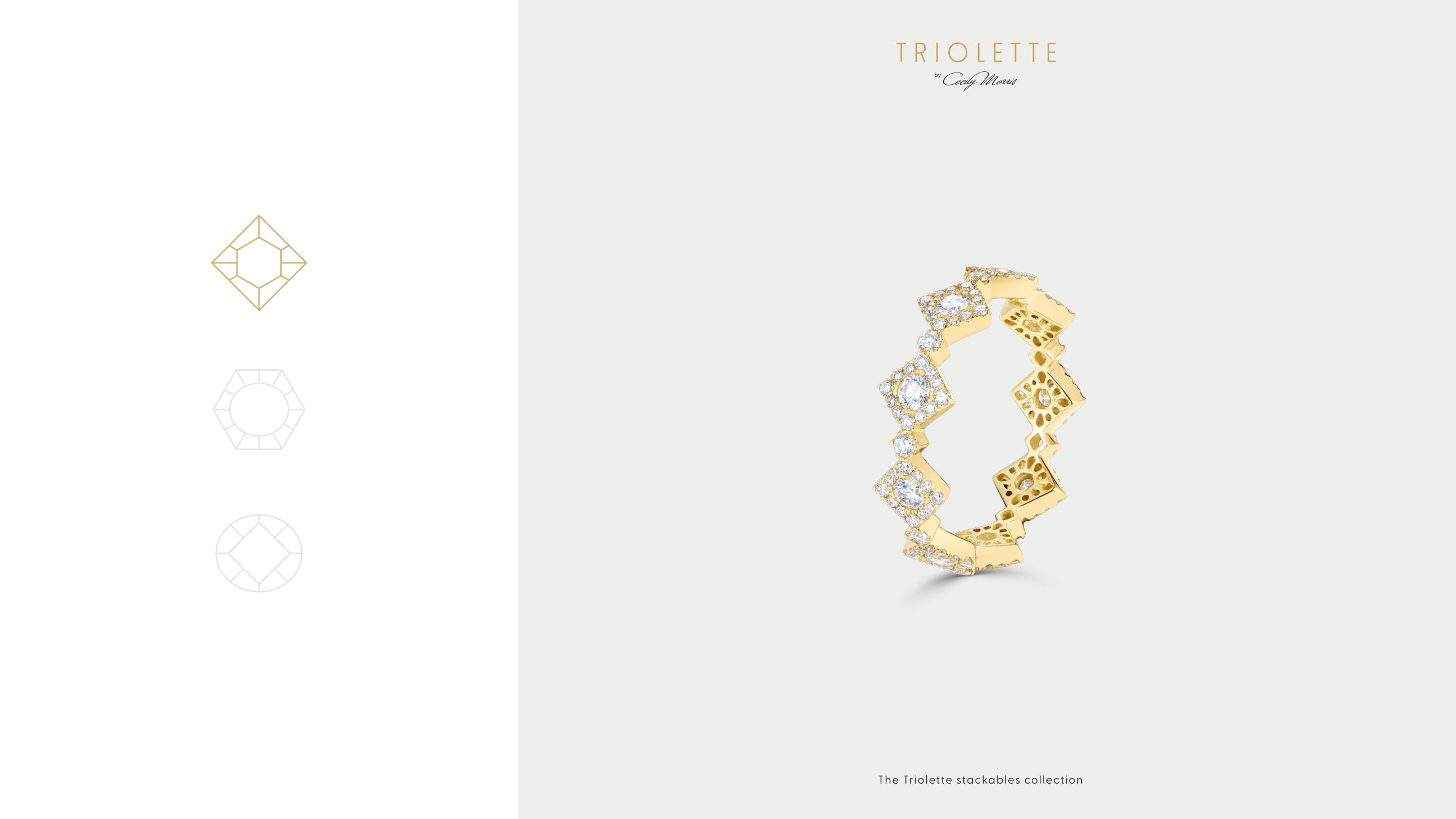
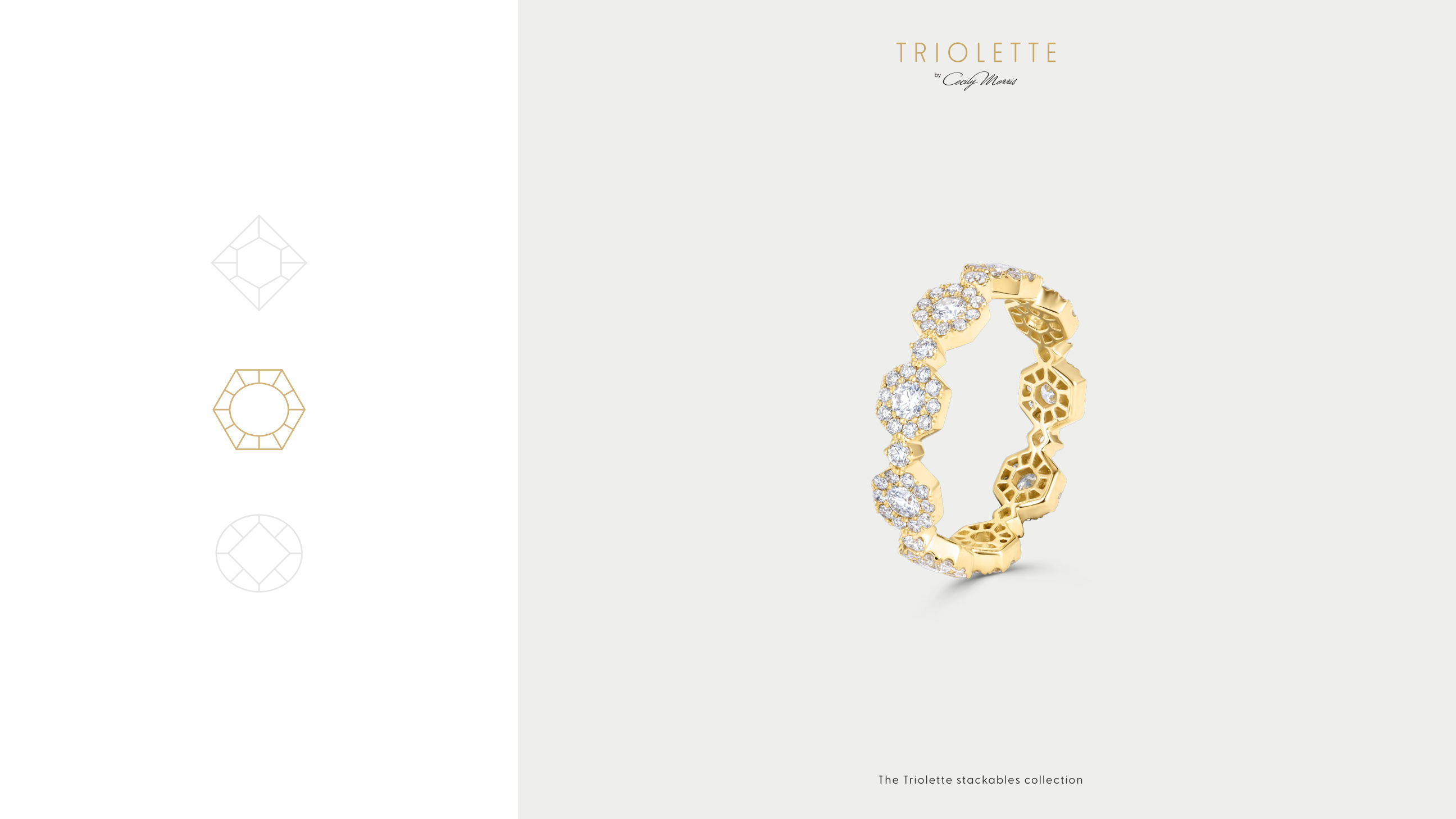
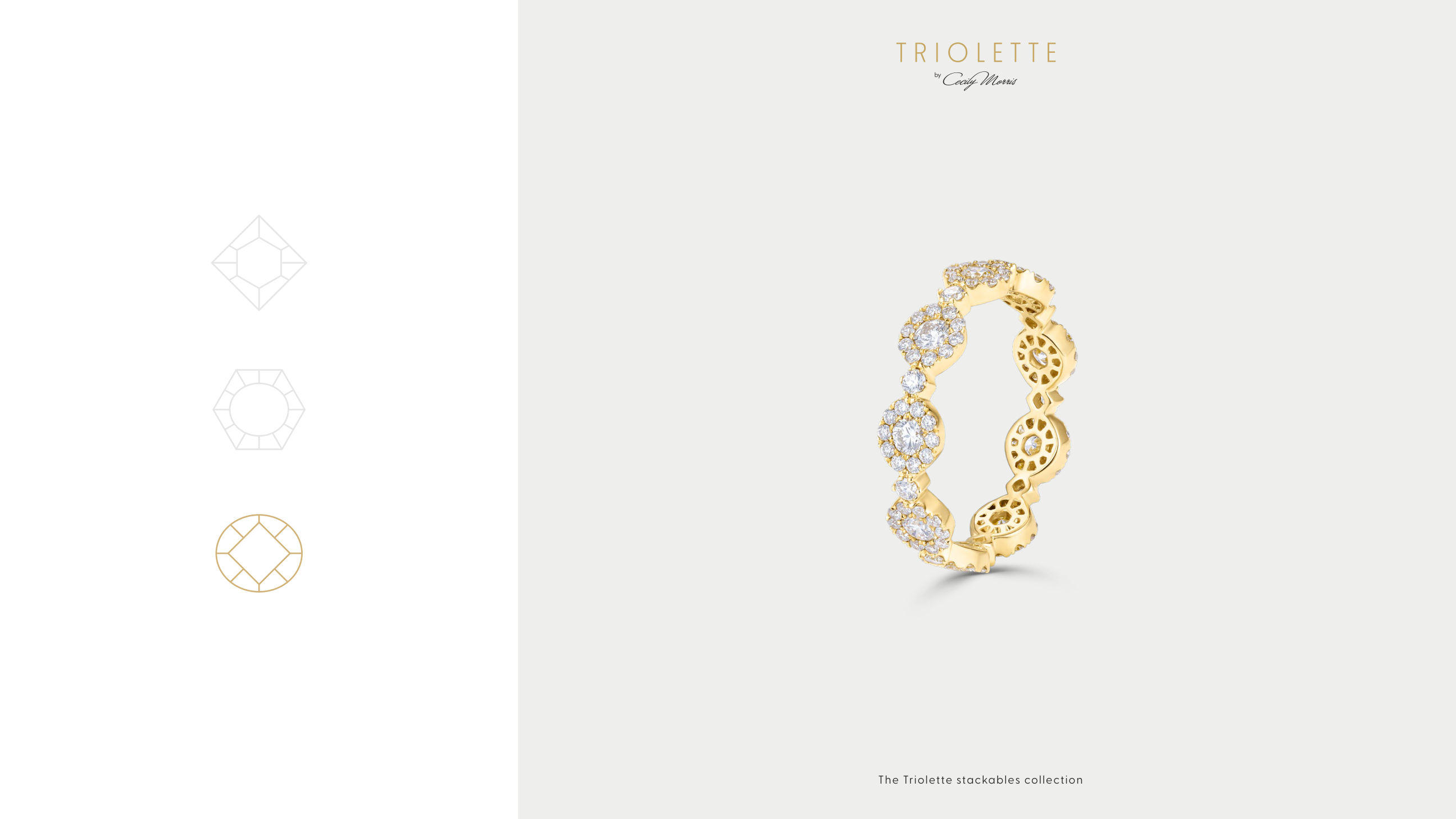
We took the collection’s own logic as the identity’s foundation. Triolette is built on three stackable forms: hexagon, oval and square. They run across rings, earrings and bracelets, each designed to sit seamlessly against any other.
That principle of interlocking parts ran through the strategy, the conceptual roots, the visual identity, the packaging and the wider brand system. Imagery blended AI generation with photography to hold one consistent world across every format.
Typography, palette, packaging.
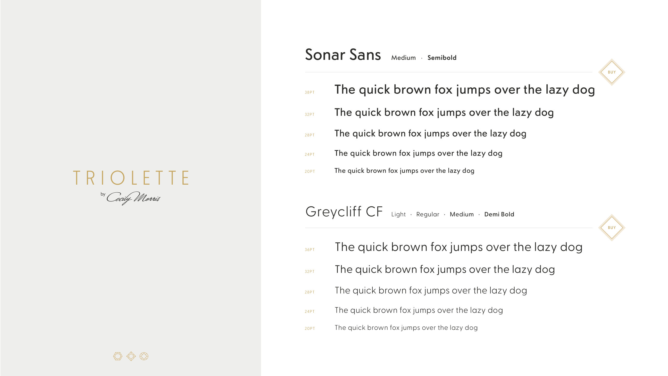
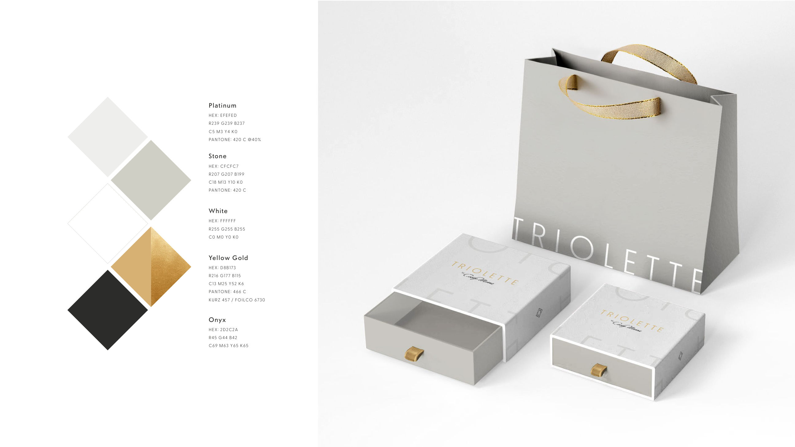
A two-family typographic system: Sonar Sans for the house voice, Greycliff CF for everything that has to work small, The palette is drawn from the materials themselves: platinum, stone, white, yellow gold, onyx.
Packaging closes the loop: the same motif, the same restraint, carried through to the bag and the box.
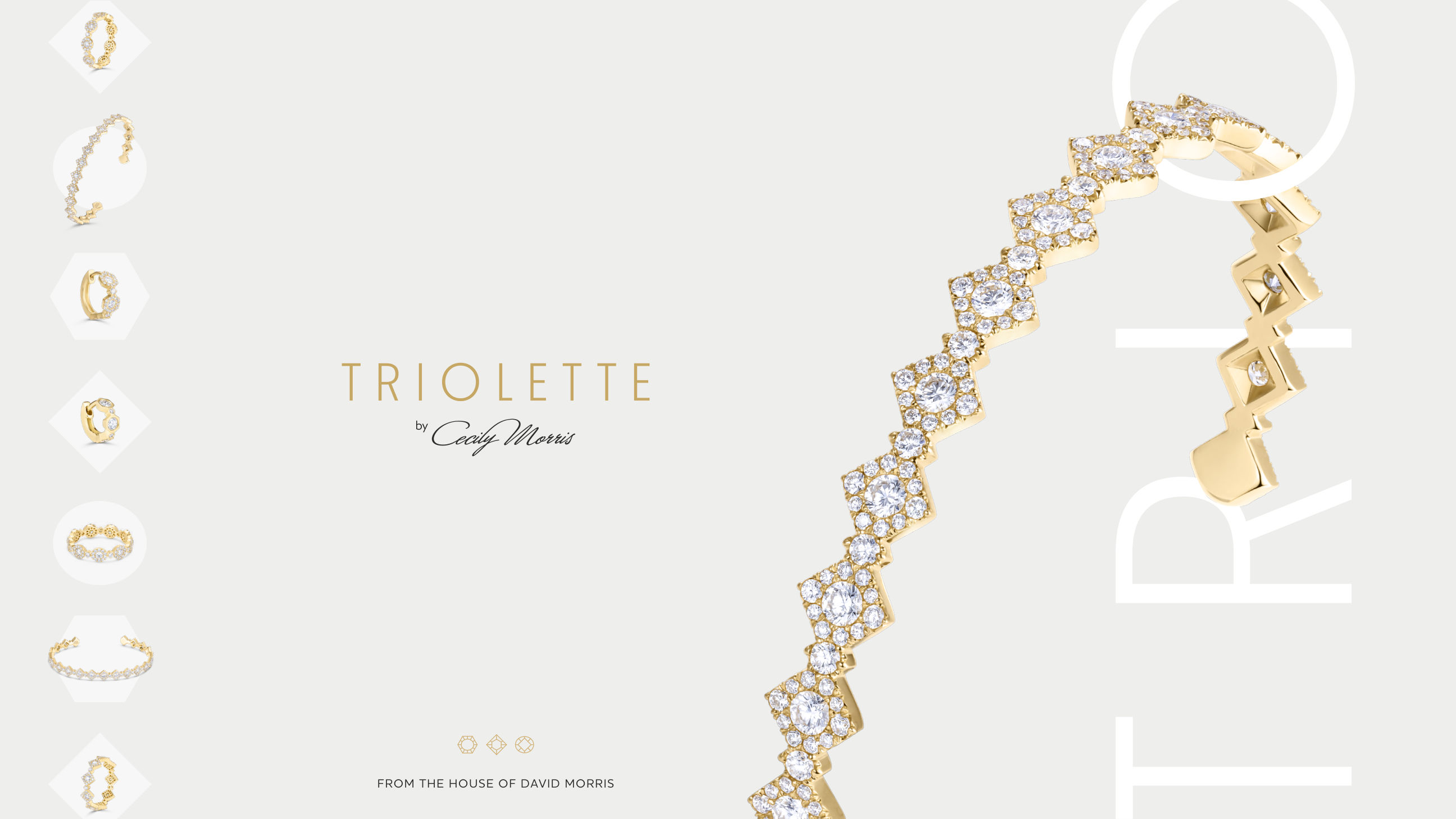
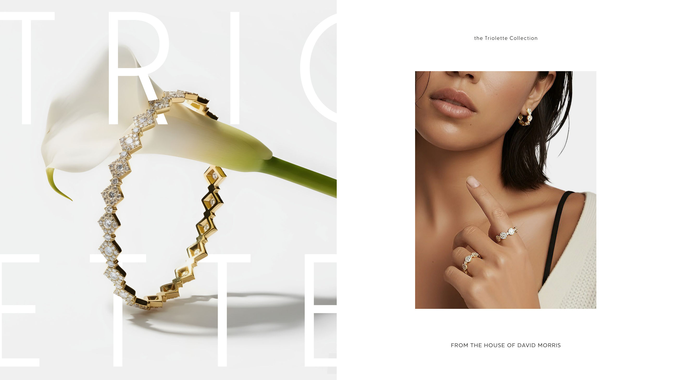
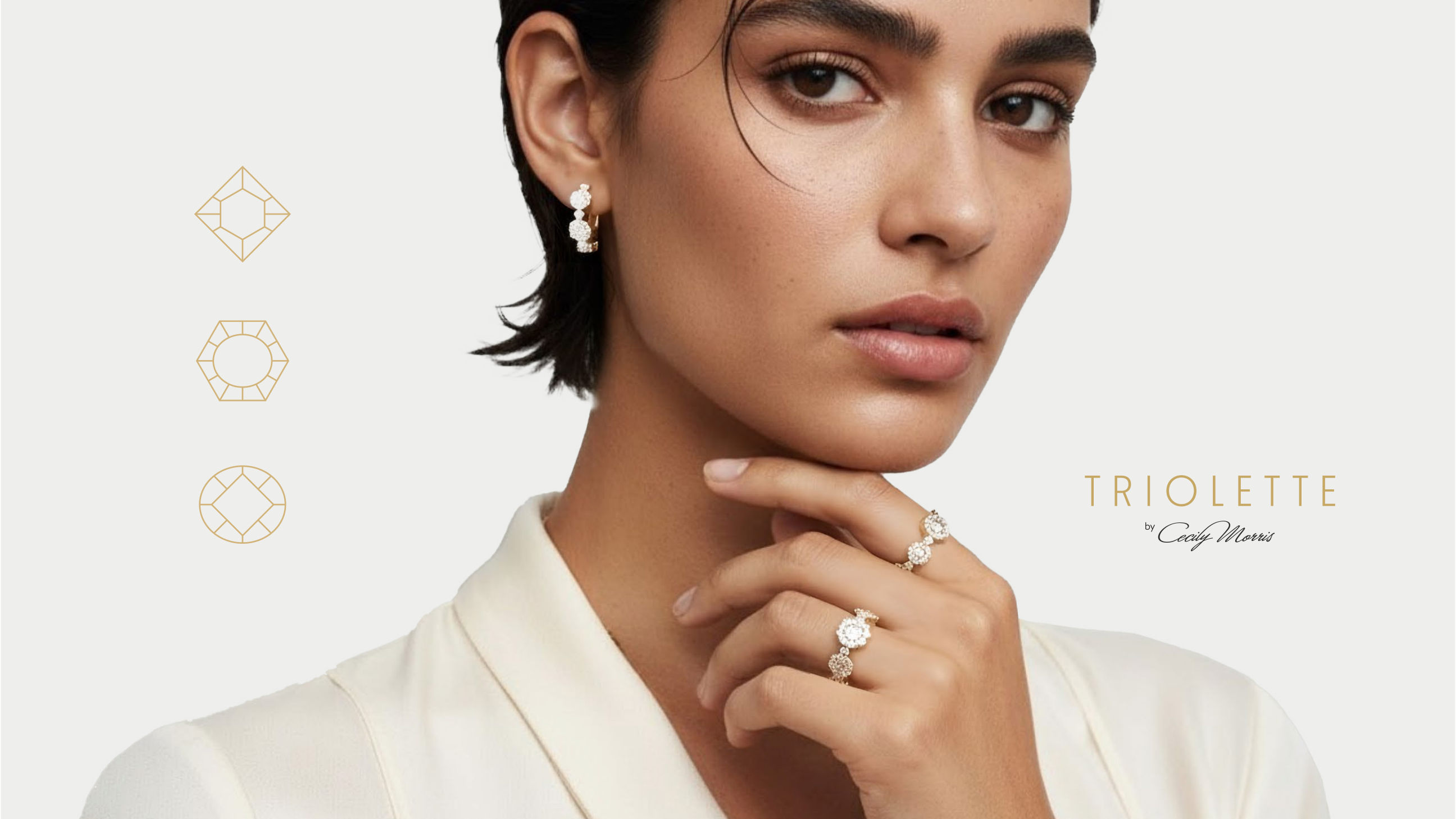
One system, every surface.
Landscape and portrait layouts built from the same grid, so the campaign holds its composure across press, outdoor, boutique and social, without a redraw. Triolette launched globally inside six weeks: Dubai Mall, Abu Dhabi Mall, Wimbledon, and black-cab wraps carrying the collection through central London.
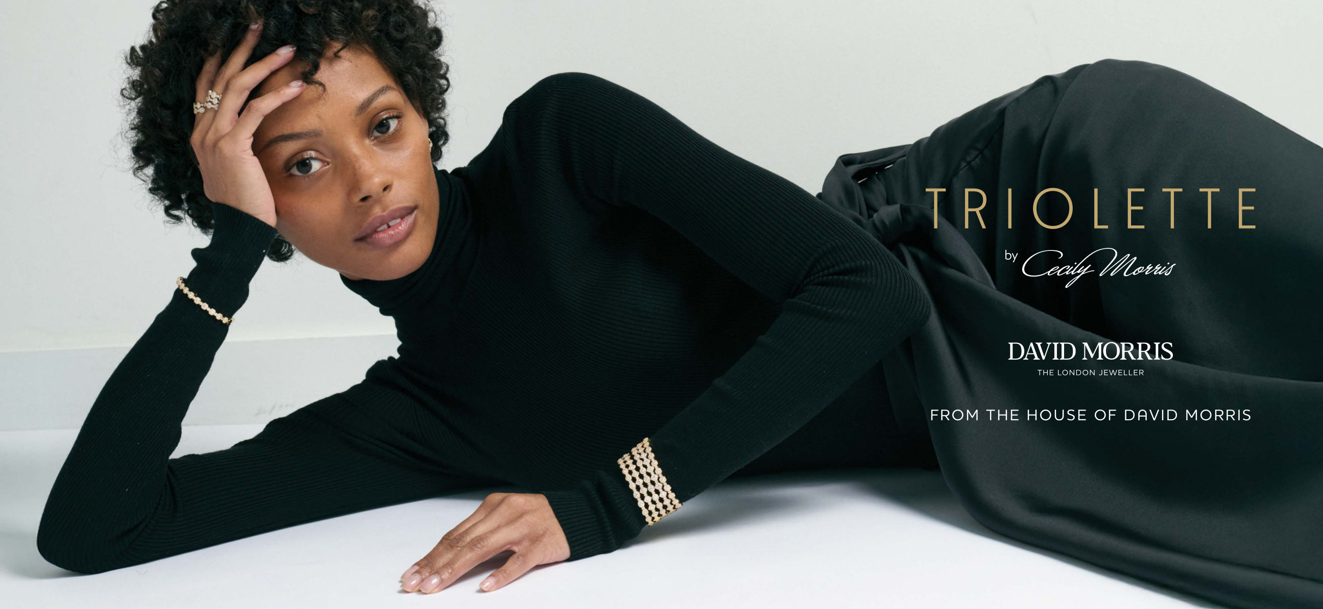
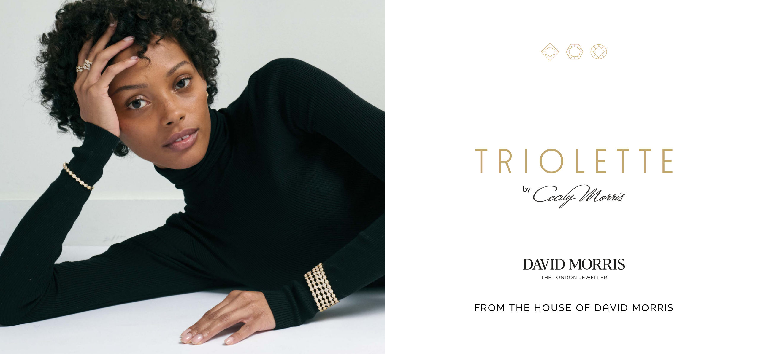
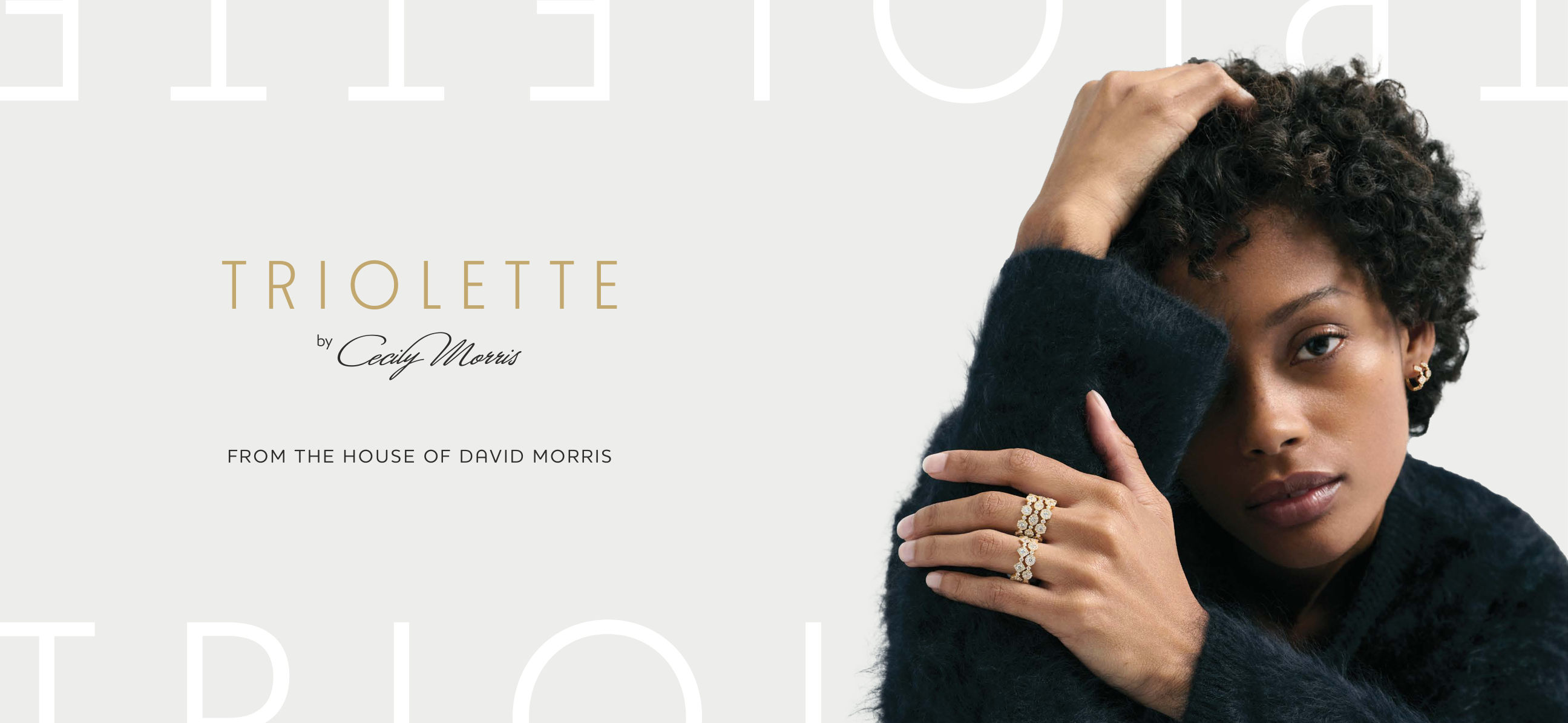
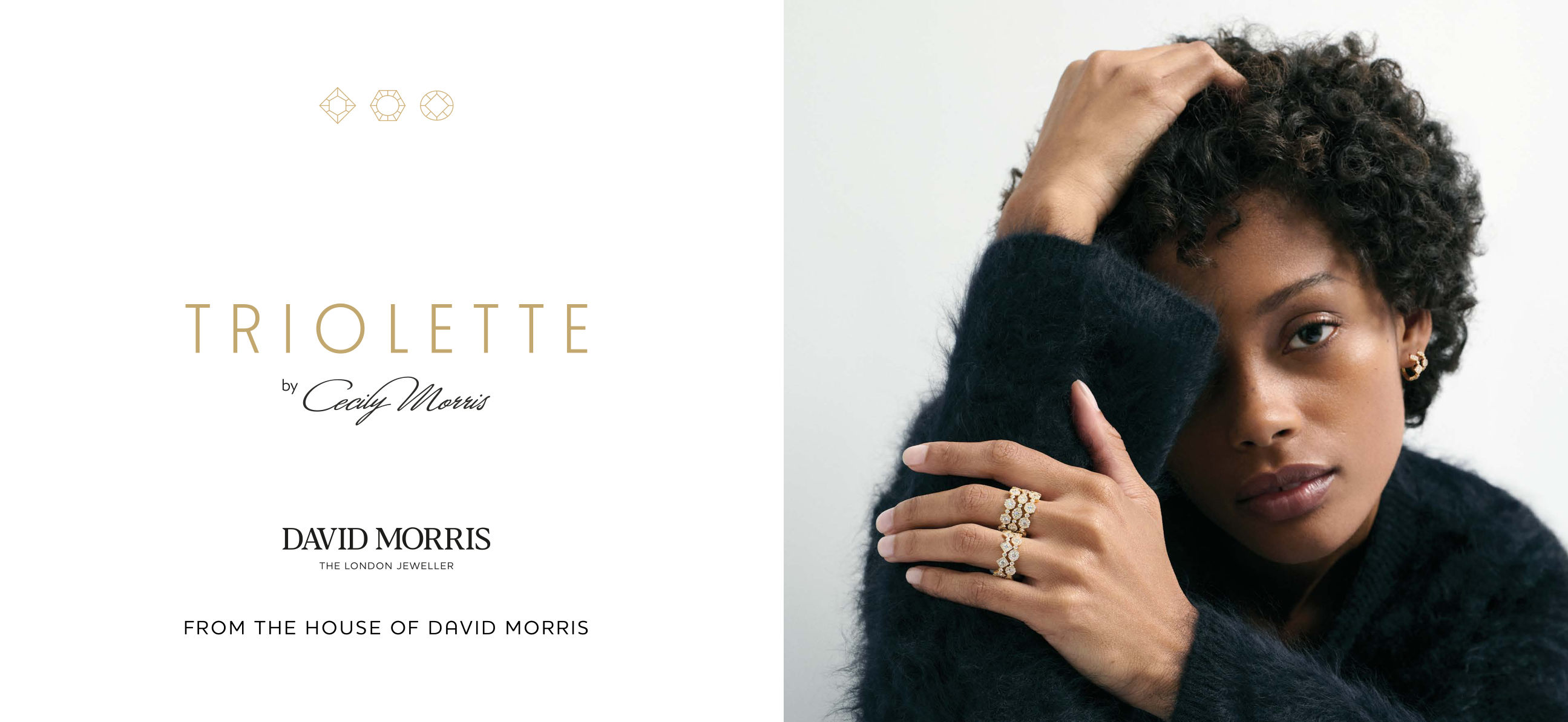
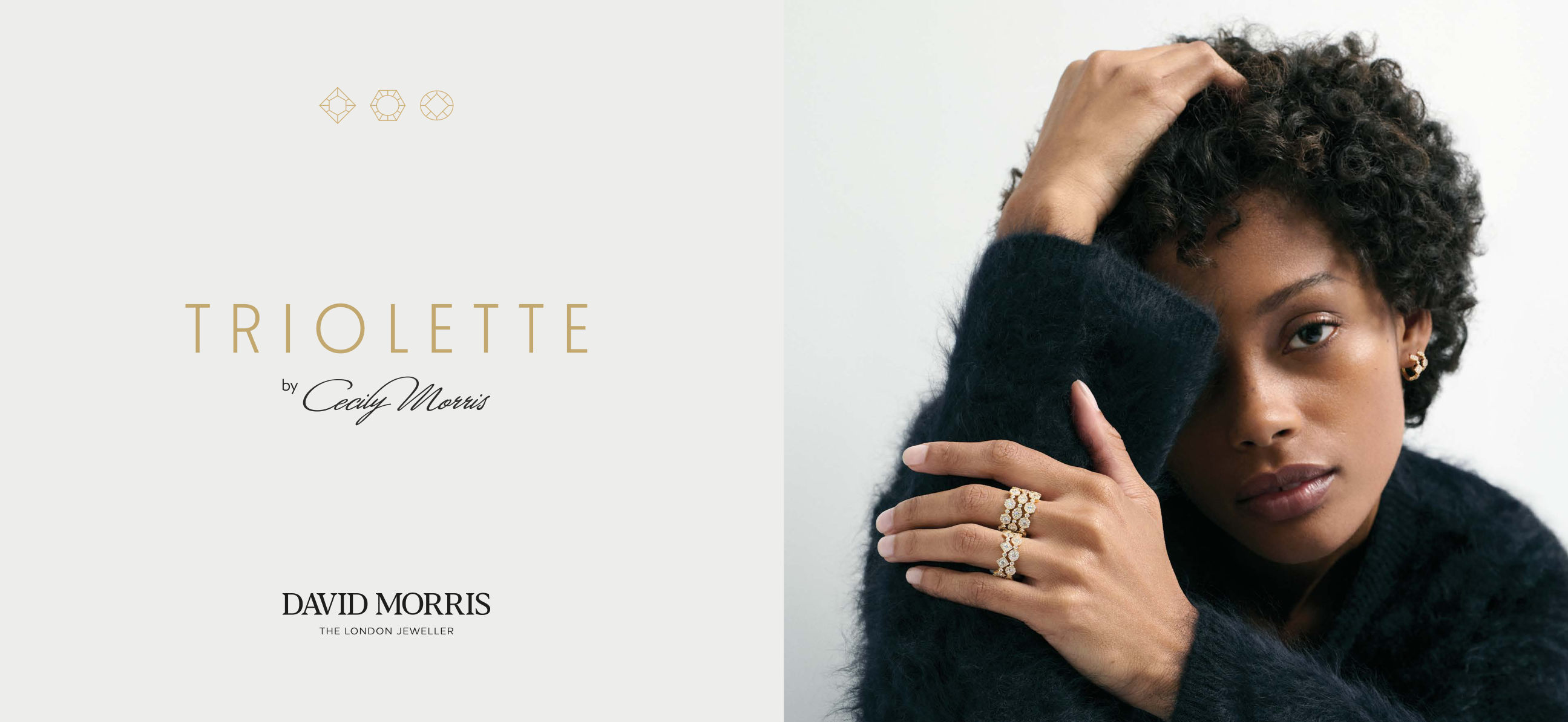
Landscape suite · press & outdoor
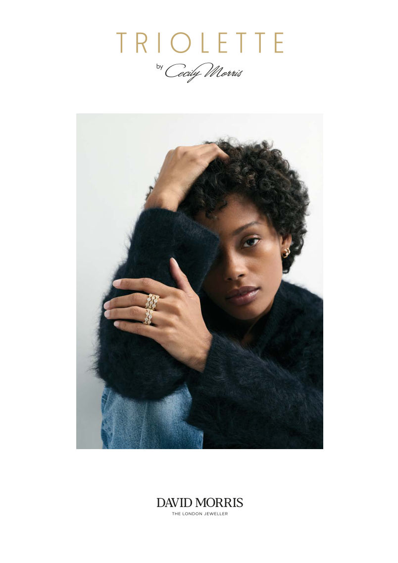
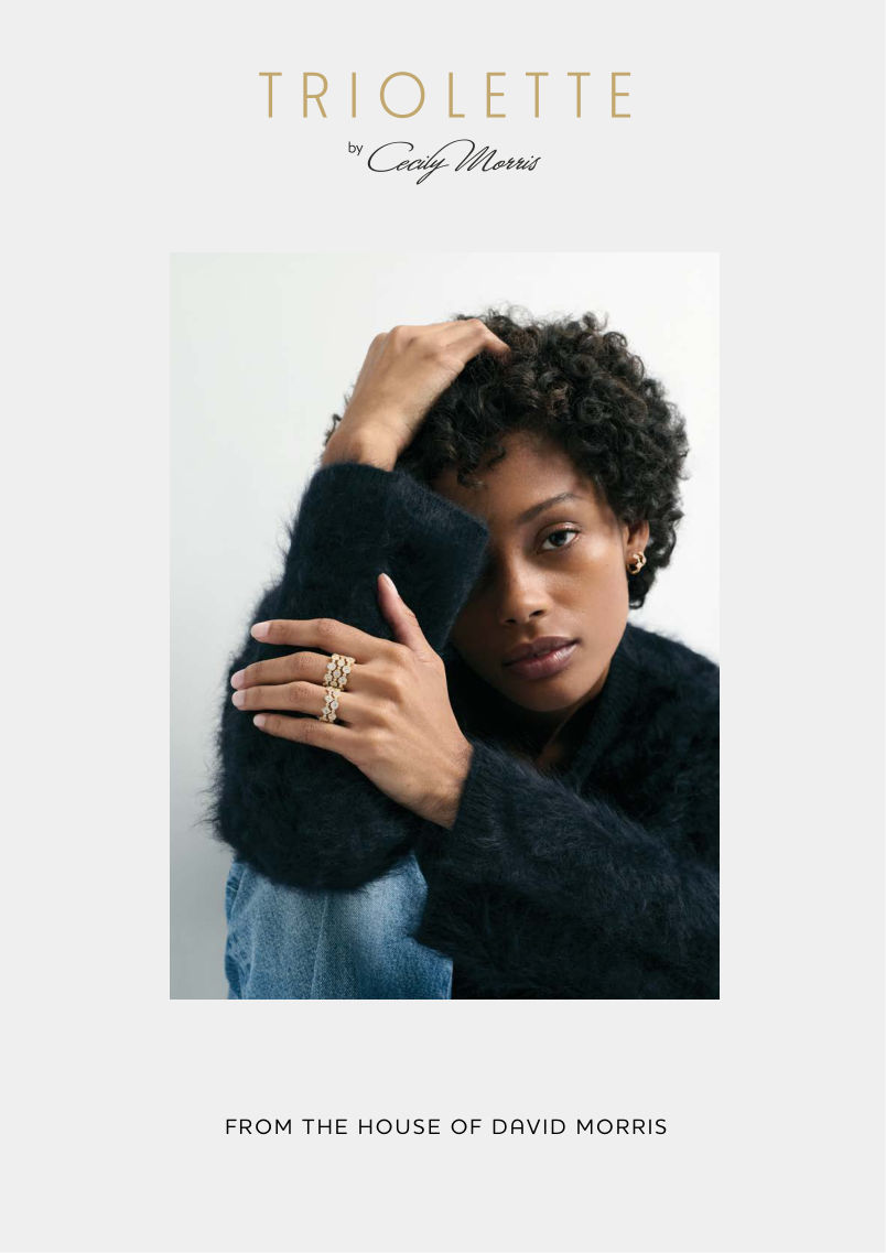
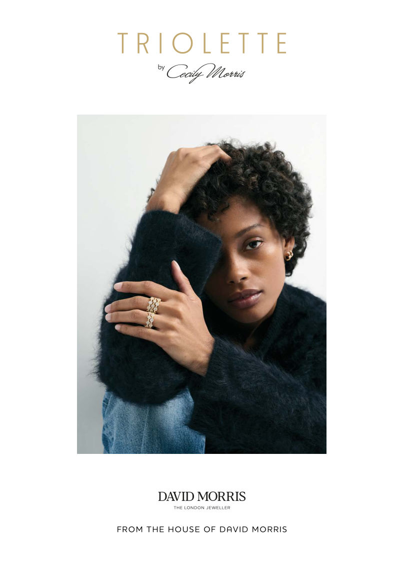
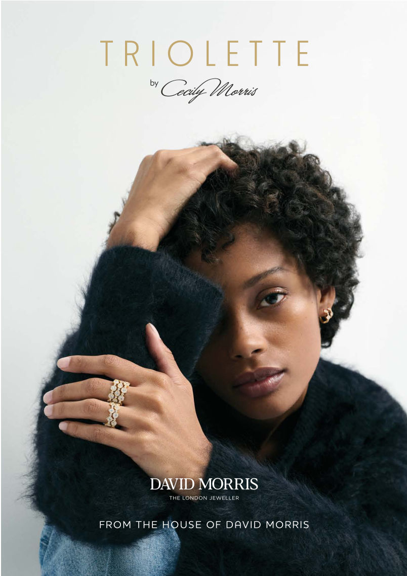
Portrait suite · print & social
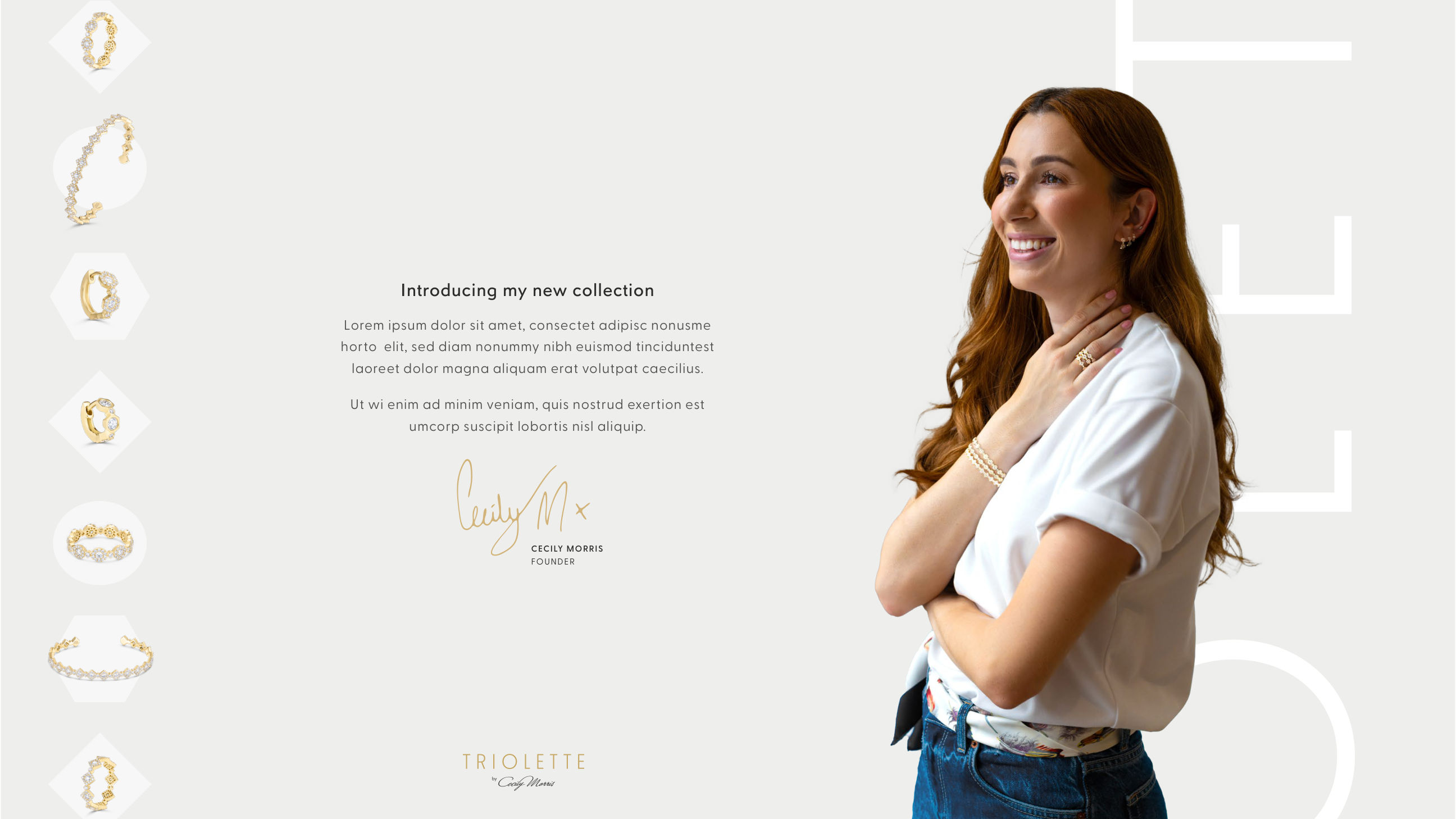
Cecily Morris, introducing the collection
The visual identity feels warm, instinctive and contemporary, yet remains unmistakably David Morris.
AndMelo understood my vision for Triolette from the very beginning. This collection is deeply personal to me: it reflects how I wear jewellery every day. What impressed me most was the thoughtful balance between our heritage and a fresh, modern perspective. They created a world in which Triolette can live confidently, both within the house and on its own.
Cecily Morris · Global Brand and Retail Director, David Morris
AndMelo understood the Triolette woman instantly. The creative process was collaborative, precise and deeply considered, and the brand world they created embodies everything we wanted: modern, wearable and quietly luxurious.
Hannah Kayani · PR and Marketing Manager, David Morris